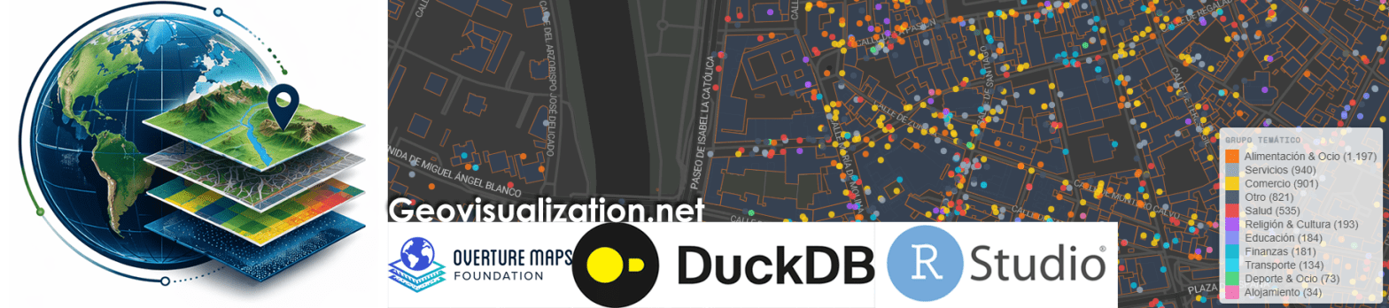
El análisis de la distribución espacial de servicios financieros en centros urbanos —bancos, cajeros, aseguradoras, gestorías y corredurías de seguros— ofrece una lectura directa de la vitalidad económica y la accesibilidad financiera de un territorio. Mapear estos puntos con assetIQ sobre datos Overture Maps permite identificar en minutos dónde se concentra la actividad financiera, qué zonas quedan en la periferia del servicio y cómo se estructuran los ejes comerciales de cada ciudad. El mismo análisis es replicable para cualquier otra capa temática —alojamiento, salud, restauración, deporte— convirtiendo cada capital de provincia en un dashboard geoespacial comparable y reproducible.
Category Archives: quality control
De NDVI a CO2e: un pipeline MRV de estimación de emisiones FLAG con GEE
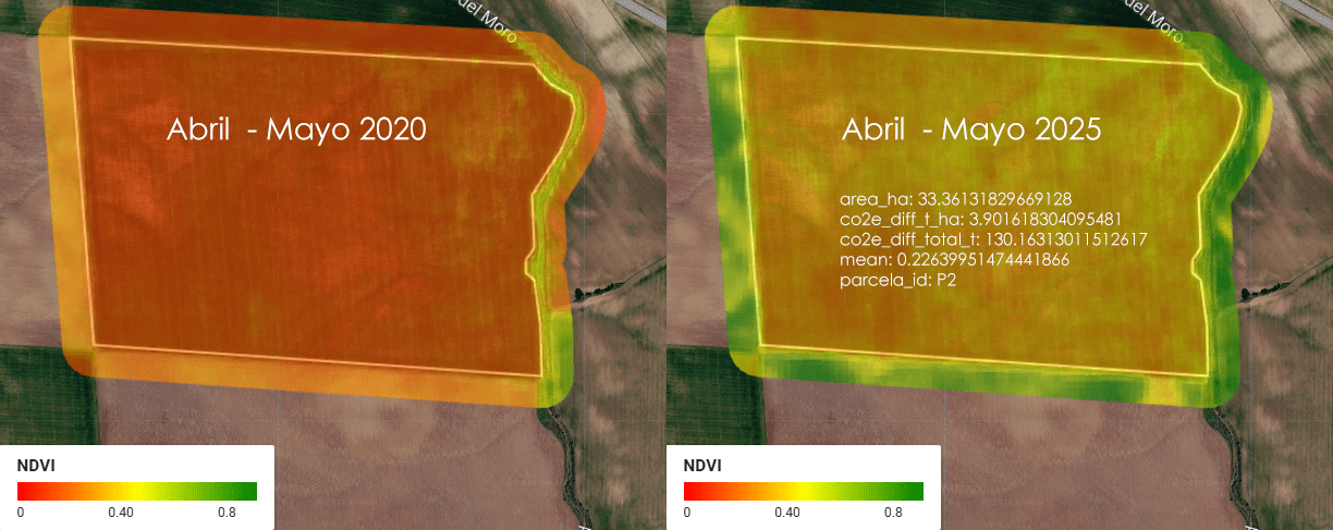
Imagina una empresa que se llama ACME. ACME es dueña de 5 parcelas de tierra en Almendralejo, Extremadura, España, donde se cultiva cereal (trigo, cebada, ese tipo de cosas). Entre las 5 parcelas, ACME tiene un total de 1.52 km² de tierra — para que te hagas una idea, eso es más o menos el tamaño de 300 campos de fútbol (a rzón de aproximadamente media hectárea por cada campo).
Population Estimation through Dynamic LULC-Based Settlement Validation
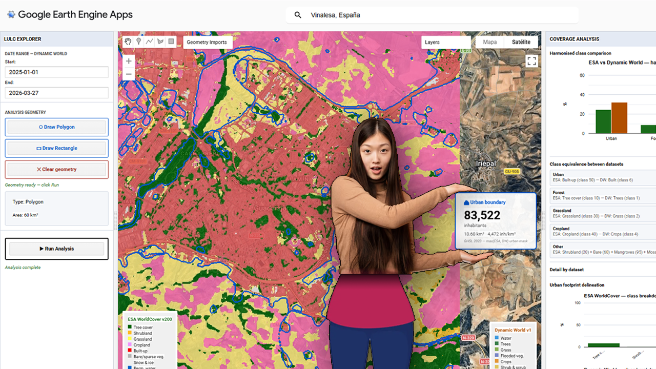
The foundational step of this methodology involves the deployment of a centralized processing interface within the Google Earth Engine (GEE) environment. The provided visualization captures the core interface of the custom GEE application, which serves as the hub for the multi-sensor LULC validation pipeline. Within this dashboard, users can define a specific Area of Interest (AOI)—highlighted here over the Iberian Peninsula and North Africa—and configure key parameters, including temporal ranges for the acquisition of sentinel-derived products. Crucially, the interface is designed to load and compare two primary datasets simultaneously: Dynamic World (near real-time, probability-based LULC) and ESA WorldCover (10m resolution structured LULC). The contrasting classification schemes are represented by the legends on the left and right sides of the map view, which illustrate the varying definitions of ‘Built-up’ and urban areas between the two products. Establishing this visual and statistical comparison at the application level is the prerequisite for calculating the spatial disagreement threshold, or delta, that guides the subsequent merging and population estimation phases.
Super-résolution 1m a Madrid avec Sentinel-2 10m. Magique ! Tracking NRT!
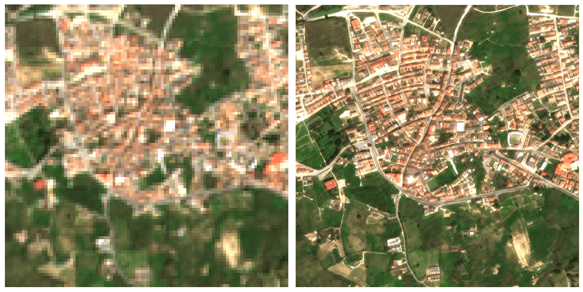
Passer d’une résolution de 10 mètres à 1 mètre change radicalement la perspective du suivi agricole : on ne regarde plus une parcelle dans sa globalité, on observe ce qui se passe à l’intérieur même des rangs de culture. Ce saut qualitatif est possible grâce à l’algorithme S2DR3, un modèle de Deep Learning qui ne se contente pas d’agrandir les pixels, mais reconstruit l’information manquante. En s’appuyant sur les corrélations entre les différentes bandes spectrales de Sentinel-2 et en s’entraînant sur des images de très haute résolution, l’IA parvient à synthétiser une image à 1 m/pixel d’une précision étonnante.
Setting up Mapterhorn terrain in RStudio
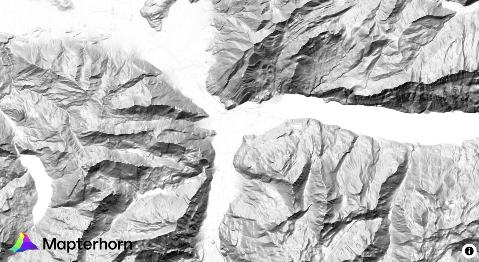
¿Alguna vez has querido visualizar el relieve de un territorio en 3D directamente desde R, sin depender de software GIS externo? Mapterhorn es un proyecto open source que distribuye modelos digitales de elevación (MDT) de alta resolución — hasta 2 metros en España — empaquetados en formato PMTiles, un estándar moderno que permite servir datos geoespaciales sin necesidad de un servidor propio.
En este post veremos cómo configurar Mapterhorn en R usando el paquete mapgl en Rstudio, que nos permite crear mapas interactivos con terreno 3D en pocas líneas de código. El resultado: visualizaciones como la que ves abajo, con sombreado de relieve (hillshade) generado directamente desde los datos de elevación del IGN.
Aventuras y desventuras de un geógrafo en “desarrollo”
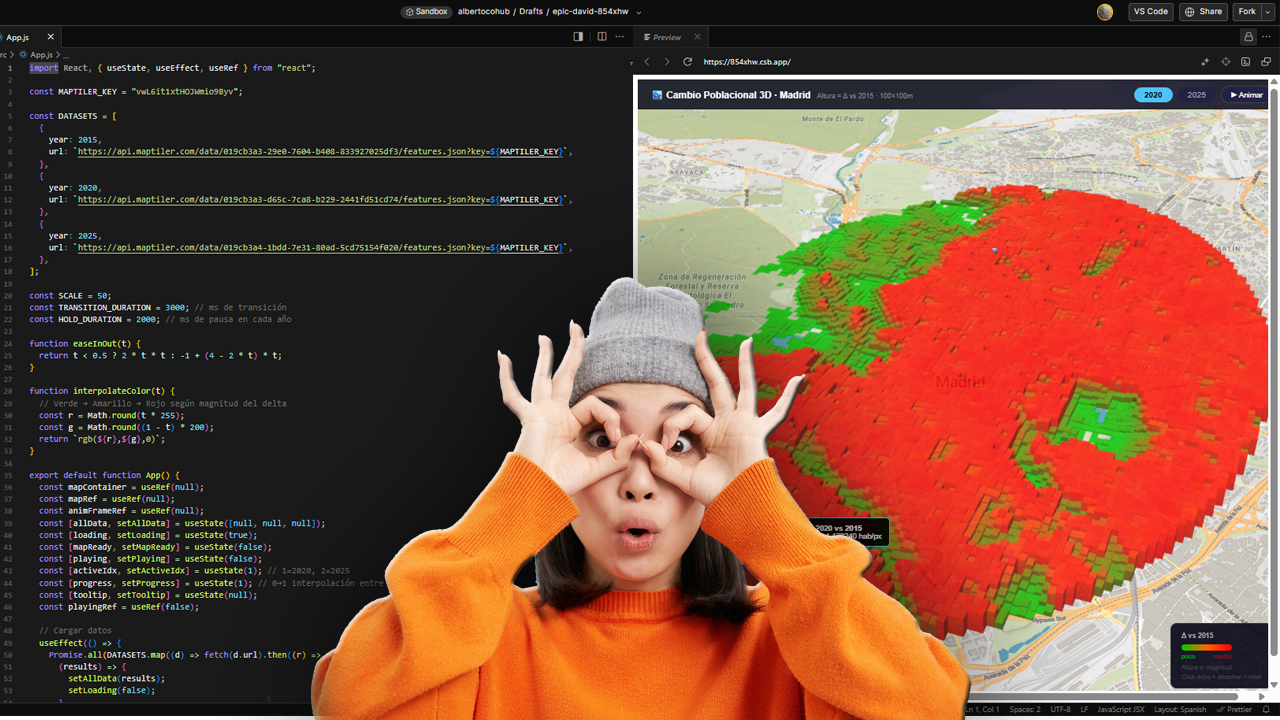
La cartografía siempre ha sido un oficio de precisión, paciencia y criterio espacial. Durante años, el flujo de trabajo de cualquier geógrafo pasaba inevitablemente por entornos de escritorio como ArcGIS Pro o QGIS: cargar capas, ajustar simbología, exportar mapas. Herramientas sólidas, probadas, indispensables. Pero algo está cambiando.
Cada vez más, el análisis espacial ocurre en la nube, en navegadores, en entornos de código. En anteriores post habéis visto algunos test/ideas/aplicaciones que he desarrollado con Javascript Google Earth Engine, que procesa imágenes satelitales a escala planetaria sin mover un solo archivo. Deck.gl y Maplibre renderizan millones de puntos en 3D directamente en el navegador. React convierte un mapa en una aplicación interactiva con pocas líneas de código.
From LIDAR USGS to DSM in a few lines of code. The magic of R
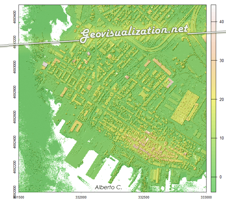
The USGS LiDAR Explorer, hosted via gishub.org, serves as a high-performance web gateway for interacting with the USGS 3D Elevation Program (3DEP) datasets. First thing, go to this GITHUB repository https://github.com/opengeos/maplibre-gl-usgs-lidar, download code for the project (code>download ZIP), get connected with RStudio, save new project and open a script window… It’s all set up!
URBAN ATLAS 2018 + WORLDPOP 100m/GHSL 100m estimates over Madrid
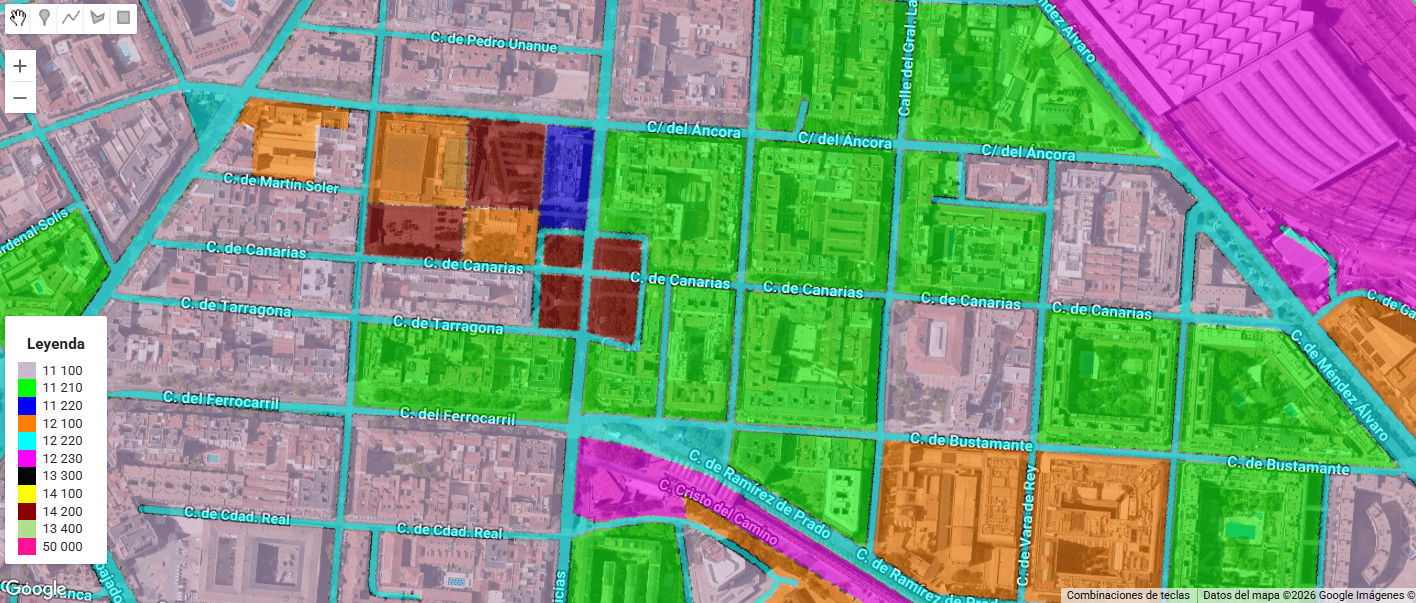
Urban Atlas (UA) representa el estándar de oro dentro del Copernicus Land Monitoring Service (CLMS) para el análisis de la morfología urbana en Europa. A diferencia de Corine Land Cover, UA ofrece una resolución temática y espacial drásticamente superior (Unidad Mínima de Mapeo de 0.25 ha para clases urbanas), permitiendo discriminar entre tejidos urbanos continuos y discontinuos con una precisión de densidad del 10% al 80%.
Testing GEMINI for 3D environments. From SketchUp to an unlikely future!
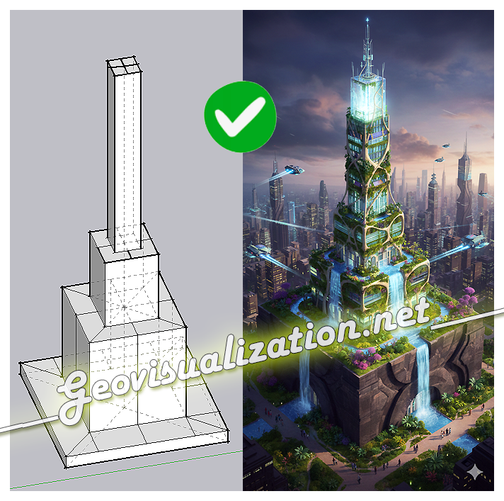
The exercise shows how a simple SketchUp 3D volume, defined solely by its basic geometry, can be transformed into a complex architectural proposal. Starting from the initial schematic model, the system interprets proportions, levels, and shapes, and converts them into a fully developed building, complete with textures, vegetation, lighting, and an urban context
Precision Elevation Data for Forest Giants: LiDAR vs ETH Global Canopy Height in Mata do Buçaco (Portugal)

High‑resolution elevation data underpins almost every spatial analysis we do in GIS—especially in forests where vertical structure defines habitat, biomass, wind exposure, fire behavior, hydrology, and the microclimates that sustain rare species. In rugged or densely vegetated environments, a coarse or biased elevation model propagates error everywhere: orthorectification drifts, hillshades mislead, slope/aspect misclassify, and canopy metrics saturate. The result is decisions made on blurred terrain that hides the very patterns we seek to manage. Precision elevation—derived from airborne LiDAR (Light Detection and Ranging)—solves this by separating the ground from the vegetation and delivering both a bare‑earth Digital Terrain Model (DTM) and a Digital Surface Model (DSM). Subtracting DTM from DSM gives a Canopy Height Model (DHM) that captures the true vertical architecture of the forest at sub‑meter resolution.

