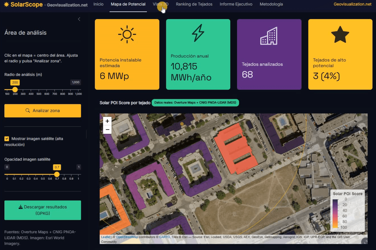
Llevo unos días dándole vueltas a una idea que, en el fondo, es bastante sencilla: si tenemos la huella de cada edificio, su altura y un modelo digital de superficies de alta resolución, ¿por qué seguimos viendo estudios de potencial solar que tratan los tejados como manchas homogéneas sobre un mapa? De esa pregunta, y de unas cuantas sesiones intensas de R, ha salido SolarScope, una aplicación Shiny que estoy desarrollando para hacer scoring de potencial fotovoltaico tejado a tejado, con datos abiertos y un flujo que se puede reproducir tanto en España como en Estados Unidos.
Category Archives: ideas
Time Series Analyzer: Análisis multitemporal de índices espectrales en Google Earth Engine
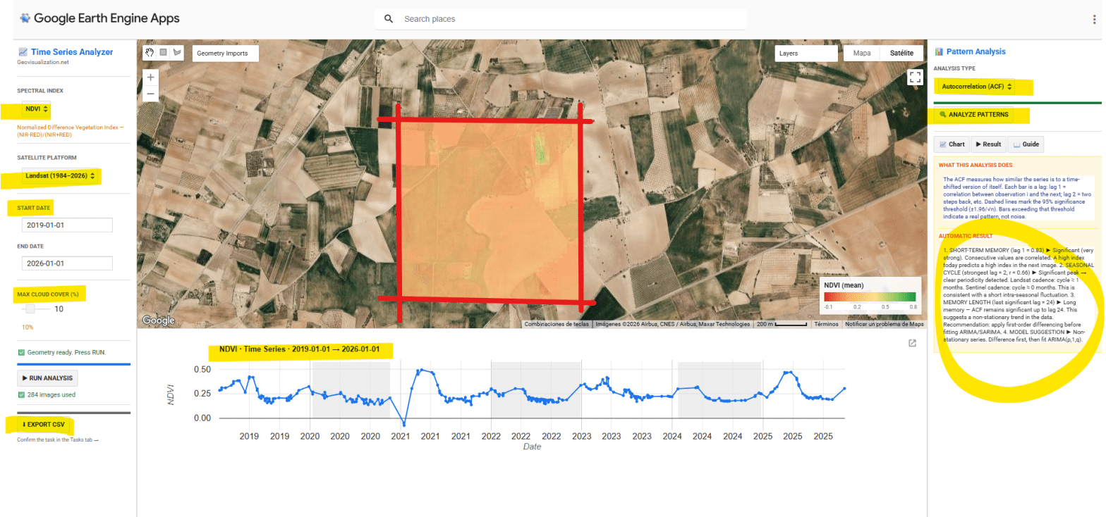
He desarrollado una aplicación interactiva en Google Earth Engine para la extracción y análisis estadístico automático de series temporales de cinco índices espectrales (NDVI, EVI, SAVI, NDWI y NBR) sobre cualquier geometría definida por el usuario en cualquier sitio del mundo. El objetivo es pasar de una imagen satélite puntual a una comprensión temporal del territorio: qué ha pasado, qué patrón subyace, y qué cabe esperar.
POI Intelligence for Urban Asset Analysis in RStudio: assetIQ
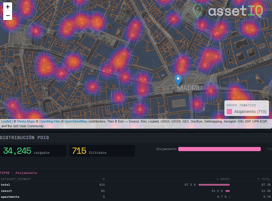
When analysing urban assets, there is genuine value in moving beyond generic neighborhood scores. The density of a coffee shop cluster, the proximity to a financial hub, or the concentration of accommodation around a transport node are signals that traditional datasets flatten into averages — or ignore entirely. assetIQ was built to change that. assetIQ is an R application powered by DuckDB and Overture Maps that extracts, classifies, and scores Points of Interest (POIs) for any location on Earth. You define a city and a search radius — from 100 meters to 25 kilometers — and the tool queries the Overture Maps Places dataset in real time, classifying each POI into thematic groups: Food & Drink, Retail, Health, Education, Transport, Accommodation, Financial Services, Leisure & Culture, Sport, and more.
The core output is an attribute value called POIQ: a normalized 0–1 score assigned to every building footprint within the area of interest, derived from a Kernel Density Estimation of the selected thematic group. A building in a dense retail corridor scores close to 1. An isolated residential block far from any commerce scores close to 0. This transforms thousands of individual points — which in raw form tell you very little — into a single, interpretable attribute per building, ready for downstream modelling, valuation, or site selection.
Detecting Potential Mobile Coverage Gaps Using OpenCellID, GHSL and Overture Maps: Case study over TUNIS
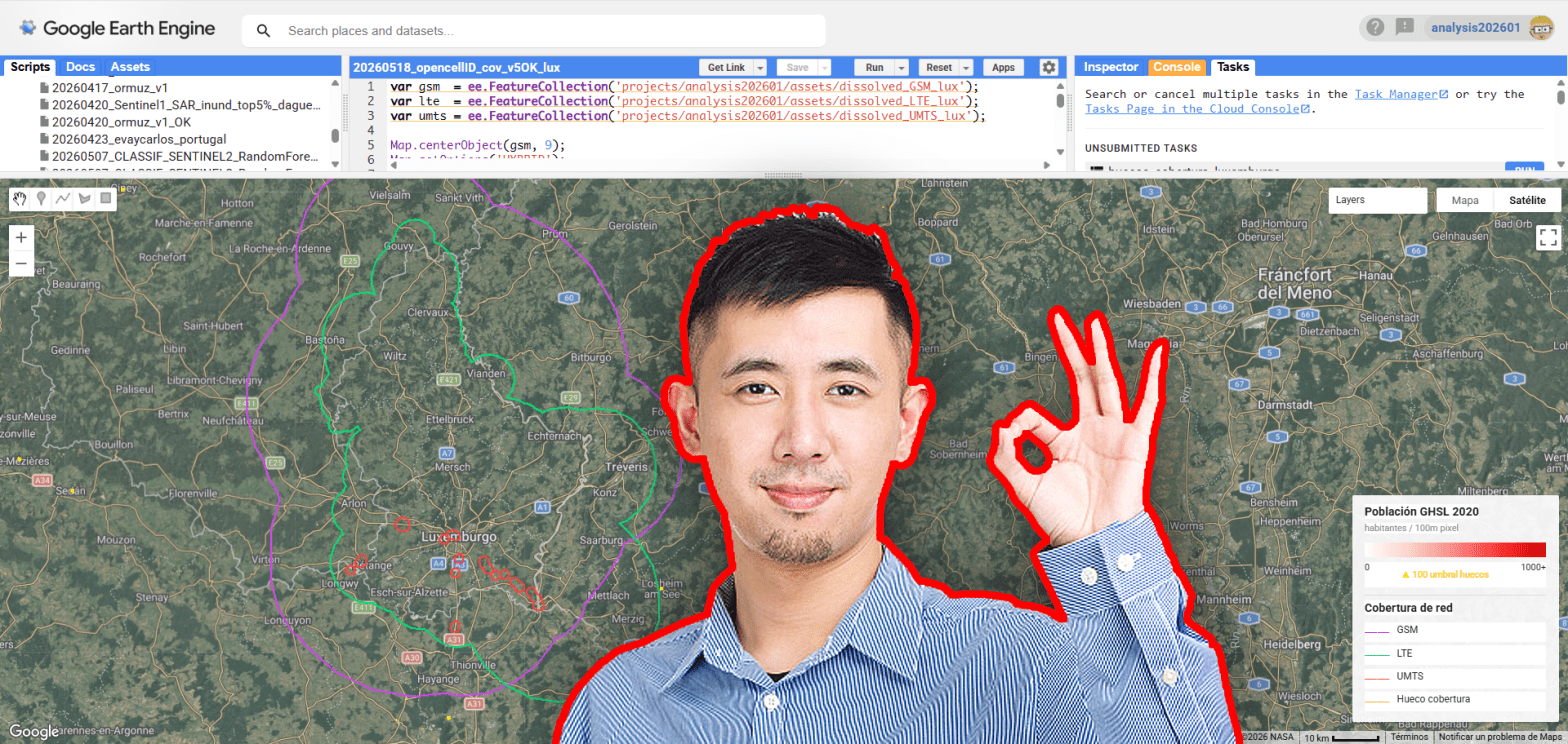
Mobile connectivity has become a fundamental component of modern infrastructure, yet significant spatial inequalities in network access still persist across both urban peripheries and rural environments. Using openly available geospatial datasets, this analysis explores potential mobile coverage gaps by combining OpenCellID cellular infrastructure observations, GHSL population layers and vector data extracted from Overture Maps. The objective is not to reproduce real telecom propagation models, but to generate a simplified spatial estimation of coverage capable of identifying populated areas potentially located outside the influence of nearby cellular infrastructure.
CHANGE DETECTION ARCGIS PRO AND LIVING ATLAS 2017-2025
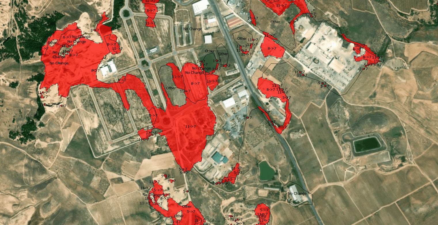
The quantification of land-use dynamics necessitates a spatiotemporal framework that ensures categorical stability over long-term observation windows. The ESRI 10-Meter Global Land Cover time series, accessible through the ArcGIS Living Atlas, provides a harmonized baseline for this purpose, derived from the dense temporal stack of the ESA Sentinel-2 mission.
From Overture Maps to GPKG in minutes: Building a Geospatial Data Extractor with R and DuckDB
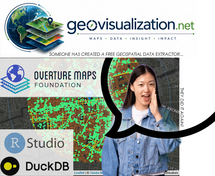
Modern geospatial workflows increasingly depend on fast, reliable access to city-scale vector data — building footprints, road networks, land use polygons, points of interest, address databases. Whether you are designing a 5G radio network, modelling urban heat islands, planning last-mile logistics, or simulating emergency response coverage, you almost always start from the same question: “How do I get clean, structured geodata for this city, right now, without spending two days on it?”
The Overture Maps Extractor is my answer to that question. It is a Shiny application written in R that lets any GIS professional extract multiple thematic layers from the Overture Maps Foundation dataset — for any city in the world — in a matter of minutes, with zero command-line interaction and zero manual data wrangling.
1762 followers in LinkedIn is something (updated 20260615)
Una red con nombre y apellidos. A veces, las métricas de las redes sociales nos hacen olvidar que detrás de cada clic hay una persona. Ver este camino de 1531 profesionales a vista de helicóptero no es un ejercicio de ego, sino de gratitud.
Urban development in Madrid from the mid-19th century to the present day

All existing buildings in Madrid currently listed in the Land Registry database have their year of construction recorded. This map shows, by decade, where the bulk of that urban development took place. For example, in the 1920s it was in the Salamanca district, in the 1930s in Chamartín… shifting from development in the city centre to the outskirts.
Bienvenido a Madrid Río, donde el carril único lo usa todo el mundo… pero solo la mitad lo usa bien
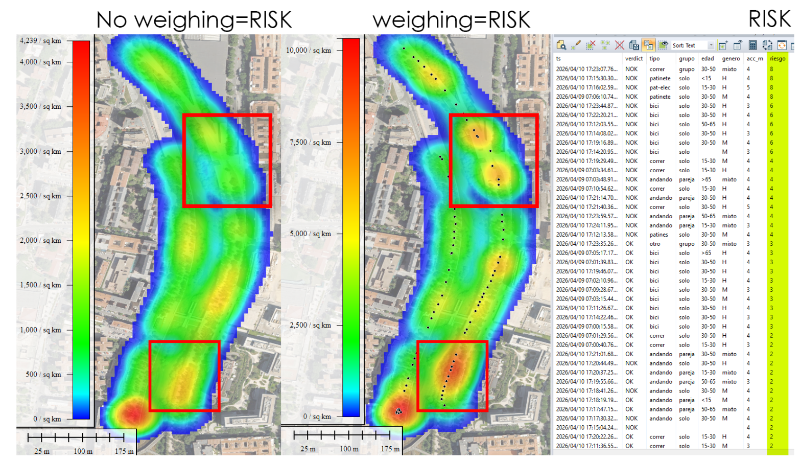
Y cuando eso ocurre, se genera un caos silencioso. Normalmente se resuelve en segundos con ese equilibrio dinámico tan mediterráneo que tenemos —un quiebro, una mirada, un gesto— pero no siempre. He visto bicis arrollar a personas que iban por su lado. Grupos andando en paralelo, bloqueando la vía entera. Patinetes a velocidad de vértigo a punto de llevarse por delante a un niño que, irónicamente, iba exactamente donde debía. Yo mismo llevo usando esta vía desde casi su inauguración, hace más de once años, y puedo decir que el problema no ha mejorado: ha crecido, a medida que el carril se ha llenado de nuevas tipologías de movilidad.
¿Qué quiero hacer? Quiero medir esto. Con rigor, con datos, y con herramientas actuales. Mi objetivo es retratar estadísticamente quién va en el sentido correcto y quién no, desagregando por tipo de movilidad, edad, género y comportamiento en grupo. ¿Son los ciclistas los que más incumplen, o los patinetes eléctricos? ¿La gente mayor es más respetuosa que los jóvenes? ¿Los grupos de tres o más personas son el mayor factor de caos? No lo sé aún. Pero lo voy a descubrir.
Super-résolution 1 m a Madrid avec Sentinel-2 10m. Magique ! Tracking NRT!
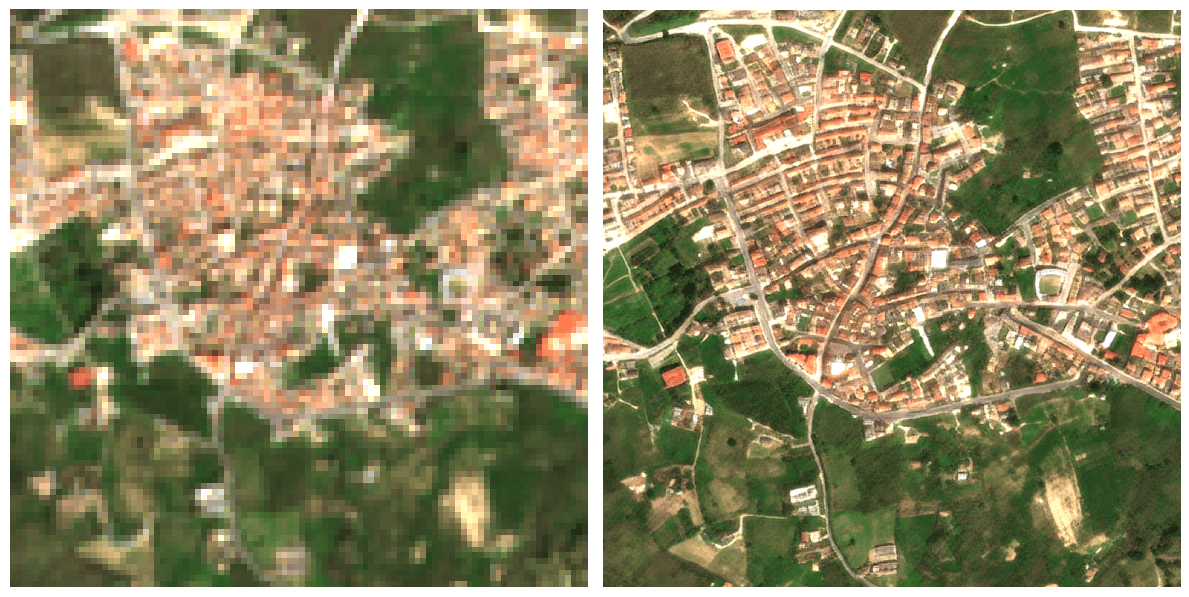
Passer d’une résolution de 10 mètres à 1 mètre change radicalement la perspective du suivi agricole : on ne regarde plus une parcelle dans sa globalité, on observe ce qui se passe à l’intérieur même des rangs de culture. Ce saut qualitatif est possible grâce à l’algorithme S2DR3, un modèle de Deep Learning qui ne se contente pas d’agrandir les pixels, mais reconstruit l’information manquante. En s’appuyant sur les corrélations entre les différentes bandes spectrales de Sentinel-2 et en s’entraînant sur des images de très haute résolution, l’IA parvient à synthétiser une image à 1 m/pixel d’une précision étonnante.
