
All existing buildings in Madrid currently listed in the Land Registry database have their year of construction recorded. This map shows, by decade, where the bulk of that urban development took place. For example, in the 1920s it was in the Salamanca district, in the 1930s in Chamartín… shifting from development in the city centre to the outskirts.
Category Archives: Photoshop
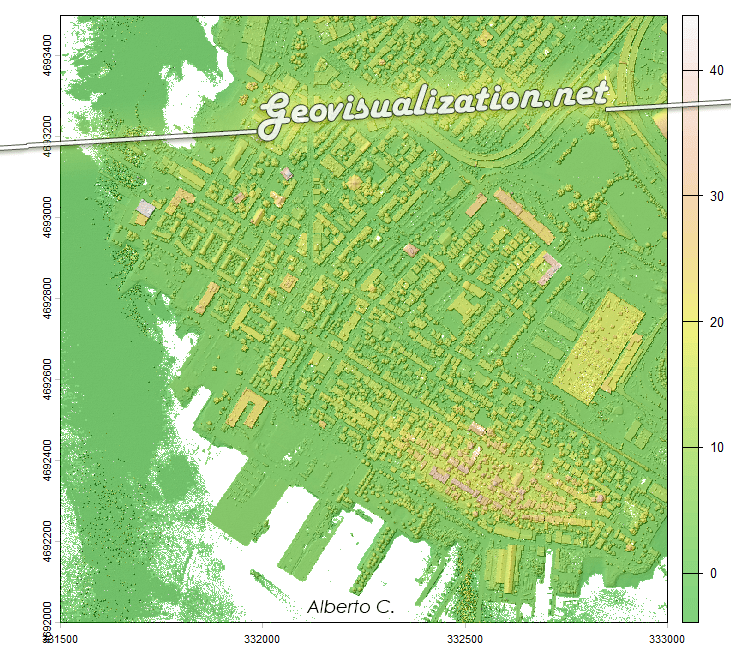
From LIDAR USGS to DSM in a few lines of code. The magic of R
The USGS LiDAR Explorer, hosted via gishub.org, serves as a high-performance web gateway for interacting with the USGS 3D Elevation Program (3DEP) datasets. First thing, go to this GITHUB repository https://github.com/opengeos/maplibre-gl-usgs-lidar, download code for the project (code>download ZIP), get connected with RStudio, save new project and open a script window… It’s all set up!
Testing GEMINI for 3D environments. From SketchUp to an unlikely future!
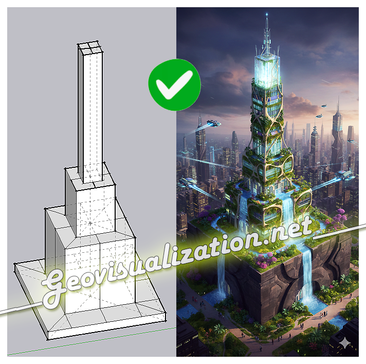
The exercise shows how a simple SketchUp 3D volume, defined solely by its basic geometry, can be transformed into a complex architectural proposal. Starting from the initial schematic model, the system interprets proportions, levels, and shapes, and converts them into a fully developed building, complete with textures, vegetation, lighting, and an urban context
Mapping Something Unthinkable: Flood Risk in Madrid using Open Data

Dont get wrong if you see the IA background showing our handsome major almost showing his beautiful smile in Cibeles/Correos it’s only to get your attentions (only if you need it thou!). Flooding in urban environments is not a speculative hazard but something we can quantify. In the case of Madrid, the intersection of pretty mountainous terrain (it might surprise you there are 2000m difference between the highest spot in Madrid province, Pico Peñalara -2428m- and the Alberche river environment in some areas -430m-) and urban expansion presents a scenario of significant risk, particularly when analyzed through the lens of shared high-resolution geospatial data. This study integrates the buildings from BTN (Base Topográfica Nacional) provided by the Spanish “IGN”, the CNIG with the official flood hazard maps for a 100-year return period (T=100), published by the Ministry for the Ecological Transition and the Demographic Challenge (MITECO). The T=100 scenario is the most representative for evaluating long-term flood exposure, as it reflects events with a 1% annual probability—rare but not improbable, and certainly not negligible.
Urban Heat Islands, Trees, and Climate Justice in the Anthropocene: A Remote Sensing-Based Reflection

In recent years, the need to understand the urban environment has grown more urgent than ever. Climate change is not an abstract future scenario; it is already here, reshaping our cities day by day. Among the many phenomena that demand our attention, the Urban Heat Island (UHI) effect stands out—not only for its environmental and public health impacts but also for its socio-political implications. Through satellite imagery and remote sensing, we can now visualize and quantify these dynamics with increasing precision. This post reflects on such an analysis I conducted using LANDSAT 8 imagery (Scene ID: LC08_L2SP_201032_20250328_20250401_02_T1, Date Acquired: 2025/03/28), and discusses the findings in the broader context of urban planning, climate justice, and the urgent need to protect urban vegetation.
Tracking fires LIVE: Boiro (A Coruña, Spain)

We can track this up as we speak. We can measure burn areas on a regular basis, creating videos, capture images, creating indexes, histograms, etc. Everything for better understanding what is going on and maybe, why not, avoiding it in te future. If you would like more information, dont hesitate to contact us.
¡Viento del Sahara en España! ¡Sí!

De repente se levanta uno y ve los coches, los marcos de las ventanas y las aceras llenos de arena… ¿Qué es esto?, ¡Uno quiere comprender más en detalle! Si esto es en Madrid, qué no ocurrirá en Murcia (que está de camino)!! 🙂 Lo cierto es que si tomamos las imágenes del SENTINEL 5P Aerosol index podemos ver cómo en esa longitud de onda encontramos aerosoles. ¡Y muchos! ¿Y hacia dónde se desplazan?. Directos al centro de la península.
Desarrollo urbanístico en Madrid capital desde mediados del S.XIX hasta hoy
Todos los edificios actuales de Madrid presentes en la base de datos de Catastro a día de hoy tienen su año de creación. Esto es un mapa que muestra -por décadas- dónde se concentraba la mayor parte de ese desarrollo urbanístico. Por ejemplo en los años 20 fue en el Barrio de Salamanca, en losContinue reading “Desarrollo urbanístico en Madrid capital desde mediados del S.XIX hasta hoy”
¡Cartografía en estado puro! Análisis COVID19 (Tasa de Incidencia acumulada 14d) por Zonas Básicas de Salud en la Comunidad de Madrid, España

asa de Incidencia Acumulada para cada una de las 287 Zonas Básicas de Salud de Madrid, definiendo rangos y colores correctos de visualización y luego un poco de Photoshop aquí y allá y voilá!
Google Earth Engine y los incendios de verano: el caso de Cadalso de los Vidrios, Madrid (Julio 2019)

Gracias a la inestimable ayuda de mi compi de co-working Pablo Martín -ingeniero Forestal- con Google Earth Engine hemos modelado este NBR (Normalized Burn Ratio) que usa los canales NIR y SWIR de Sentinel-2 para medir la severidad del incendio de la semana pasada en mi pueblo, Cadalso de los Vidrios (Madrid, España). Rozamos la tragedia en lo personal pero sin duda fue terrible a nivel material. Tardaremos décadas en revertir este funesto incendio…
