dfghdfgh
dfghdfgh
Case study 04 – Data aggregation and Open Data for flagging settlements
Input: Open Data buildings, irrespective the source,
Software: ArcGIS. ArcToolBox Feature to point, point aggregation
The idea is being able to flag potential settlements with the only help of Open Data building distribution. Some tests are to be performed to get to know the amount of buildings needed to be considered a settlement and how close to the buildings around should be to be considered the belonging to the same settlement.

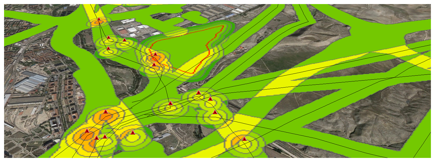
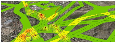
Case study 03 -Risk exposure level assessment – ArcGIS+CARTO
Now that we have completed a first example, let’s continue with a real-world one. Its important working on a Data Model to define what we understand as a Risk and how important this is. Meaning. High voltage power lines are an actual risk but the closer we are, i guess the bigger the risk is, meaning i.e 3 if we are within 50m and 1 if we are 150m away… It’s only a guess.
Same thing related to antennas, Petrol stations, etc.
This is my Data Model defined over the city of Madrid, Spain.
1 LINES- Roads speed >50 km/h within 100m risk=3
2 LINES- Power lines within 100m risk=3
3 POINTS-
Antenna,
High voltage towers,
Petrol stations:
risk if within 50m=3; risk if within 100m=2; risk if within 150m=1;
4 AREAS-
Cement factories,
Electric Sub-stations,
Waste storage facilities:
risk if within 50m=3; risk if within 100m=2; risk if within 150m=1;
(NOTE: You can choose your own risk thresholds and importance. Also note these information downloaded from Open Source data (Cartociudad, CNIG) has not been double checked and it has been used as is).

How is this risk, or these combination of risks impacting in the population of Madrid?
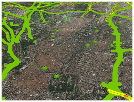
Can we extrapolate these patterns to other cities in the world?
We will definitely continue this analysis shortly.
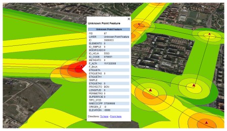
You can also visuallze this analysis using CartoDB, the field regarding “risk exposure level” is called ALL2, and ranges from 2 to 12:
Software: ArcGIS 10.3, Global Mapper 17, CartoDB
Please share if you enjoyed it… or just to say hello!
Case study 02 – Easy visualization of geoprocessed data
The idea is using ‘easy to understand’ codes for visualizing certain kind of information. In this particular case we have the smallest administrative boundary with information regarding population for the country of Spain: ‘secciones censales’ (1). We also have a 1 sq km grid where we are going to link that information to (2). Once we spatially link that information (3, using ArcGIS 10 in this particular case) we proceed to symbolize it. This is not trivial at all, color codes, number of classes, proper extrusion scales are KEY to understand the information we are trying to show… (4, 5 and 6).
Please take a look at this interesting document about proper symbolization using ArcGIS.
Et voilá !

Case study 01 – Landuse changes evaluation
The first visual shows the first stage of the process, lets say we have classified this clutter in i.e year 2010 and these are the classes and their distribution. The second visual shows a second classification, the same classes should be used, that’s pretty logical. The third one states which classes have more variation in terms of area. For instance Forest figures vary from from 43.000k to 11.000k sqm so more than 500% variation thus classified as red colour.
For this purpose i use ARCGIS and the table information. I calculate geometries to know the exact area of every class, i also summarize and make some simple % calculations to figure out the results. Having made this i also use simbolization to express the easiest way possible what i want to show. A very quick way of flagging anything.

Case study 04 – Data aggregation and Open Data for flagging settlements
Input: Open Data buildings, irrespective the source,
Software: ArcGIS. ArcToolBox Feature to point, point aggregation
The idea is being able to flag potential settlements with the only help of Open Data building distribution. Some tests are to be performed to get to know the amount of buildings needed to be considered a settlement and how close to the buildings around should be to be considered the belonging to the same settlement.
Case study 03 -Risk exposure level assessment – ArcGIS+CARTO
Now that we have completed a first example, let’s continue with a real-world one. Its important working on a Data Model to define what we understand as a Risk and how important this is. Meaning. High voltage power lines are an actual risk but the closer we are, i guess the bigger the risk is, meaning i.e 3 if we are within 50m and 1 if we are 150m away… It’s only a guess.
Same thing related to antennas, Petrol stations, etc.
This is my Data Model defined over the city of Madrid, Spain.
1 LINES- Roads speed >50 km/h within 100m risk=3
2 LINES- Power lines within 100m risk=3
3 POINTS-
Antenna,
High voltage towers,
Petrol stations:
risk if within 50m=3; risk if within 100m=2; risk if within 150m=1;
4 AREAS-
Cement factories,
Electric Sub-stations,
Waste storage facilities:
risk if within 50m=3; risk if within 100m=2; risk if within 150m=1;
(NOTE: You can choose your own risk thresholds and importance. Also note these information downloaded from Open Source data (Cartociudad, CNIG) has not been double checked and it has been used as is).
How is this risk, or these combination of risks impacting in the population of Madrid?
Can we extrapolate these patterns to other cities in the world?
We will definitely continue this analysis shortly.
You can also visuallze this analysis using CartoDB, the field regarding “risk exposure level” is called ALL2, and ranges from 2 to 12:
Software: ArcGIS 10.3, Global Mapper 17, CartoDB
Please share if you enjoyed it… or just to say hello!
Case study 02 – Easy visualization of geoprocessed data
The idea is using ‘easy to understand’ codes for visualizing certain kind of information. In this particular case we have the smallest administrative boundary with information regarding population for the country of Spain: ‘secciones censales’ (1). We also have a 1 sq km grid where we are going to link that information to (2). Once we spatially link that information (3, using ArcGIS 10 in this particular case) we proceed to symbolize it. This is not trivial at all, color codes, number of classes, proper extrusion scales are KEY to understand the information we are trying to show… (4, 5 and 6).
Please take a look at this interesting document about proper symbolization using ArcGIS.
Et voilá !
Case study 01 – Landuse changes evaluation
The first visual shows the first stage of the process, lets say we have classified this clutter in i.e year 2010 and these are the classes and their distribution. The second visual shows a second classification, the same classes should be used, that’s pretty logical. The third one states which classes have more variation in terms of area. For instance Forest figures vary from from 43.000k to 11.000k sqm so more than 500% variation thus classified as red colour.
For this purpose i use ARCGIS and the table information. I calculate geometries to know the exact area of every class, i also summarize and make some simple % calculations to figure out the results. Having made this i also use simbolization to express the easiest way possible what i want to show. A very quick way of flagging anything.
