I am a geographer by training, and my professional career has always had a predominantly geospatial focus. Having recently completed a forty-hour course in R, using RStudio and GitHub, I feel that a whole new world of analysis has opened up before me. This work represents the meeting point between my basic geographical instinct and the technical capabilities of statistical programming. It is important to emphasise that I have invented this data and model entirely, so the results have no real meaning and contain inevitable biases. Their sole purpose is to learn and demonstrate the capabilities of this language. I believe that geographical knowledge and code are interdependent, as one without the other would not function successfully. It is precisely this symbiosis that I hope will make a difference in my current job search.
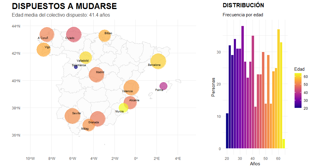
In terms of visual results, the analysis integrates layers of complexity that facilitate understanding of the territory. Using logarithmic scaling, we have managed to bring cities with very different data volumes together on the map, allowing us to identify small talent hubs that would normally be hidden by large capital cities. Furthermore, we do not simply place points on the map, but use colour gradients to link average age with location, making it easier to detect groups of young talent as opposed to more senior profiles. The inclusion of a histogram allows us to validate the general distribution of the data in relation to its geographical dispersion. This exercise demonstrates that the combination of territorial analysis and programming can transform data into a clear and strategic visual narrative.
Let us imagine an HR company that seeks to understand when its clients, with certain educational backgrounds and occupations, are most likely to decide to move to another city. In other words, is the profile of those willing to move mostly young or older? Urban or rural? With low or high levels of education? Where are they concentrated?
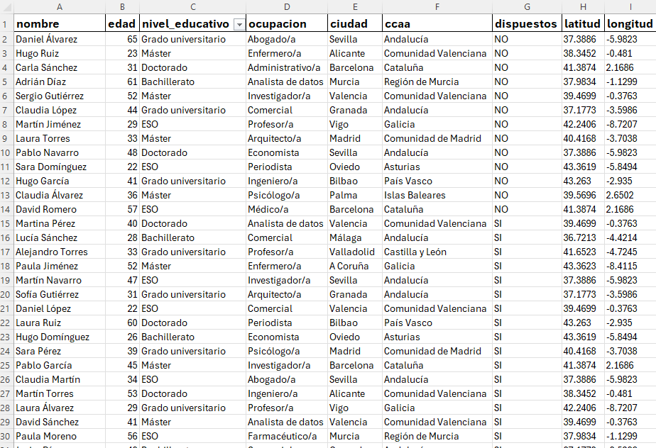
The database is a CSV file with only nine fields, thoroughly cleaned up so we can start playing around with the tidyverse library.
Figura 2 – Invented RH data model for decision making 🙂
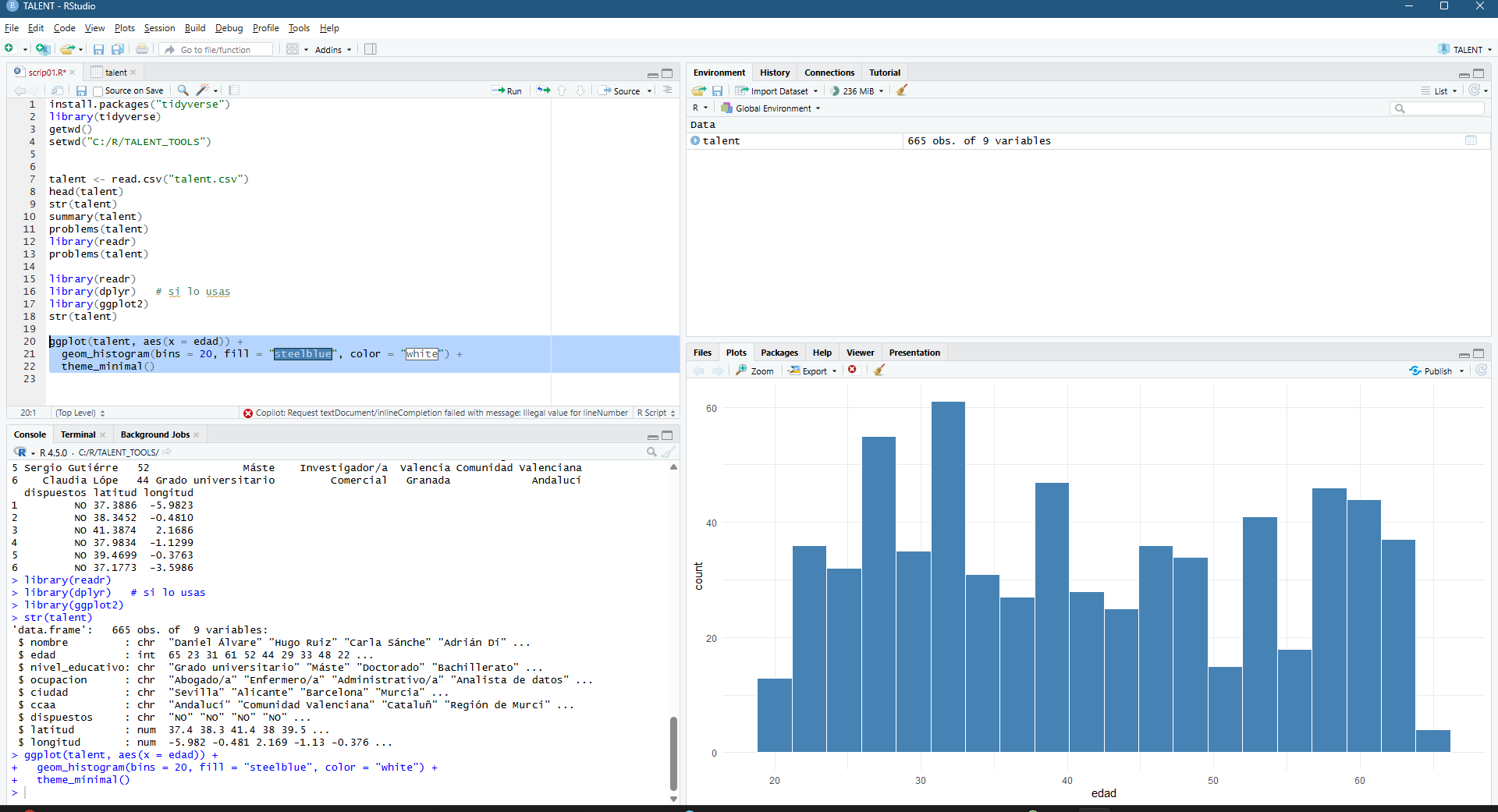
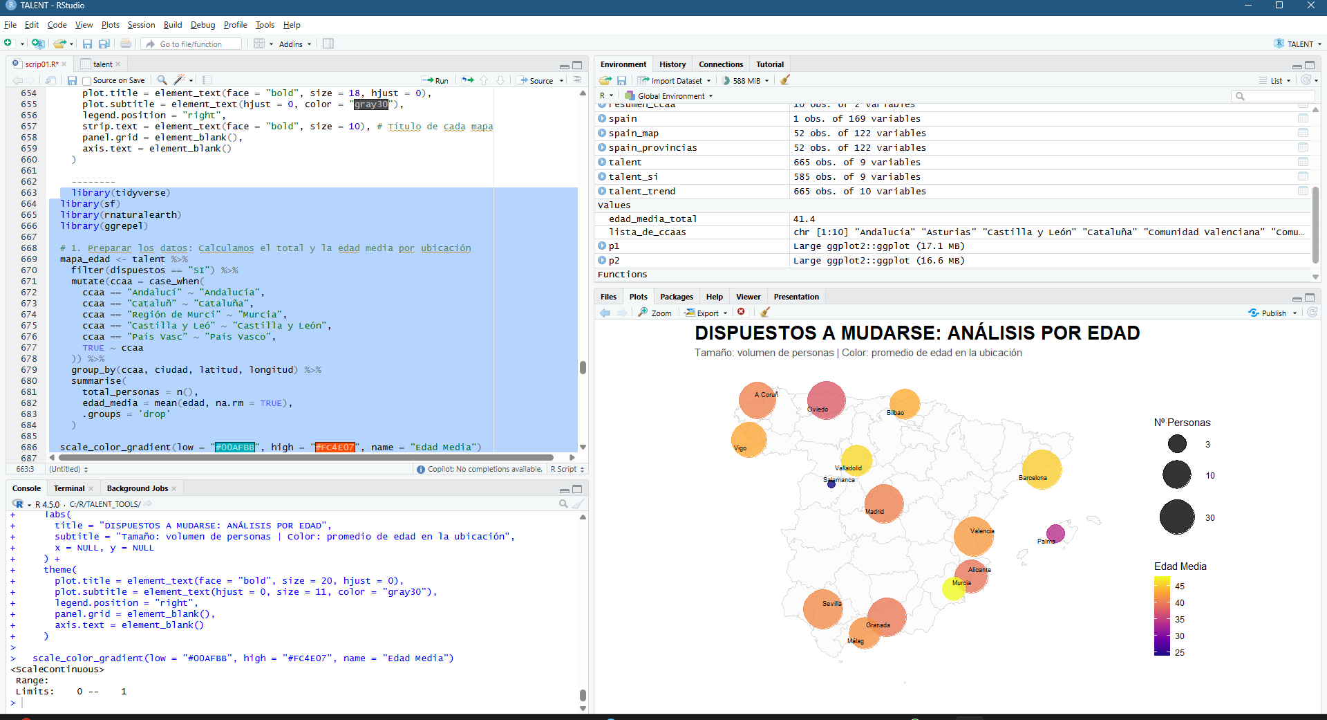
Una vez se ha hecho el set up del proyecto, que en realidad puede ser una de las partes más complejas (directorios, archivos con separadores adecuados, coherencia general de la información, etc) empezamos a mertele mano al código (por favor no mirar en detalle que soy un humilde geógrafo… y rubio!). Abajo empiezo a comprender la base, hago un histograma de cantidad de personas desglosadas por edad.
Figura 3 – Adding my first ggplot2 in this R project
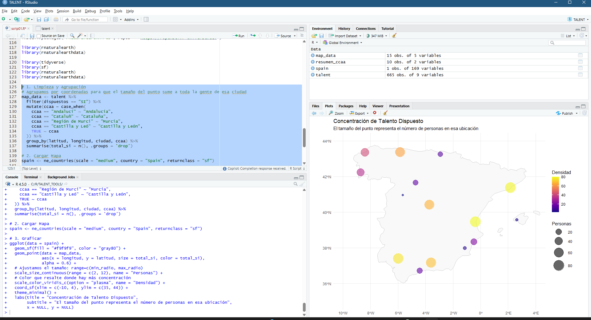
But, what is an analysis without a map to overlay it?? 🙂
Figura 4 – Adding the base map, and start sketching the “invented” model
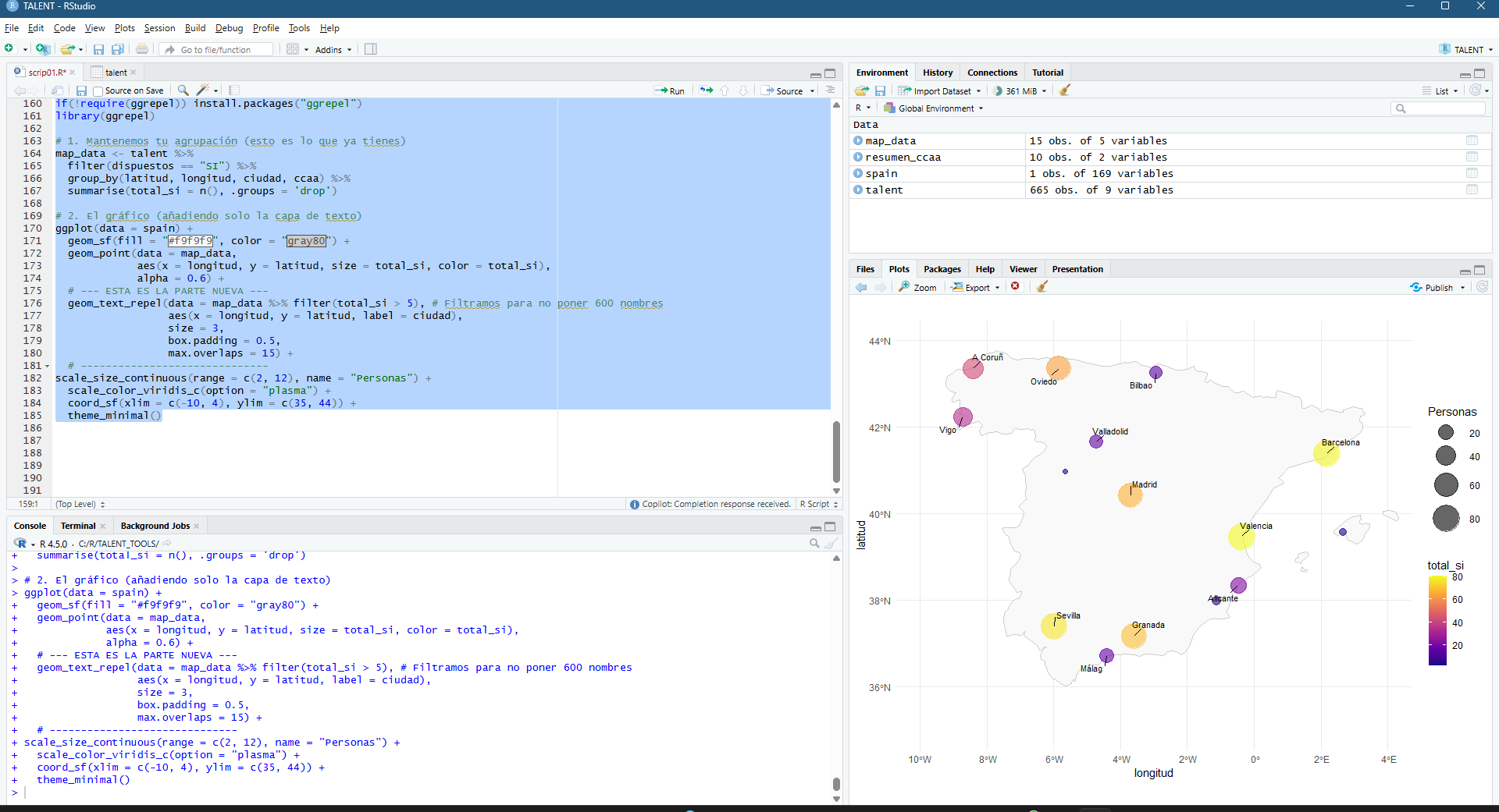
Inserting a map, adding labels, playing with sizes, colors, alphas, shapes… I have a lot to thank to my “geography visualization” teachers at the UVA in Valladolid!
Figura 5 – If “SI/YES” they’re willing to move to switch to a better job
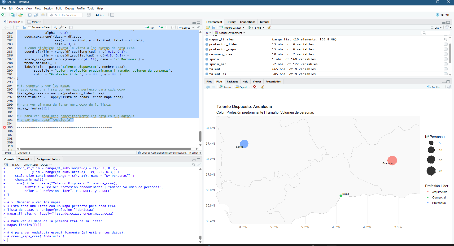
A little detour, let’s focus on Andalucía…
Figura 6 – Focusing on specific regions
Here comes the fun. Adding colors to disaggreagate profiles and size to rapidly get to understand where is the bigger amount of people willing to move…
Figura 7 – A bigger title for a quicker understanding. ¿Have we saved one second? It’s definitely worth.
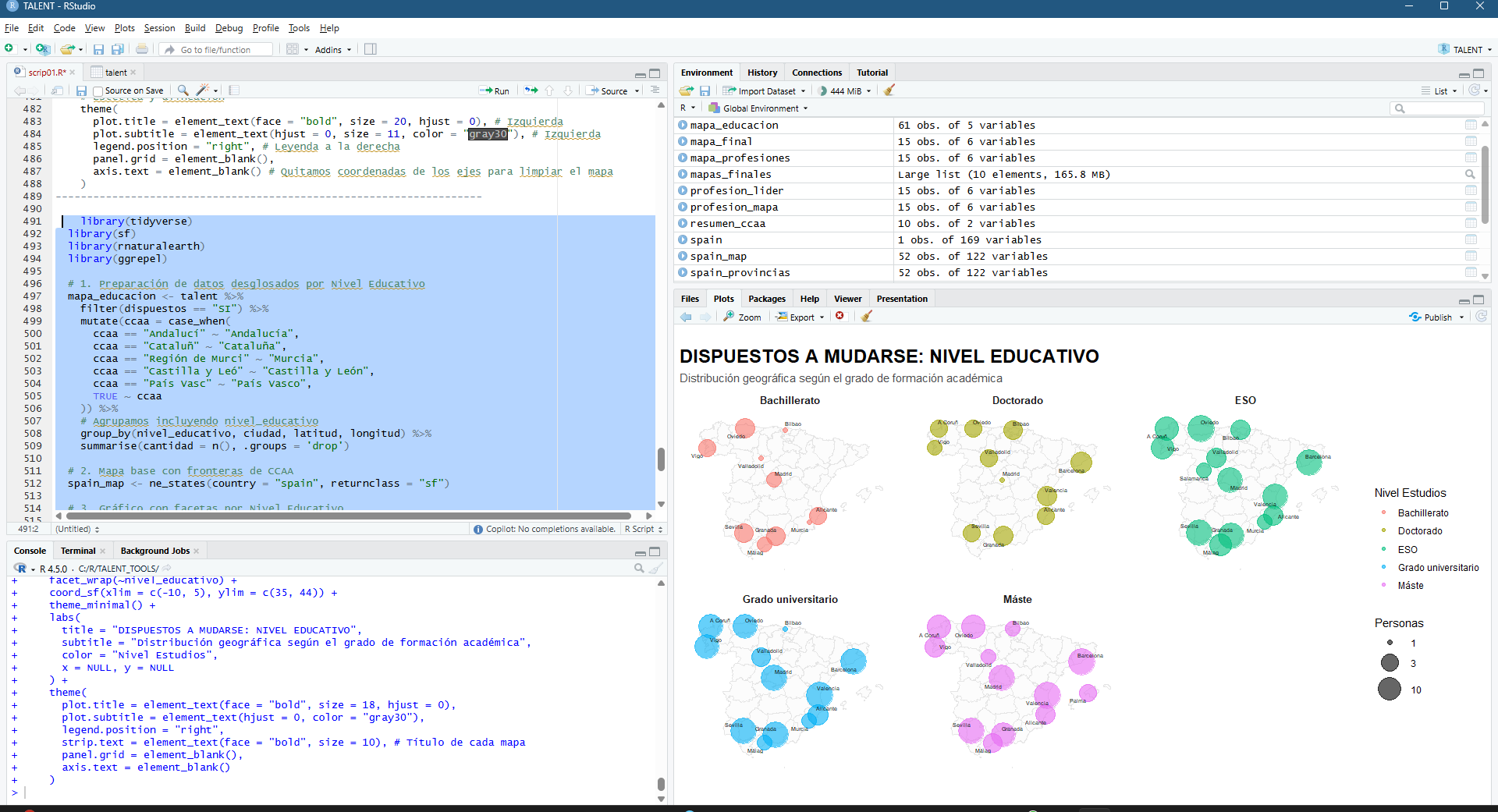
¿Do I need to disaggregate by bigger regions (CCAA in Spain)?
Figura 8 – disaggregating in R using facet wrap
Please don’t blame me for the incoherence… this is FULLY RANDOM!!!! 🙂 Do we understand if we use a color fade for average age?
Figura 8 – Getting closer to the final result
Should we try a violin-like diagram showing that I don’t just make pretty maps or graphs, but that you establish aKPI? Any HR recruiter can see which groups are ‘aged’ or which are the ‘youngest’ in relation to the total workforce. A Senior Geodata Analyst should know how to interpret the social reality behind the data 🙂
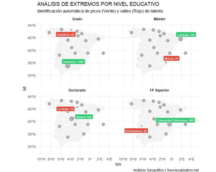
Or even better, a disaggregation and highlight of MAX-MIN cases per level of education.
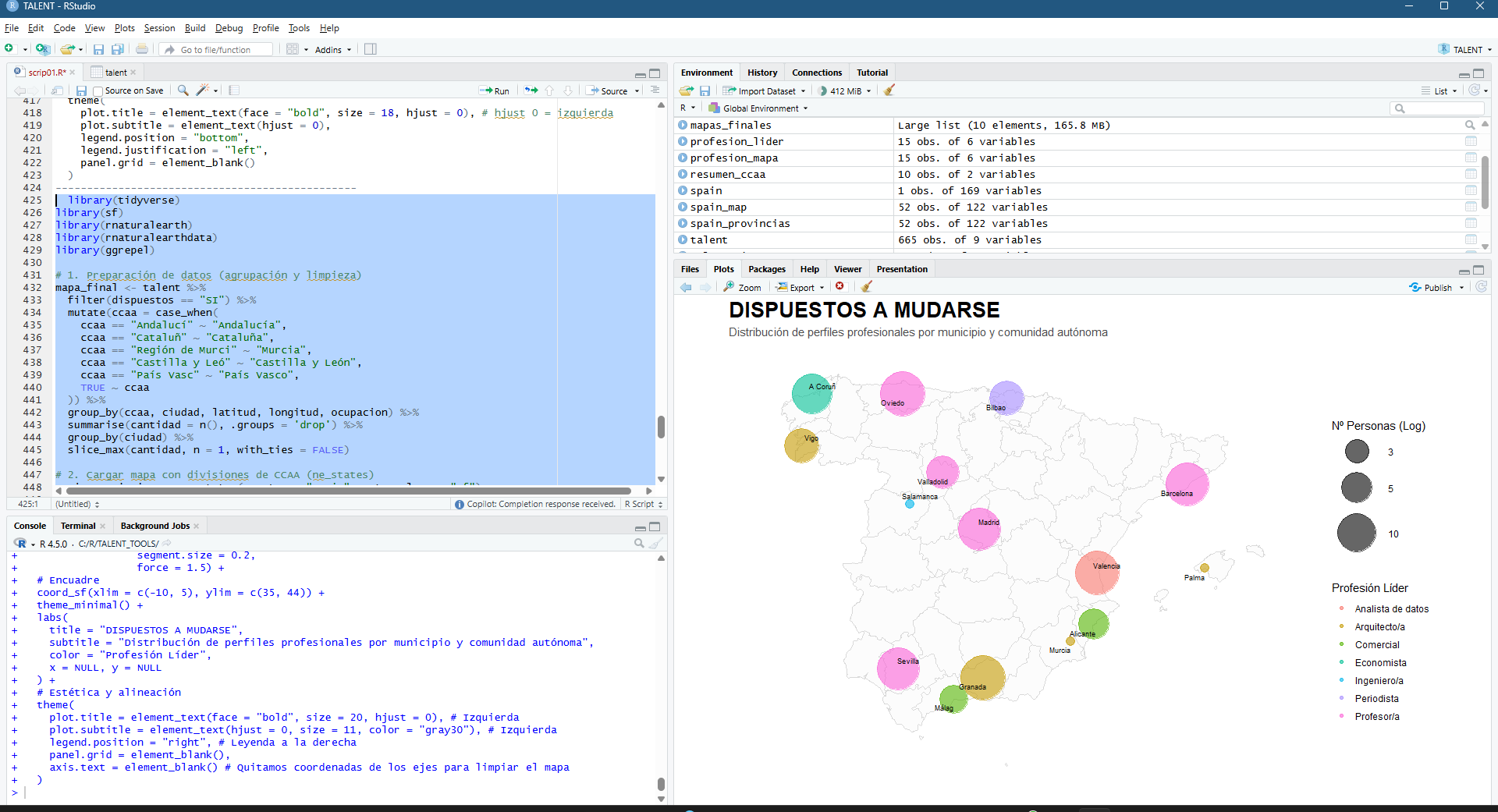
And the final result today (so far). the main cities, the age factor, the average candidate profile. Everything has an explanation:-)
Figura 9 – OUTCOM: Those willing to relocate is mostly young, urban and highly educated, concentrated in the country’s major economic hubs
Urban Concentration: The map shows that willingness to relocate is not uniform; it is concentrated heavily in Madrid, Barcelona, Seville, and Valencia. The larger circles in these areas confirm that they are the main ‘talent engines’.
The Age Factor: The trend line and histogram reveal a clear negative correlation: the younger the age, the greater the willingness. Younger talent (light/yellow colours) is the most flexible, while from the age of 45-50 (dark colours), the intention to move falls dramatically.
Geographical Balance: Thanks to logarithmic scaling, we see that although capital cities dominate, there is a constant flow of profiles in medium-sized cities, suggesting that talent is distributed but needs incentives depending on the stage of life.
Candidate Profile: The histogram confirms that the bulk of those interested are between 25 and 38 years old. Outside this range, mobility becomes exceptional.
Borders: The visualisation by autonomous community allows us to identify that regions such as Andalusia and Catalonia have a network of secondary cities with high mobility, unlike other regions where everything is concentrated in a single point.
In conclusion: the profile of those willing to relocate is mostly young, urban and highly educated, concentrated in the country’s major economic hubs.
I hope you enjoyed it. If you can think of any other scenarios where we don’t have to make up the data, I’ll give it some thought and write another post!
Alberto C. Geospatial analyst and someone who is looking for a job. ¿Do you have one?
Urban Atlas: Precision Geoespacial en el Corredor de Copernicus. Usos del Suelo combinados con estimaciones de población sobre cada una de las clases, un paso más en combinación de fuentes de Datos Abiertos en la nube.
Este análisis representa un pequeño test rápido desarrollado por Alberto C (Geovisualization.net) para mostrar las potencialidades de uso de un asset externo en la plataforma Google Earth Engine (GEE) mediante JavaScript. Se trata de un mapa de usos del suelo (LULC / Clutter) de media-alta resolución que ofrece una precisión temática y espacial muy precisa (significativamente superior a la de Corine Land Cover) a lo que añadimos una estimación de población con una base de datos transnacional como WOLDPOP 100m y otra en paralelo GHSL 100m. Este flujo de trabajo, que integra capas externas con datasets globales de computación en la nube, se ha ejecutado íntegramente en unos pocos minutos, demostrando la agilidad operativa de las herramientas cloud actuales.
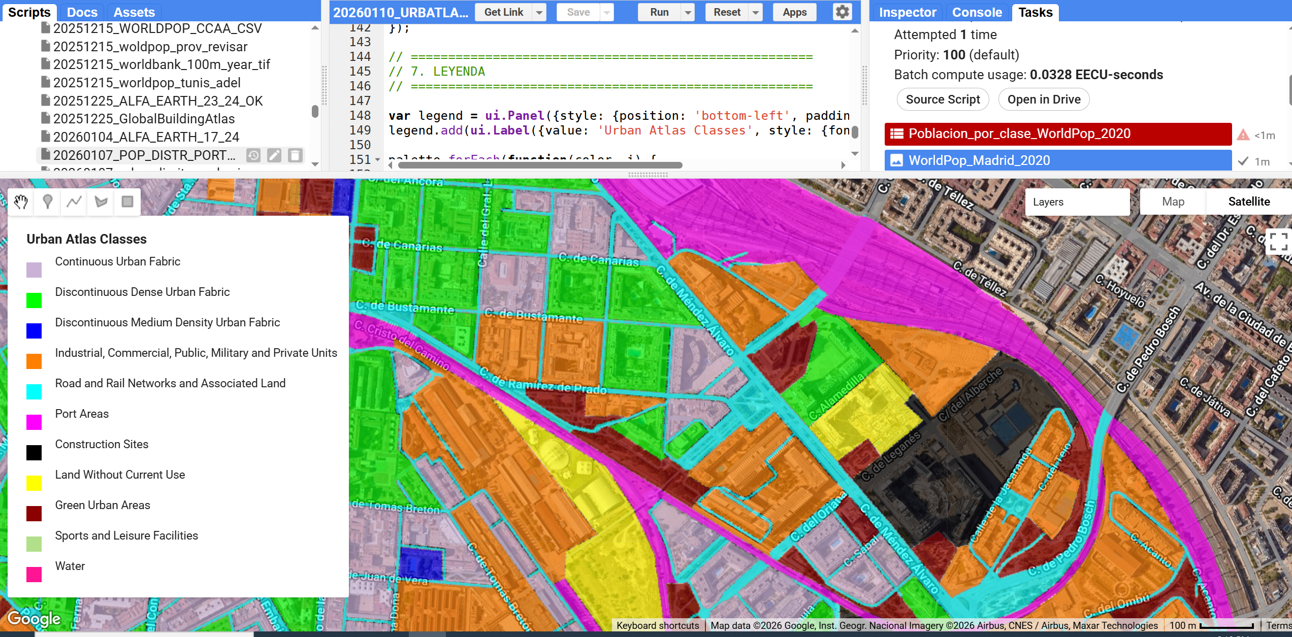
Urban Atlas (UA) representa el estándar de oro dentro del Copernicus Land Monitoring Service (CLMS) para el análisis de la morfología urbana en Europa. A diferencia de Corine Land Cover, UA ofrece una resolución temática y espacial drásticamente superior (Unidad Mínima de Mapeo de 0.25 ha para clases urbanas), permitiendo discriminar entre tejidos urbanos continuos y discontinuos con una precisión de densidad del 10% al 80%.
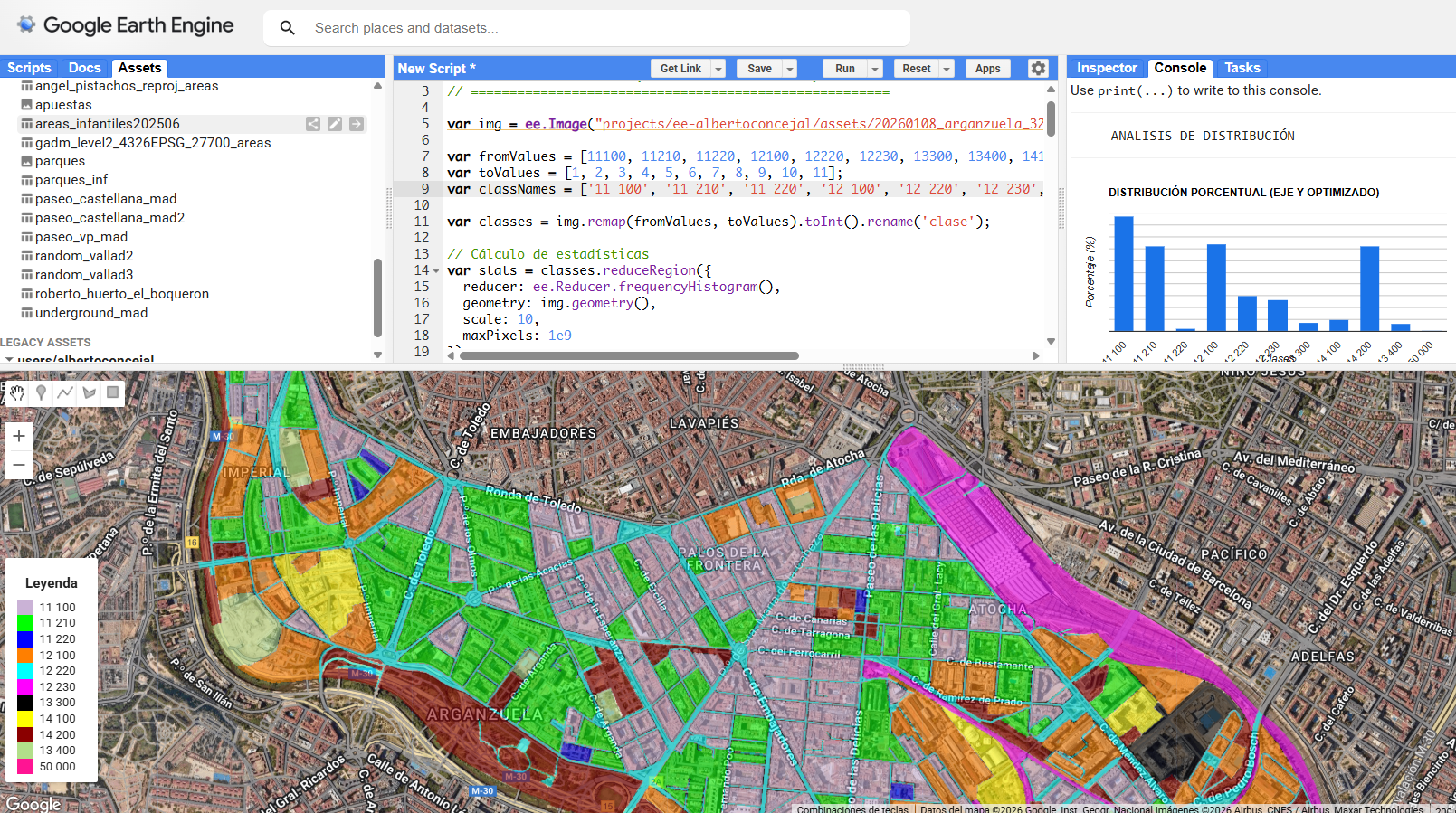
Figura 1. Interfaz de GEE visualizando el ASSET de URBAN ATLAS
Casos de Uso de Vanguardia: Del Urbanismo a la Resiliencia
En la actualidad, el Urban Atlas se ha consolidado como la capa base para modelos críticos:
Modelización de Islas de Calor Urbanas (UHI): Gracias a la diferenciación entre superficies selladas y áreas verdes, UA es el input fundamental para correlacionar la temperatura de superficie (LST) con la tipología edificatoria.
Gestión de Escorrentía y Riesgo de Inundación: La clase High/Low Imperviousness permite calcular coeficientes de escorrentía precisos para el diseño de infraestructuras hidráulicas.
Planificación de la “Ciudad de los 15 minutos”: Se utiliza para analizar la fragmentación del ecosistema urbano y la accesibilidad a servicios según el tejido residencial.
Cuentas de Ecosistemas: Monitorización del “Urban Sprawl” (expansión urbana) y la pérdida de suelo agrícola o forestal colindante a las Funcional Urban Areas (FUA).
Integración en Google Earth Engine: Escalando el Análisis
La verdadera potencia del Urban Atlas se libera al integrarse en motores de Cloud Computing como GEE. Pasar de un análisis local por municipio a un análisis continental es ahora una cuestión de código, no de capacidad de hardware.
Ventajas de la automatización en GEE:
Zonal Statistics a Gran Escala: Mediante el uso de reduceRegions, se pueden extraer perfiles de uso de suelo para miles de ciudades en segundos, cruzándolos con datos de población.
Fusión Multi-Sensor: GEE permite intersectar el ráster categórico de Urban Atlas con series temporales de Sentinel-2 (NDVI) o Sentinel-1 (Backscatter) para validar la salud de la vegetación urbana o la altura de las estructuras.
Remapping Dinámico: Como hemos visto en flujos de trabajo previos, la capacidad de aplicar un .remap() instantáneo permite simplificar las 27 clases originales de UA en indicadores binarios (Gris vs. Verde) para generar histogramas de resiliencia en tiempo real.
Ejemplo de flujo lógico en GEE:
JavaScript
// Agregación de clases para análisis de infraestructura verde
var greenSpace = ua_image.remap([14100, 14200, 31000], [1, 1, 1], 0);
var stats = greenSpace.reduceRegion({
  reducer: ee.Reducer.mean(),
  geometry: region_interes,
  scale: 10
});
El Futuro: Automatización y Deep Learning
El siguiente paso que estamos viendo en la industria es el uso de Urban Atlas como Ground Truth (verdad terreno) para entrenar redes neuronales convolucionales (CNN) sobre imágenes de muy alta resolución (VHR), permitiendo actualizar los mapas de uso de suelo de forma continua sin esperar a los ciclos de actualización trienales de Copernicus.
Figura 2. Histograma en consola de % de área por cada clase.
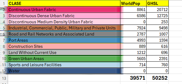
Las estimaciones de población se obtuvieron mediante la intersección espacial de los datos de población en cuadrículas de WorldPop 2020 con clases categóricas de uso del suelo y la agregación de los recuentos de población por clase.
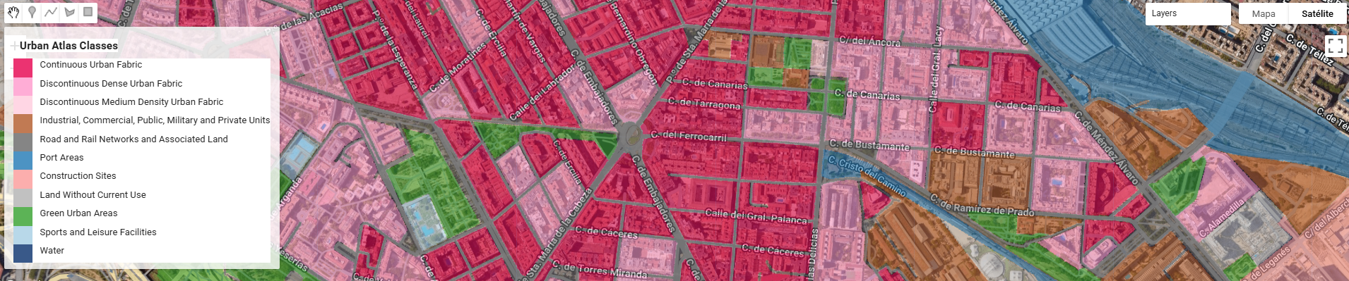
Figura 3. Clases corregidas para mejor comprensión.
Cambiamos fácilmente la leyenda puesto que necesitamos unos colores más más adecuados
Figura 4. Leyenda más adecuada al tejido urbano.
Las clases de uso del suelo se obtuvieron del Atlas Urbano Copernicus y se agruparon en categorías temáticas siguiendo la nomenclatura oficial del Atlas Urbano. El scrip de GEE saca directamente esta tabla en formato CSV.
Figura 5. Población por clases
Si bien no hay correspondencia con la población real del distrito esto es porque por un lado tenemos una fuente vectorial de media-alta resolución (urban atlas) mientras que los datos de población vienen de una fuente continua de 100m (100 veces menor). Este análisis advierte de las limitaciones del estudio mientras que se enfoca en las potencialidades de uso de fuentes en la nube que con toda lógica, deben de hacerse coincidir en aras de una completa coherencia.
Si te interesa el tema, pídeme el ASSET de URBAN Atlas (lo puedes ver en las fuentes abajo del post) o el ASSET de población sobre el AOI para que puedas importarlo en tu workspace o si no quieres replicarlo simplemente dime qué te parece este enfoque! Un saludo!
Theoretical framework: This GIS study applies Geographically Weighted Regression (GWR) to investigate the spatial relationship between Purchasing Power Index (PPI) and the distribution of gambling-related retail establishments within the city of Madrid. My aim is to account for spatially varying relationships driven by local urban contexts, under the assumption that the relationship between socioeconomic conditions and the presence of gambling venues varies across urban space and his socioeconomic patterns. My hypothesis is that this socioeconomic conditions of the urban fabric I mention, can be a breeding ground for the location of Betting Shops/Gambling Stores (AKA bookmakerin UK or bookiein the US), or in other words, I am attempting to Detect Urban Vulnerability to Gambling Harm.
Figura 1 – Highlighting Gambling Stores’ distribution over Madrid
I have chosen this Purchasing Power Index (PPI) as it’s a standardized socioeconomic indicator that represents the relative capacity of households to spend and consume goods and services within a given geographic area. It typically integrates information on income levels, employment, and demographic structure, and is expressed as a relative measure rather than an absolute monetary value, allowing comparisons across spatial units such as census sections. The logic says: The higher the PPI, the lower the vulnerability (where ) thus the more likely to find Gambling Stores around.
Figura 2 – Purchase Power Index 2022
A potential relationship between purchasing power and the location of Gambling Stores arises from commercial location strategies and socioeconomic vulnerability dynamics. Gambling operators may preferentially locate in areas where household purchasing power and consumption patterns maximize demand, or conversely in areas with lower purchasing power where gambling expenditure may function as a substitute consumption behavior. As a result, the spatial distribution of gambling establishments may reflect underlying socioeconomic gradients within the urban fabric.
Figura 3 – Gambling Stores (Official Local Census, 2024) over Census Sections (INE, 2025). Spatial Join in ArcGIS Pro
From a spatial analysis perspective, traditional global regression models (e.g., Ordinary Least Squares) impose a single, spatially invariant relationship across the entire study area. However, urban socioeconomic processes are inherently heterogeneous, especially in large metropolitan areas such as Madrid, where neighborhood-level dynamics, urban morphology, and socioeconomic gradients differ significantly between districts. GWR is therefore selected as the most appropriate method to capture local variations in model coefficients and to provide geographically explicit insights.
Figura 4 – Gambling Stores and Census Sections over Madrid (Zoom out)
Sources: The analysis integrates two primary datasets, both harmonized at the census section level (sección censal), which represents the finest administrative unit for socioeconomic statistics in Spain:
Figura 5 – Gambling Stores and Census Sections over Madrid (Zoom in)
Gambling Stores Local Census (2024): An official census of commercial premises provided by the City of Madrid, including the geolocated inventory of gambling-related establishments (e.g., betting shops, gaming halls). For analytical purposes, individual point locations were spatially aggregated to census sections, generating a count of Gambling Stores per census section. (–>Figura 3)
Purchasing Power Index (INE, 2022, extracted from ESRI’s LIVING ATLAS): Socioeconomic data derived from the Spanish National Statistics Institute (INE), used ESRI demographics for providing a standardized Purchasing Power Index at the census section level. This indicator reflects relative household purchasing capacity and is widely used as a proxy for local socioeconomic status.
The census section is adopted as the spatial unit of analysis to ensure statistical consistency between datasets and to align with official demographic and economic reporting standards.
I used ArcMap 10.6.1 Spatial Statistics Tool /Modelling Spatial Relationships /Geographically Weighted Regression. Also visualized and geoprocessed in Global Mapper 26.2.
Figura 6 – ArcMap 10.6.1 – Geographically Weighted Regression (GWR)
Geographically Weighted Regression is a local regression technique that extends classical linear regression by allowing model parameters to vary spatially. Instead of estimating a single global coefficient, GWR computes a separate regression equation for each spatial unit, calibrated using nearby observations weighted by their geographic proximity.
I would like to mention that, at this point, having fed the tool (using ArcMap 10.6.1) with the necessary inputs (dependent and explanatory variables), I am noting down the results and adding them to the article in order to systematize my understanding (and perhaps that of some of you), but my explanatory capacity is still limited. I continue thou.
Formally, the GWR model can be expressed as:
where:
yi represents the number of Gambling Stores in census section i,
xi corresponds to the Purchasing Power Index,
(ui,vi) are the spatial coordinates of census section i,
β0 and β1 are location-specific parameters,
εi is the local error term.
This formulation allows the strength and direction of the relationship between purchasing power and gambling store presence to vary across Madrid.
And these were the results/output
OBJECT_ID / VARNAME / VARIABLE / DEFINITION 1 / Bandwidth / 6563,230379 2 / Residual Squares / 513,203175 3 / Effective Number / 12,898945 4 / Sigma / 0,45955 5 / AICc / 3141,813059 6 / R2 / 0,016602 7 / R2 Adjusted / 0,011787 8 / Dependent Field / 0 / Join_Count (Amount of Gambling Stores in the same Census Section) 9 / Explanatory Field / 1 / PPIDX_CY (Purchase Power Index)
Figura 7 – Geographically Weighted Regression (GWR) map result: Associational rather than casual
The geographically weighted regression model shows a very low explanatory power (adjusted R² = 0,011787), indicating that purchasing power alone does not meaningfully explain the spatial distribution of betting shops, even when allowing for spatially varying relationships.
A critical component of GWR is the definition of the spatial weighting scheme, which determines how neighboring census sections influence each local regression. In this analysis:
A distance-based kernel function is used to assign higher weights to closer census sections and progressively lower weights to more distant ones.
The bandwidth—controlling the spatial extent of each local calibration—is optimized automatically using AICc minimization, balancing model fit and complexity.
This adaptive approach ensures that densely populated urban areas benefit from a more localized calibration, while peripheral areas incorporate information from a broader neighborhood when necessary.
The GWR model produces several spatially explicit outputs of analytical relevance:
Local regression coefficients for the Purchasing Power Index, revealing where purchasing power is more strongly or weakly associated with the presence of Gambling Stores.
Local R² values, indicating how well the model explains variance in gambling store distribution in different parts of the city.
Residual surfaces, used to identify spatial patterns of over- or under-prediction and potential omitted variables.
Rather than seeking a single city-wide conclusion, the emphasis is placed on geographic patterns, such as clusters of census sections where lower purchasing power is more strongly associated with higher concentrations of gambling establishments, or conversely, areas where this relationship is weak or absent.
By adopting a geographically weighted approach, this analysis explicitly acknowledges that urban socioeconomic processes are spatially contingent. The resulting maps of local coefficients provide actionable insights for urban policy, public health, and regulatory frameworks, allowing stakeholders to identify areas where gambling availability may be more closely linked to socioeconomic vulnerability.
From the standpoint of a spatial analyst, GWR serves not only as a statistical tool but as an exploratory framework that integrates spatial thinking directly into the modeling process. It enables an interpretation of the urban landscape of Madrid, grounded in official data sources and aligned with best practices in spatial econometric analysis.
Despite the analytical advantages of Geographically Weighted Regression in capturing spatial heterogeneity, several ***assumptions and limitations**** must be acknowledged to ensure a transparent and rigorous interpretation of the results.
First, GWR assumes that spatial non-stationarity is present and meaningful, and that local variations in model parameters reflect real underlying processes rather than random noise. The method presumes that nearby observations are more relevant for explaining local relationships than distant ones, an assumption operationalized through the spatial weighting kernel and bandwidth selection. While this assumption is generally appropriate in urban socioeconomic analyses, it may oversimplify complex, multi-scalar processes that operate beyond immediate spatial neighborhoods.
Additionally, GWR inherits the core assumptions of linear regression, including linearity, additivity, and independence of errors at the local scale. Although local calibration mitigates some forms of spatial autocorrelation, it does not fully eliminate the risk of residual spatial dependence, particularly in densely urbanized areas with strong structural patterns.
Also we need to have into account that the analysis relies on cross-sectional data from different reference years, specifically the Purchasing Power Index from INE (2022) and the Gambling Stores census from the City of Madrid (2024). This temporal mismatch assumes relative stability in the spatial distribution of purchasing power over the short term. While this assumption is reasonable for aggregated socioeconomic indicators, it may obscure short-term dynamics or recent neighborhood-level changes.
The results of this study should be interpreted as associational rather than causal. GWR identifies spatially varying relationships between purchasing power and gambling store distribution, but it does not establish causal directionality. The observed patterns may reflect a combination of regulatory frameworks, commercial location strategies, historical land-use patterns, and unobserved socioeconomic factors.
Moreover, areas exhibiting strong local relationships should not be automatically interpreted as zones of direct vulnerability without complementary qualitative, behavioral, or health-related data. Gambling harm is a multidimensional phenomenon, and the presence of gambling establishments constitutes only one potential exposure factor.
Finally, this analysis focuses exclusively on the relationship between purchasing power and the spatial distribution of Gambling Stores. Other relevant dimensions of urban vulnerability—such as age structure, unemployment, educational attainment, or proximity to schools—are not explicitly modeled. As such, the results should be viewed as a partial and exploratory assessment of urban vulnerability, intended to inform further multivariate and multi-scalar analyses rather than provide a definitive evaluation
Anyway, my aim writing this post is start understanding this potentional multivariable correlation and this is only the first step. Hope you are still reading this and come back every now and then to keep reading 🙂
The exercise shows how a simple SketchUp 3D volume, defined solely by its basic geometry, can be transformed into a complex architectural proposal. Starting from the initial schematic model, the system interprets proportions, levels, and shapes, and converts them into a fully developed building, complete with textures, vegetation, lighting, and an urban context.
All IA prompts, step by step
It is a good test to evaluate the extent to which AI understands spatial structure and is capable of generating a coherent and rich interpretation from a minimal geometric skeleton.
Et voilá, the final result
Adding a bit of perspective to this post, myself I have always loved 3D and I have worked over it in the past using it from different approaches, starting from architectural modelling to massive QC of LOD1 buildings anywhere in the world. That’s why I see these Gemini features as something kind on interesting and related to my world.
Some old 3D models sold to Telespazio back in 2008 🙂
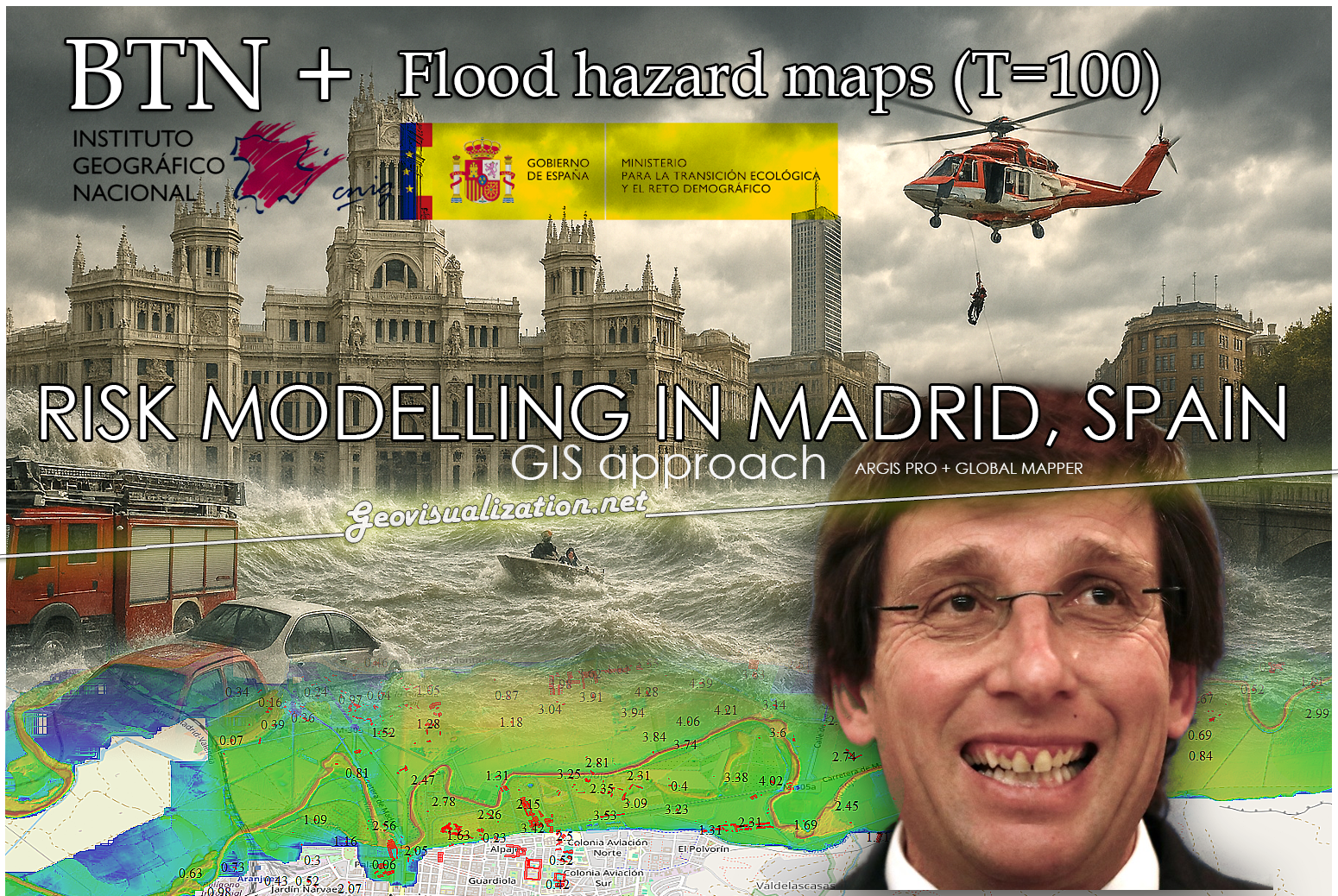
Dont get wrong if you see the IA background showing our handsome major showing his beautiful smile in Cibeles/Correos, it’s only to get your precious attention (only if you need it thou!). Flooding in urban environments is not a speculative hazard but something we can quantify. In the case of Madrid, the intersection of pretty mountainous terrain and urban expansion presents a scenario of significant risk, particularly when analyzed through the lens of shared high-resolution geospatial data (it might surprise you there are 2000m difference between the highest spot in Madrid province, Pico Peñalara -2428m- and the Alberche river environment in some areas -430m-).
Major Almeida is surprised to get to know how risky might be a heavy rain episode over Madrid area
This study integrates the buildings from BTN (Base Topográfica Nacional) provided by the Spanish “IGN”, the CNIG with the official flood hazard maps for a 100-year return period (T=100), published by the Ministry for the Ecological Transition and the Demographic Challenge (MITECO). The T=100 scenario is the most representative for evaluating long-term flood exposure, as it reflects events with a 1% annual probability—rare but not improbable, and certainly not negligible.
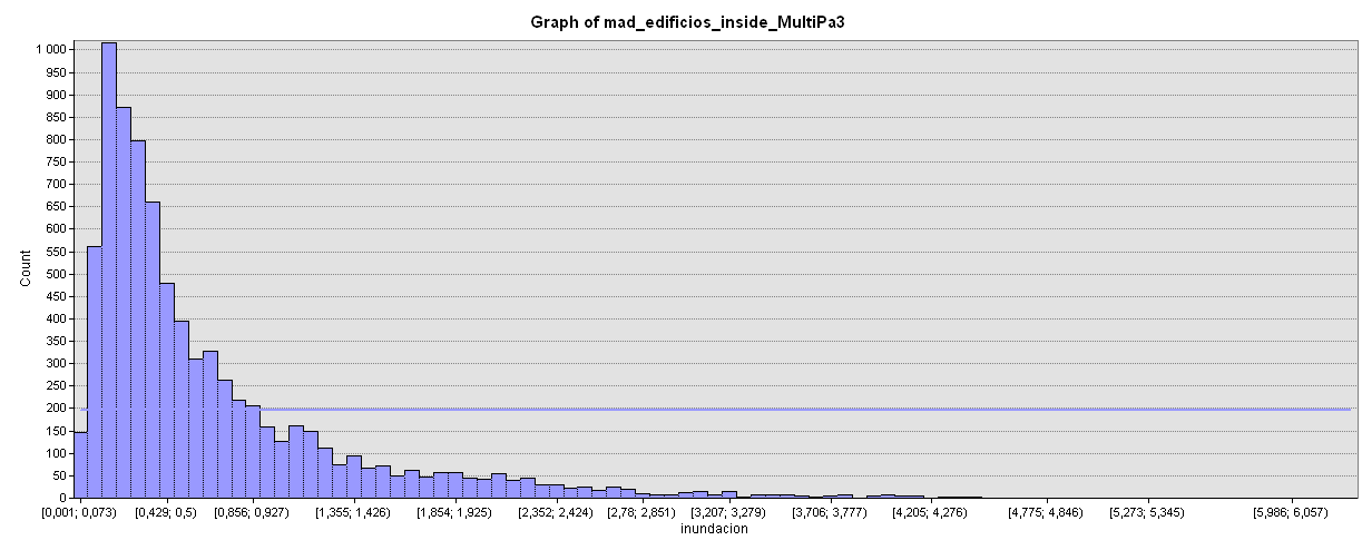
If we measure preliminarily, only 0.999% (8097/810134) of all buildings (available in our latest BTN buildings provided by CNIG) would be affected but but if we go deeper, this means a lot in specific spots: Aranjuez for instance would be very affected by the Tajo river flood.
Focused over Aranjuez area as I find it representative and we happen to find lots of buildings in likely flood areas (check it yourself in GEE)
The spatial overlay of flood-prone zones with demographic and land-use data reveals a concerning concentration of residential population within areas designated as ARPSIs (Áreas de Riesgo Potencial Significativo de Inundación). These zones include dense urban districts along the Manzanares River and low-lying areas in Arganzuela, Usera, and parts of Puente de Vallecas.
Histogram of those 8097 buildings (according to BTN/CNIG database of all buildings over Madrid)
While precise population figures vary depending on the granularity of census data, preliminary estimates suggest that tens of thousands of residents could be directly affected by a flood event of this magnitude. The implications extend beyond displacement and property damage, encompassing public health risks, disruption of essential services, and long-term socioeconomic instability.
Global Mapper was used to geoprocess and visualize geodata
Economic activities within these flood zones are diverse and structurally significant. Central districts host a high concentration of retail, hospitality, and cultural institutions, while peripheral zones near the M-30 corridor accommodate logistics, warehousing, and industrial operations. The exposure of these sectors to flood risk implies not only direct financial losses but also cascading effects on employment, supply chains, and urban mobility. Moreover, the presence of public infrastructure—transport nodes, administrative buildings, and emergency services—within these vulnerable areas raises questions about the resilience of the city’s operational backbone.
*Retail and hospitality in central districts (e.g., Lavapiés, La Latina) *Logistics and warehousing near the M-30 corridor *Cultural and tourism assets, including museums and heritage sites *Public infrastructure, such as metro stations, bus depots, and administrative buildings
Disruption in these zones could result in multi-million euro losses, not only from direct damage but also from prolonged service interruptions.
I have uploaded a small sample over Aranjuez to my GEE interface (is not that I am from this place, I only find it representative!). You can quickly tune the JavaScript code to be able to count the amount of buildings affected, the area of all of them and the DTM range of the flood DTM REM (Relative Elevation Model) over your actual screen. https://code.earthengine.google.com/1d7e907283e33dc4b468ab3adf578840
Cloud computation calculation in GEE. Flood Risk in Madrid. Check it yourself using the code below!!!
Of particular concern is the identification of facilities regulated under Annex I of Directive 96/61/EC, which governs integrated pollution prevention and control.
ArcGIS Pro was also used for geoprocessing and visualization
*Fuel storage and distribution centers *Waste treatment plants *Industrial facilities with hazardous materials
These include fuel depots, waste treatment centers, and industrial sites handling hazardous substances. In the event of flooding, such facilities pose a risk of accidental contamination, with potential impacts on protected zones defined in Annex IV of Directive 2000/60/EC. These zones include drinking water abstraction points, Natura 2000 habitats, and recreational waters. The spatial proximity of these sensitive areas to flood-prone industrial sites underscores the need for integrated risk assessment that goes beyond hydrological modeling and incorporates environmental and public health dimensions.
(i) Drinking water abstraction points (iii) Habitats designated under Natura 2000 (v) Recreational waters and sensitive ecosystems
The visual simulations accompanying this analysis are intentionally exaggerated. They do not represent predictive models but serve as heuristic devices to provoke reflection and debate. By depicting iconic Madrid landmarks submerged under chaotic floodwaters, these images challenge the viewer to confront the consequences of urban planning decisions that disregard hydrological constraints. They are not intended to alarm, but to illustrate the scale of disruption that could result from a statistically plausible event.
Please note these features have been taken out of the scope of this preliminary approach for analysis Flood in Madrid province using Open Data.
Again, this study/first approach would not have been possible without access to open geospatial data. The availability of national datasets such as the Base Topográfica Nacional and flood hazard maps from MITECO exemplifies the transformative potential of public data infrastructures. However, the mere existence of data is insufficient. What is required is a culture of proactive use—by planners, policymakers, and civil society—where risk is treated not as an abstract probability but as a concrete design constraint.
The presence of vulnerable populations, critical infrastructure, and environmentally sensitive facilities within flood-prone zones constitutes a non-assumable risk. It is a risk that could be mitigated through better zoning, stricter regulation, and investment in adaptive infrastructure. The cost of inaction is not only economic but ethical. Avoidable losses—whether of property, livelihoods, or ecosystems—are a failure of foresight, not fate.
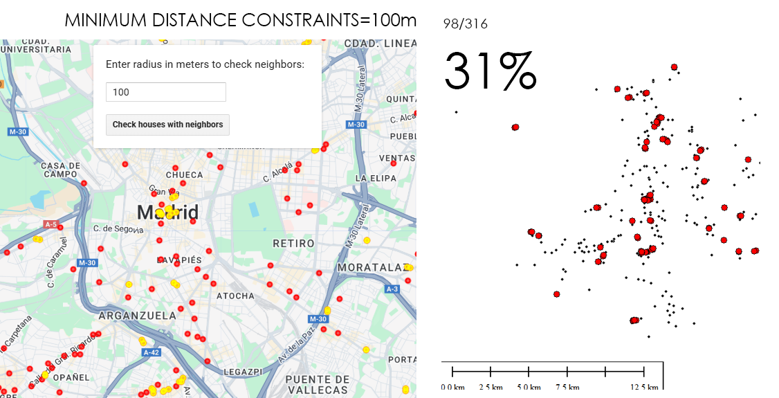
It is a fact that a betting shop (AKA bookmakerin UK or bookiein the US) should not be close to a secondary school. Its obvious the impact on population ranging something like 12-18 could be higher than in other age thresholds. How close? 100m? 300m? 500m? Euclidean distance (a straight line) or following the street network?. In any case, if I decide choosing for instance a range of 500m, for example, 81% of betting shops in Madrid have secondary schools within that distance (258 out of 316). Looking at it from the secondary schools’ point of view, almost 60% of secondary schools have betting shops within 500m (171/291). This is undoubtedly an issue that needs to be addressed.
The spatial analysis reveals a moderately negative correlation (r = -0.39) between the distance to the nearest betting shop and the number of betting shops within a 500-meter radius of each secondary school. This means that, on average, the shorter the distance between a school and the nearest betting house, the greater the number of betting houses found within a short walking distance (for example, within 500 meters). In other words, schools that are close to one betting house are very often close to several. Conversely, schools located farther from any betting house tend to be in areas where these establishments are much less common or even absent. This pattern does not imply a perfect one-to-one relationship — some exceptions exist — but the overall trend is clear: betting houses are not randomly distributed in the city. Instead, they tend to form clusters, and those clusters often appear in the same parts of the city where many schools are located. Although the relationship is not perfectly linear, it might indicate a potential spatial association between the two types of locations.
Source: 2playbook.com
From the heat map, this relationship becomes more tangible. 171 out of 291 secondary schools in Madrid — approximately 60% of the total — are situated within 500 meters of at least one betting shop. The density surface highlights four clear hotspot zones: Usera, Carabanchel, Centro, and Tetuán. These districts concentrate the majority of the spatial overlap between High Schools and betting shops , forming well-defined high-intensity clusters. The pattern aligns with socio-economic and demographic realities: these are traditionally dense urban districts with younger populations and, in several cases, lower average income levels, which have historically attracted a higher concentration of gambling venues.
Concentration of Problem zones (threshold 500m) Usera, Carabanchel, Centro, and Tetuán
By contrast, the richest districts — such as Salamanca, Retiro or Chamberí — show a more dispersed and lower-intensity pattern. This uneven distribution reinforces the idea that the proximity of betting shops to High School educational institutions is not random, but rather follows a spatial logic influenced by the urban and social fabric of the city.
In practical terms, the combination of a negative correlation and the hotspot clustering suggests that High Schools and betting shops in Madrid exhibit a clear spatial association. The proximity of many High Schools to gambling establishments may have implications for urban planning, youth protection policies, and spatial regulation of gambling activities. The results provide a quantitative foundation for further policy discussions on how the city’s gambling landscape interacts with its educational network.
Pearson correlation. Number of betting houses vs High Schools. Pearson r: -0.39
Methodology: Open Data Madrid provided ‘Censo de locales, sus actividades y terrazas de hostelería y restauración. Histórico’ which I cleaned and cross-referenced to obtain the venues dedicated to gambling and having an active licence (2020). Then I downloaded Madrid High Schools (those offering public and private secondary education). Based on Madrid districts I was able to measure distances and highlight the most affected areas. I used GEE to performed the Pearson Correlation (you have the code below). Maps where created using Global Mapper v26.2.
GEE interface. Cloud Computation calculation
What if I can get a GeoJSON just by feeding the system with the required threshold? (i.e this code returns the 171 secondary schools in Madrid which have betting houses closer than a 500m radius from them). It’s crazy 171/291!! (almost 60%)?: https://code.earthengine.google.com/e15e0ee2c0269d8b3e4a199d444620d3
31% of bookies are closer than 100m to another bookie
TRY IT YOURSELF!!!
Additional considerations:
The regulations governing the distance between betting shops and educational establishments such as secondary schools vary depending on the autonomous community. Some communities have implemented or proposed minimum distances, such as a 300-metre radius in some regional laws, while others continue to apply shorter distances or are in the process of reviewing their regulations. It is essential to consult the specific legislation of each community to find out the exact regulations and how they are applied. Examples of regulations by autonomous community (CCAA):
*Community of Madrid: Established a minimum distance of 100 metres between gaming halls and schools/secondary schools in 2019. Although extensions were proposed, the current regulation remains at 100 metres, with the possibility of some existing premises being exempt, according to El Mundo. *Galicia: Its gaming law establishes a minimum distance of 300 metres from educational centres for new gaming establishments, increasing the previous linear distance of 150 metres, according to GaliciaPress. *Andalusia: The proposal to extend the distance to 500 metres has been taken to Parliament, although the current regulation may be different, as reported in ABC. *Other regions: Some cities, such as Talavera de la Reina in Castilla-La Mancha, have included a minimum distance of 300 metres, backed by court rulings, according to different sources.
Distance can be measured in a straight line or in radius, and this difference is important when applying the regulations. Premises that were already in operation before the regulations were implemented in some regions are often exempt. In the case of Madrid, proposals to ban betting shops from being located less than 500 metres from educational establishments have even been analysed, as reported by Telemadrid.
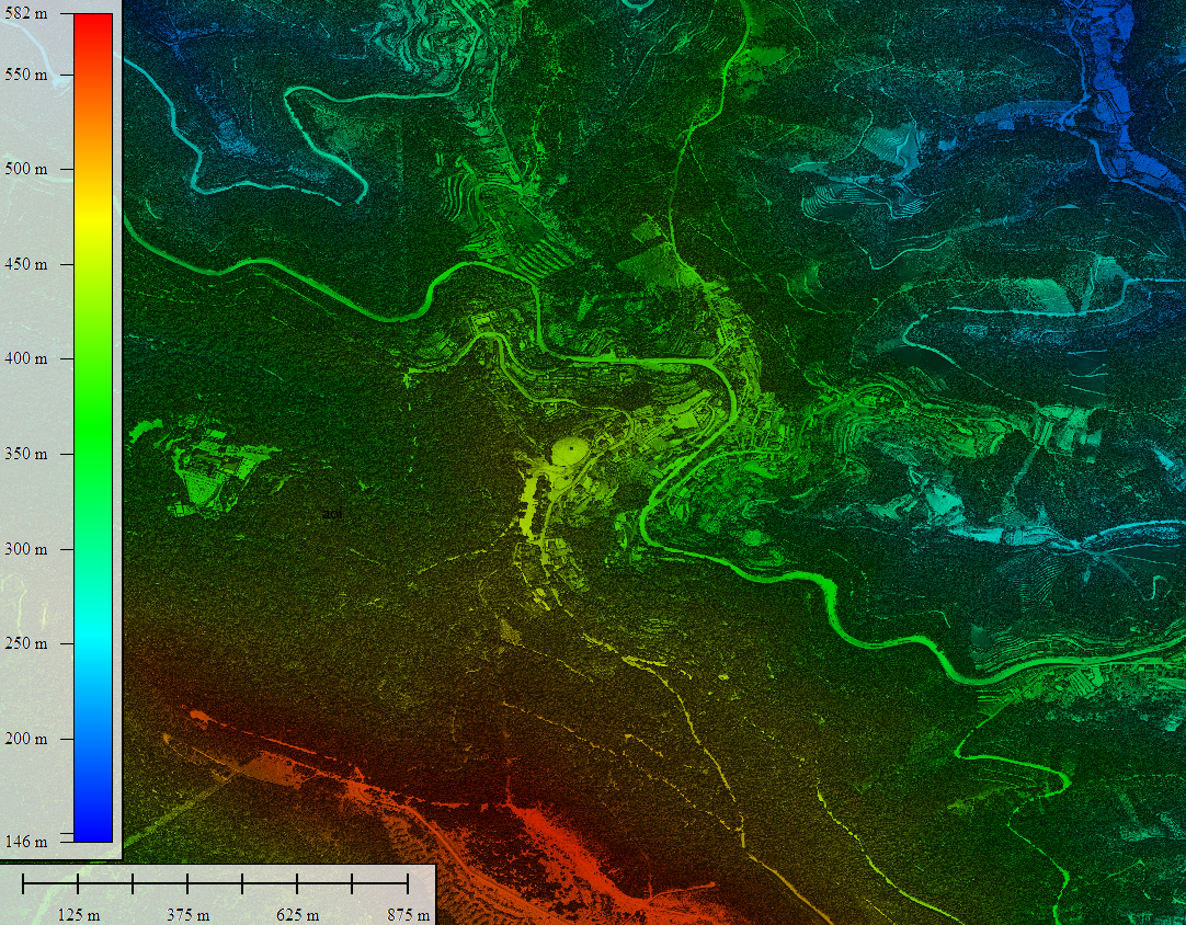
High‑resolution elevation data underpins almost every spatial analysis we do in GIS—especially in forests where vertical structure defines habitat, biomass, wind exposure, fire behavior, hydrology, and the microclimates that sustain rare species. In rugged or densely vegetated environments, a coarse or biased elevation model propagates error everywhere: orthorectification drifts, hillshades mislead, slope/aspect misclassify, and canopy metrics saturate. The result is decisions made on blurred terrain that hides the very patterns we seek to manage. Precision elevation—derived from airborne LiDAR (Light Detection and Ranging)—solves this by separating the ground from the vegetation and delivering both a bare‑earth Digital Terrain Model (DTM) and a Digital Surface Model (DSM). Subtracting DTM from DSM gives a Canopy Height Model (DHM) that captures the true vertical architecture of the forest at sub‑meter resolution.
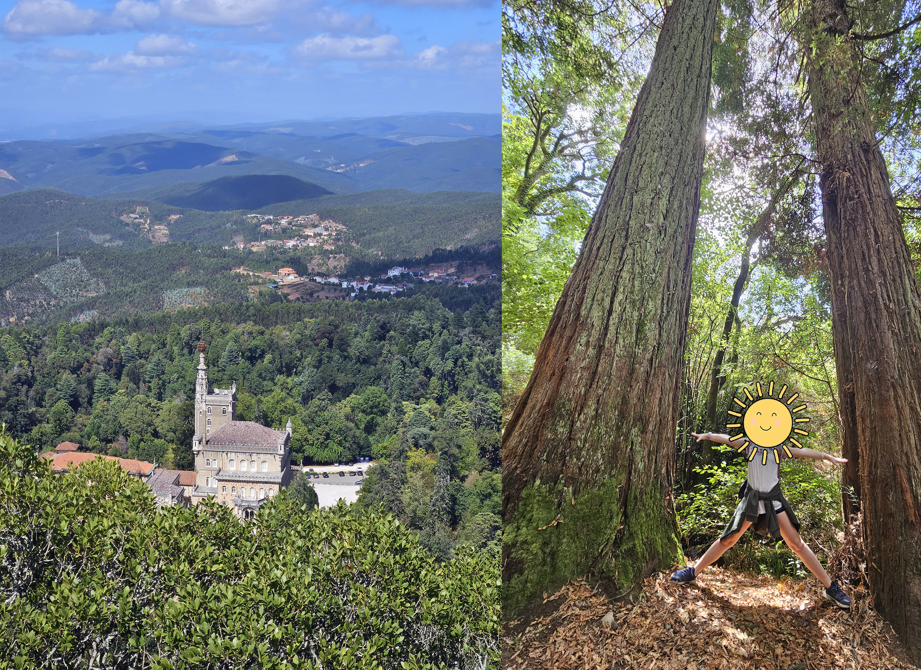
My visit to the “premises” late August 2025 (almost yesterday!)
This post uses the Mata do Buçaco (Bussaco), near Luso in central Portugal, to illustrate why precision matters and how it compares to the widely used global product ETH_GlobalCanopyHeight_2020_10m_v1. We will look at the site, the LiDAR technology, and a practical comparison workflow for GIS users.
Surprise! a RMSE deviation result too high! Why?
Mata do Buçaco: a compact sanctuary of forest giants
Mata do Buçaco is a walled arboretum and national forest just above the spa town of Luso, north of Coimbra. Despite its modest footprint (~1.0–1.5 km across, ~100–110 hectares), it packs a dendrological collection of remarkable diversity curated over centuries. The topography rises from low foothills to the crest of the Serra do Buçaco, creating a humid, fog‑prone microclimate with precipitation notably higher than the surrounding region. That microclimate, plus deliberate introductions by botanists and gardeners since the 17th century, explain today’s extraordinary vertical structure: towering conifers (including giant sequoias), Mexican cypress, Atlantic and Tasmanian eucalypts, and groves of native broadleaves stitched between ornamental plantings and relic laurel‑oak patches.
LIDAR data converted to raster DSMLIDAR data converted to raster DTM
Walk any of the shaded paths and the “feel” of the forest is its third dimension: deep crowns stacked in tiers, emergent stems breaking above the canopy, and abrupt transitions where the slope pitches toward gullies and water stairs like the Fonte Fria. For mapping, this means Buçaco is the perfect stress‑test for vertical data. Local reports and lidar‑based profiles identify emergent trees approaching 60–65 m in height—exceptional for continental Europe—and many stands with 40–55 m canopy tops (giant sequoias Sequoiadendron giganteum, Tasmanian mountain ash Eucalyptus regnans, and mature Eucalyptus globulus among others). Add the steep relief and stone architecture of the palace‑convent complex and you have a site where coarse models tend to smear peaks, clip crowns, and understate vertical extremes.
From a data user’s perspective, Buçaco is interesting because it’s small enough to survey with dense airborne LiDAR yet diverse enough to benchmark against global canopy products. It’s also highly visited and well‑documented, which makes it a prime candidate for open, reproducible analyses that other practitioners can repeat.
LiDAR (and why it excels in forests)
Principle of operation. Airborne LiDAR instruments emit near‑infrared laser pulses toward the Earth’s surface and record the time‑of‑flight of returned photons. Distance = (c × Δt) / 2, where c is the speed of light and Δt is the measured two‑way travel time.
Full‑waveform vs discrete return. Modern sensors either store the entire returned energy waveform (full‑waveform) or extract distinct echoes (discrete returns). In forests, multiple returns (first, intermediate, last) capture interactions with the canopy top, internal branches, understory, and finally the ground.
Point cloud. Each pulse becomes a 3D point with XYZ, intensity, scan angle, GPS time, and often classification labels (ground, vegetation, building, water). Typical densities for national programs range from 2 to >12 points/m²; local surveys can exceed 20–30 points/m².
DTM and DSM. Ground classification filters (e.g., progressive TIN densification, cloth simulation) isolate ground returns to build a DTM. Interpolating the highest returns per cell builds a DSM that traces the top of canopy and built features.
Canopy Height Model (DHM). DHM = DSM − DTM at a chosen grid (often 0.5–2 m). Because the DTM is true bare earth, DHM measures canopy height above ground rather than above sea level—critical on steep slopes like Buçaco’s.
Vertical accuracy. With good boresight calibration and GNSS/INS trajectories, vertical RMSE for DTMs is commonly 5–15 cm in open ground; DHM accuracy depends additionally on canopy penetration and interpolation choices but still outperforms passive methods.
Structure metrics. From the point cloud or DHM we derive height percentiles (P10…P95), gap fraction, rugosity, leaf‑area proxies, and individual‑tree segmentation. These are the metrics that drive biomass, habitat, windthrow risk, ladder‑fuel detection, and view‑shed quality.
Radiometry & intensity. Intensity encodes target reflectance and range effects; after calibration, it helps distinguish materials (e.g., conifer vs broadleaf, moisture gradients) and detect powerlines or archaeological traces.
Waveform advantages. Full‑waveform captures the vertical distribution of scattering elements; deconvolution yields canopy penetration in denser stands and improves ground detection under eucalyptus and conifers.
Limitations. LiDAR is weather‑ and budget‑dependent. Dense undergrowth, scan angle, and leaf‑on conditions can reduce ground hits. Interpolation choices (max vs. percentile) affect DHM peaks—important when claiming “record” trees.
Bottom line: when you need true heights, crown architecture, and centimeter‑scale terrain under forest, airborne LiDAR remains the gold standard.
DSM-DTM=DHM (Global Mapper v26.1)
The global benchmark: ETH_GlobalCanopyHeight_2020_10m_v1
The ETH Zurich Global Canopy Height (GCH) product provides a wall‑to‑wall canopy top height map at 10 m ground sampling distance for the year 2020. It fuses GEDI lidar footprints (spaceborne, sparse but vertically precise) with globally consistent Sentinel‑2 optical imagery using a deep learning model to predict canopy heights between footprints. The result is a globally consistent raster that is easy to stream in Earth Engine or GIS platforms and ideal for continental to global analyses where airborne LiDAR is unavailable.
Global Canopy Height in TIF format extracted from GEE cloud computationVisualization of Global Canopy Height over the spot
Strengths
Global coverage at 10 m with a single epoch (2020), enabling cross‑region comparisons.
Trained on physically meaningful lidar targets (GEDI L2A/L2B canopy top metrics), correcting for many radiometric and terrain confounders in passive imagery.
Includes uncertainty metrics and tends to preserve macro‑patterns (ecotones, disturbance scars, plantation heights).
Known trade‑offs for sites like Buçaco
Saturation at the tall end. In stands with emergent stems >50 m, 10‑m pixels average crowns and can under‑predict peak heights; local maxima are “flattened.”
Terrain complexity. On steep slopes, small georegistration or DTM mismatches between Sentinel‑2 and GEDI training can leak terrain into predicted canopy height.
Edge effects. The palace complex, walls, and clearings introduce sharp transitions that are sub‑pixel at 10 m, broadening edges and obscuring narrow corridors.
Understory structure. The model predicts canopy top height, not vertical distribution; it cannot replace LiDAR‑derived structure metrics for habitat or fire modeling.
In short, ETH GCH is an excellent baseline and context layer, but for site‑scale management, airborne LiDAR remains the reference.
Practical comparison: LiDAR DHM vs ETH GCH over Buçaco’s 8818 vegetation GCP
Below is a workflow you can reproduce in QGIS/ArcGIS Pro or Google Earth Engine (GEE):
Ingest data.
Airborne LiDAR: download the point cloud (LAS/LAZ) or prebuilt DTM/DSM tiles for the Buçaco area.
ETH GCH 2020: load the ETH_GlobalCanopyHeight_2020_10m_v1 raster.
Build the LiDAR DHM.
Classify ground → DTM (0.5–1 m).
Highest‑return DSM (0.5–1 m) with spike filtering over built structures.
Harmonize grids. Aggregate DHM to 10 m by maximum or high percentile (P95) to compare fairly with ETH pixels while preserving tall peaks.
Sample and compare.
Randomly sample 5,000–20,000 points (I created 8818 GCP to sample) within the forest wall; extract DHM_10m and ETH_10m.
Compute bias (ETH − DHM), RMSE to see where ETH under/over‑estimates–> RMSE=12,97m (a bit too high!). Please try the code in GEE and you will also see a deviation map.
Tall‑tree check. Use a local maxima detector on the 1 m DHM to identify emergent crowns; intersect with ETH to quantify peak loss at 10 m.
Topographic controls. Regress residuals against slope, aspect, and curvature from the LiDAR DTM to diagnose terrain‑related biases.
Reporting. Summarize by species zones (sequoia groves, eucalyptus stands, relic laurel) if you have stand polygons or classify by crown texture.
Typical outcome in Buçaco (what to expect):
Median ETH bias close to zero over mid‑height stands (20–35 m).
Increasing underestimation in the tallest groves (e.g., −5 to −12 m at local maxima).
Larger residuals near walls/buildings and along steep steps and gullies.
RMSE calculation (think it needs further development thou)
Why sharing these data multiplies their value
Open elevation and canopy datasets have network effects. When agencies publish LiDAR DTMs/DSMs and derived DHMs under open licenses, practitioners can:
Validate global products locally, quantifying where models work and where they fail.
Stack analyses, from biodiversity corridors and storm‑damage assessments to micro‑hydrology, archaeology, and trail design, all anchored to the same precise terrain.
Build reproducible workflows, so results can be peer‑checked, improved, and extended.
Accelerate response, e.g., after windstorms or fires when canopy loss and debris flows must be mapped within days.
Educate and engage, by providing compelling 3D visualizations that show citizens and decision‑makers the invisible vertical dimension of their landscapes.
Portugal’s national investment in open, high‑accuracy remote sensing—airborne LiDAR and very‑high‑resolution imagery—has put the country to the level of Spain or France in terms of accurate shared open data.
Key sources used
Overview and context on Mata do Buçaco’s location, flora, and microclimate. Wikipedia
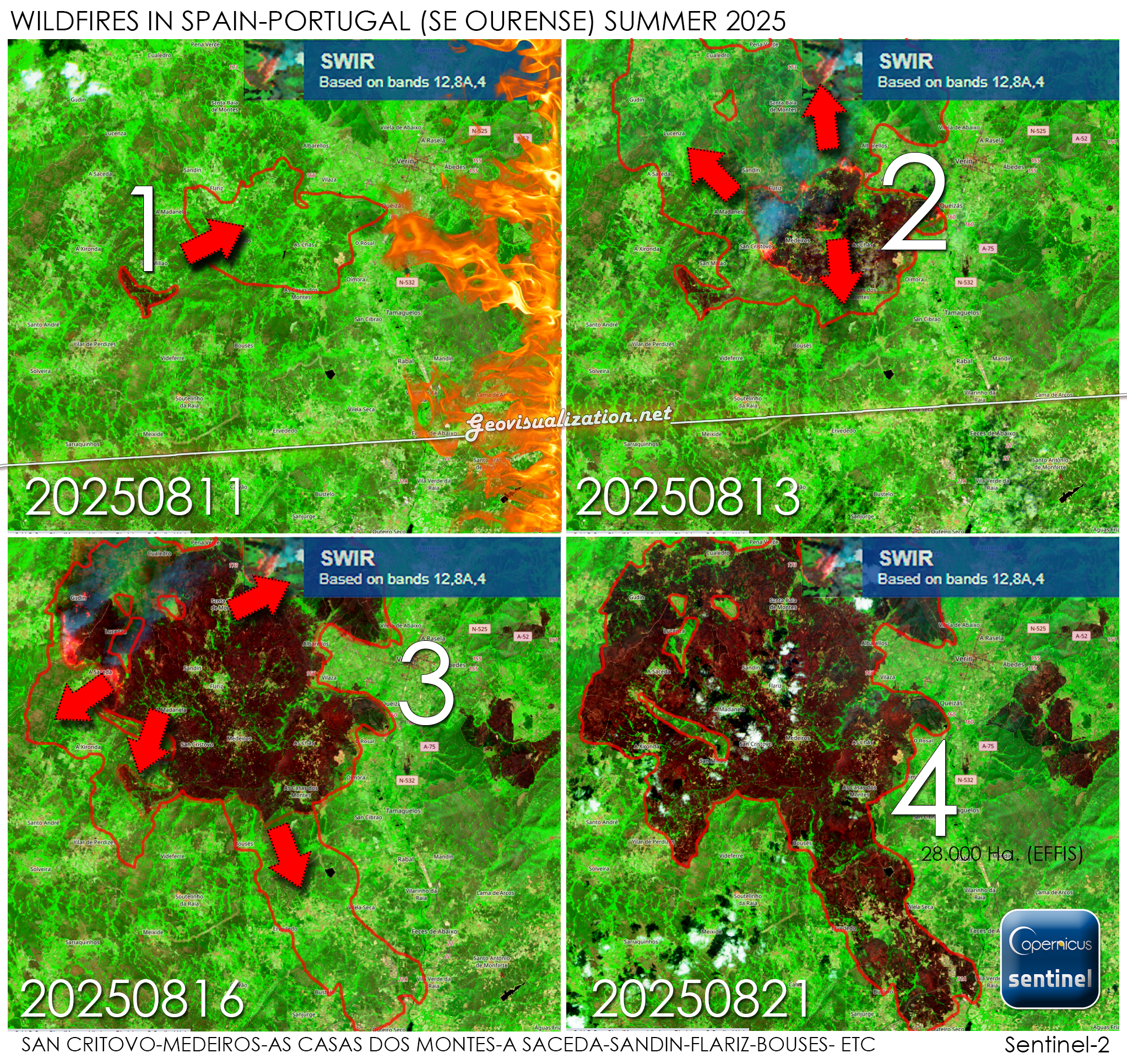
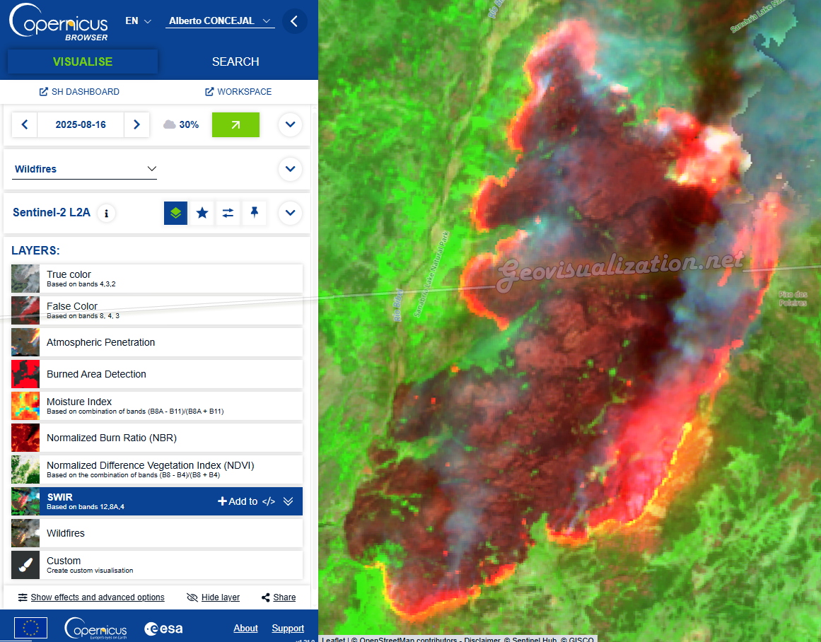
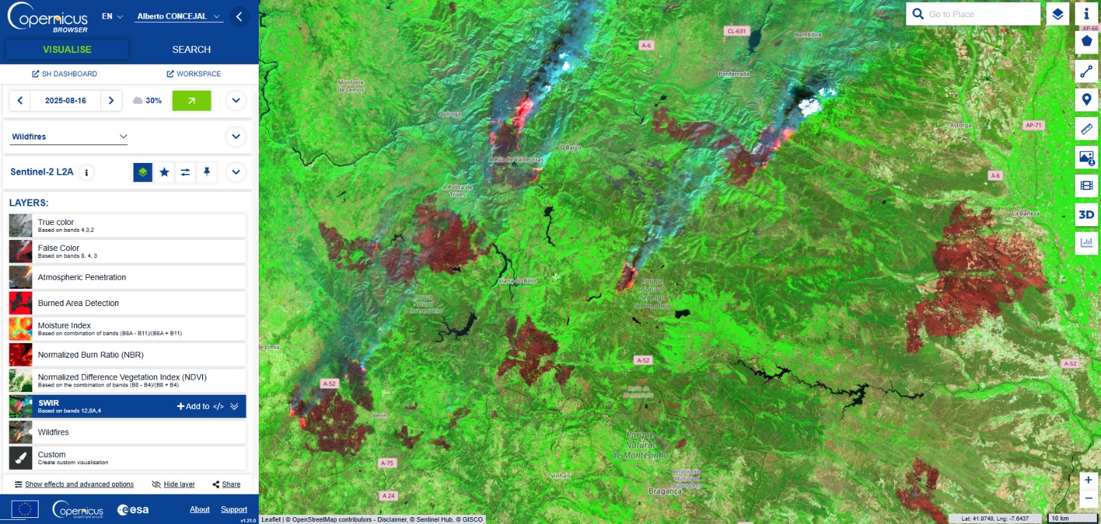
Este agosto, España y Portugal estan viviendo una temporada de incendios excepcionalmente dura. En España, las llamas han calcinado ya casi 390.000 hectáreas (más de seis veces la media reciente) y han dejado varias víctimas mortales, en Portugal, las superficies quemadas superan las 200.000 hectáreas, el 2% del total de su territorio (!) muy por encima del promedio 2006–2024 para estas fechas. El humo cruzó fronteras y degradó la calidad del aire a cientos de kilómetros…
A escala europea, el área ardida acumulada a 19 de agosto asciende a 895.000 hectáreas—casi cuatro veces la media para esta época del año. Es un pico que confirma lo excepcional del verano. ¿No hay algo raro?. ¿Es escepcional?
Si quieres entender un episodio como este sin ruido de los medios, el EFFIS (European Forest Fire Information System, del programa Copernicus) es tu herramienta:
Mapa de situación actual: muestra el peligro de incendio (FWI), focos activos y evolución diaria en Europa y Mediterráneo. Es la referencia pública y se actualiza continuamente.
Detección NRT de focos: integra “hotspots” (MODIS/VIIRS) que llegan en cuestión de horas tras el paso satelital para ver dónde arde ahora mismo.
Evaluación rápida de daños (RDA): mapea áreas quemadas con imágenes diarias para dimensionar el impacto durante la campaña, también con latencia de pocas horas.
Además, el Mecanismo de Protección Civil de la UE ha preposicionado medios aéreos y brigadas (rescEU) en Portugal y España este verano, lo que marca diferencia en los picos de simultaneidad.
EFFIS system. Copernicus (Burnt Area Locator)
La pregunta es, ¿por qué este año está habiendo tantos incendios?. No es un único factor: es la suma, y este año han “encajado” a mi juicio demasiadas piezas.
*Vientos y meteorología de episodio: rachas y condiciones locales han “disparado” la propagación en varios frentes activos. (Se aprecia en el rastro de humo en las imágenes satelitales sobre toda la península el 15 de agosto).
*Calor prolongado y sequedad extrema: la ola de calor más larga registrada en España (16 días) dejó combustibles finos listos para arder y propagarse rápido.
*Déficit hídrico acumulado: menos lluvia efectiva y suelos más secos elevan el índice de peligro (FWI) y alargan ventanas de ignición.
*Paisajes con mucha “carga de combustible”: Excesos de lluvia primaveral (llegando en elgunos casos a superar varias veces la media del periodo, como en Madrid), por otro lado el sempiterno abandono rural y la continuidad del matorral/masa forestal favorecen los fuegos de gran tamaño, especialmente con viento. (Conclusión coherente con los incendios recientes y el patrón observado en Galicia, Castilla y León y Extremadura).
Para finalizar no nos olvidemos del fuego de orígen antrópico de muchas igniciones: desde negligencias (gente haciendo barbacoas en medio el bosque, increíble, ¿no?) a presuntos incendios provocados investigados por las autoridades, con algunas personas que ya han entrado en prisión preventiva.
Sanabria surroundings. Zamora, Spain. 20250816
Para finalizar, si tienes tiempo, hoy y próximos días: revisa el FWI y su anomalía (riesgo meteorológico), los hotspots (dónde arde), y el RDA (qué se ha quemado). Si el FWI está en Muy Alto/Extremo y hay focos cercanos, espera propagación rápida. Contexto: compara en el portal de estadísticas las hectáreas de 2025 con su media 2006–2024 por país. Te ayuda a separar percepción de magnitud real. Tienes los links abajo.
Ponferrada surroundings. León, Spain. 20250816
Traducción para aquellos que no necesariamente están puestos en la materia (no tienen por qué, por otra parte): No es “mala suerte”. Es exposición + vulnerabilidad + clima más cálido. 2025 es la enésima prueba de estrés. La buena noticia: tenemos un sistema (EFFIS), cooperación europea reforzada y lecciones claras para prevención (paisaje, interfaz urbano-forestal) y respuesta (medios preposicionados, detección temprana). La mala: sin reducir riesgos estructurales y sin adaptación seria, estos picos serán cada vez más frecuentes (un conocido ha perdido por ejemplo su casa y todas sus pertenencias en uno de estos incendios~>nos puede pasar a cualquiera!)… Así, si has llegado hasta aquí, dime qué piensas. En este caso permitidme que os diga que “hay que mojarse”.
Combinación True color. Sentinel-2
Interfaz del Copernicus browser por la zona más concentrada de fuegos
GOES-East image over Portugal
Alberto C. Geógrafo y preocupado grado máximo con el hecho de que no nos demos cuenta como sociedad que estamos ante un problema gravísimo…
¿Cuántas veces has oído a tu cuñado (o cuñada) decir en una comida familiar frases tipo:
“¡Antes llovía más, se está desertificando todo!”
o peor aún:
“¡Yo ya lo noto, desde que era niño no ha vuelto a llover igual!”
Frases como estas suenan bien, tienen tono de verdad empírica… pero en realidad son pura intuición, sin ninguna evidencia científica detrás. Afortunadamente, vivimos en una época donde podemos rebatir con datos, mapas y gráficos, sin despeinarnos ni tener que abrir Excel.
CHIRPS en una gran fuente de datos desde hace más de 30 años!!. Añade un poco de CHIPRS a tu conversación navideña!
📡 ¿La clave? Computación en la nube + datos abiertos
En lugar de entrar en debates circulares, te propongo usar Google Earth Engine (GEE), una plataforma gratuita (si demuestras que no vas a usarlo comercialmente, claro) de computación geoespacial en la nube, y una fuente de datos de primer nivel: CHIRPS (Climate Hazards Group InfraRed Precipitation with Station data).
Haz zoom sobre tu zona de interés y ya lo tienes!
CHIRPS ofrece datos de precipitación diarios desde 1981 hasta la actualidad, a resolución global (~5 km). Es decir: puedes consultar con precisión cuánta lluvia ha caído en cualquier país durante los últimos 40 años, sin bajarte ni un solo archivo.
🔍 ¿Qué hace el script?
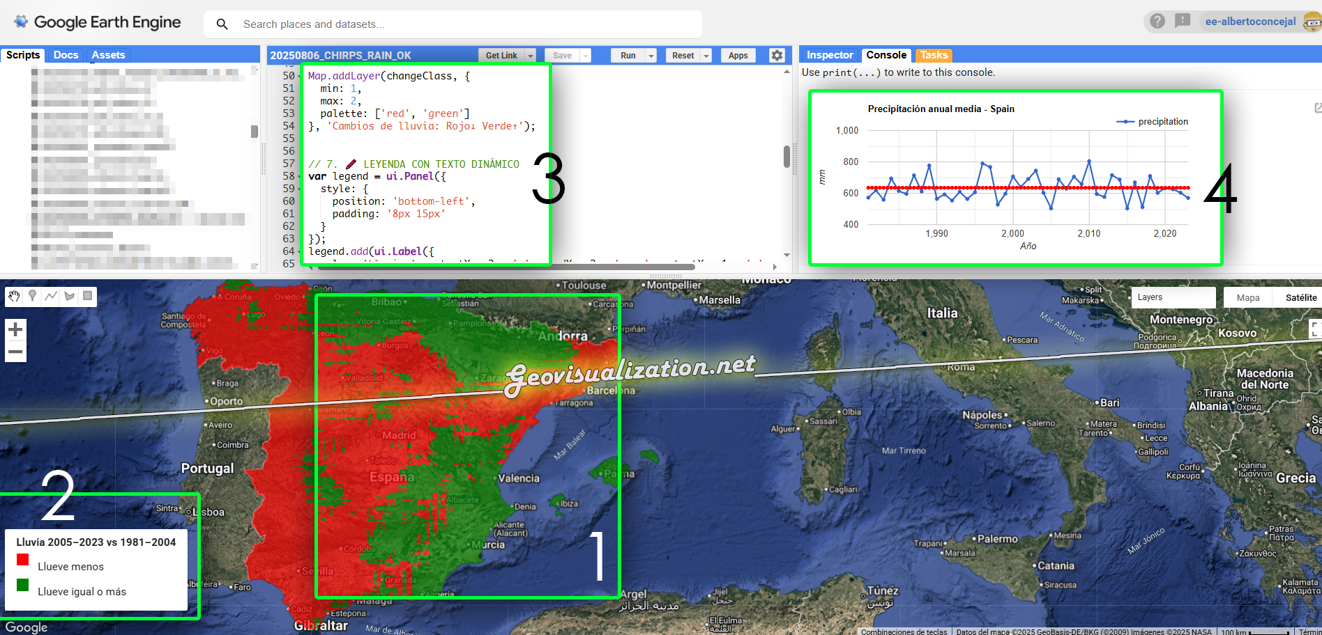
Te dejo un código en GEE que compara la precipitación media anual entre dos periodos (por defecto: 1981–2004 y 2005–2023), y genera:
🗺️ Un mapa en rojo y verde:
Rojo: zonas donde llueve menos ahora
Verde: zonas donde llueve más
📈 Un gráfico temporal con la evolución año a año y su tendencia lineal
📄 Un archivo CSV con la precipitación media anual de cada año
🗂️ Un archivo GeoTIFF binario que puedes abrir en QGIS, ArcGIS o cualquier visor de datos raster
🧪 ¿Cómo lo uso?
Solo tienes que cambiar una línea:
javascriptCopiarEditarvar countryName = 'Spain';
Y listo. Puedes poner 'France', 'Peru', 'Morocco' o el país que quieras. Todo se actualiza automáticamente: el código (3) el mapa binario (1), el diagrama (4), los nombres de los archivos exportados, el título del gráfico… incluso la leyenda (2).
ZASCA!!!!!!!!!!!!!!!!! Nadie será capaz de rebatirte con el GEE en la mano! 🙂
💻 ¿Y qué necesito instalar?
Nada. Cero. Solo una cuenta de Google Earth Engine y copiar el script en tu entorno. No necesitas tener experiencia previa con programación: el código está comentado y documentado para que sea lo más sencillo posible.
🧠 Bonus: más allá de tu cuñado
Además de ganar discusiones familiares, este tipo de análisis sirve para mucho más:
Validar percepciones locales con datos reales
Comunicar visualmente fenómenos complejos (como la variabilidad climática)
Enseñar geografía y ciencia de forma amena
Y sobre todo… para divertirte aprendiendo
Morocco, Tunisia y France en unos 30 segundos… Vamos que nos vamos!!!
¿Tienes un cuñado pesado? Reviéntalo con datos (esto es metafórico, claro). Y si no tienes uno… seguro que en Navidad aparece alguien con ganas de opinar. 😄
Alberto C. 🎓 Soy Geógrafo y me encantan las tecnologías geoespaciales. Creo firmemente que el conocimiento se democratiza cuando lo hacemos visual, accesible y directo. Analista GIS y feliz cuñado de Carlos y Koldo
Quieres conocer cuál es el momento óptimo para plantar? Para fumigar? Para recolectar?. Sabías que dos de cada tres agricultores no cosechan en la fase de madurez adecuada?. Aquí abajo te describo un método completamente automatizado mediante el uso combinado de varios índices de vegetación como NDVI, NDWI, SAVI y EVI que podemos extraer del Satétile SENTINEL-2 en la plataforma COPERNICUS de la UE para conocer exactamente y anticipar las mejores decisiones de intervención sobre tus tierras.
Precision farming / Agricultura de precision o cómo tomar decisiones adecuadas en el campo
Para comprender rápidamente, el gráfico de es un espectro de reflectancia para una superficie de grass (HIERBA) obtenido de una imagen Sentinel-2 L2A. Cada punto del gráfico representa la reflectancia media del suelo para distintas longitudes de onda, alineadas con las bandas espectrales del sensor Sentinel-2, que cubre desde el visible (VIS) hasta el infrarrojo cercano (NIR) y el infrarrojo de onda corta (SWIR). En verde oscuro el modelo (cómo normalmente reacciona la hierba a la luz, su reflectancia) y en verde claro (perdón soy un inepto con los colores) la medición específica sobre el punto que nos ocupa.
Por otro lado, si por ejemplo mido la reflectancia de la misma zona a lo largo del tiempo (Sentinel-2 ofrece una revisita de 5 días, lo que facilita el seguimiento temporal de la vegetación) , veo si la misma sube o baja, esto es importante como veremos más adelante.
Medición multitemporal/puntual de la reflectancia en cada uno de los 12 rangos que ofrece Sentinel 2
Visualmente vemos cómo claramente la humedad cambia a lo largo del tiempo (de maner obvia) para lo cual muestro una secuencia de aproximadamente el mismo día del año de tres años diferentes, una imagen del Infrarrojo Cercano IR que muestra en rojo intenso las zonas con más humedad.
Ilustración 1- Infrarrojo Sentinel 2
Si en lugar de medir puntualmente lo que hago es medir un área y extraer la media de todas las mediciones en una fecha o en una franja de tiempo determinada, tengo entonces unos datos sistemáticos que ya puedo tomar para medir por ejemplo la salud de la vegetación con un índice NDVI, que se calcula a partir de la reflectancia de la luz roja e infrarroja cercana IR de la vegetación.
El NDVI (Índice de Vegetación de Diferencia Normalizada) de Sentinel-2 es un índice que se utiliza para evaluar la salud y densidad de la vegetación, utilizando datos de las bandas rojas e infrarrojas cercanas de las imágenes Sentinel-2. Permite identificar áreas con vegetación, estimar su desarrollo y detectar cambios anormales en su crecimiento.
Los valores de NDVI varían de -1 a 1. Valores negativos indican ausencia de vegetación (agua, nieve, etc.), valores cercanos a cero indican superficies sin vegetación (rocas, suelo), y valores positivos indican vegetación, con mayor valor correspondiendo a vegetación más densa y saludable
NDVI = (B8 – B4) / (B8 + B4)
NDVI – Índice de Vegetación de Diferencia Normalizada
Para un cliente que desea determinar el momento óptimo para la siembra, la fumigación o la cosecha, podemos utilizar este mismo análisis de reflectancia (con datos normalizados para orregir variaciones atmosféricas residuales o nubosidad parcial), pero extendido de forma multitemporal y usando varios otros índices como el NDWI, SAVI, EVI, etc. (que explicaremos en detalle más adelante), para complementar la información espectral básica y relacionarla con la humedad del suelo, la cobertura vegetal y la temperatura superficial (si se cruza con otros sensores).
De momento sigamos con el NDVI, de él, conoceremos con certeza los momentos del año en los que la tierra ha estado más cargada de humedad (teniendo en cuenta y eliminando o no, si es necesario, mediciones con cobertura de nubes). Así podremos también analizar tendencias, se pueden detectar ventanas óptimas de humedad y temperatura del suelo que garanticen una mejor germinación y menor estrés hídrico inicial (propuesta de ventanas de siembra más estables según la variabilidad de la humedad interanual).
Interpretación de un NDVI index values 2020-25
NDVI throughout time 2021-2025
Pasamos ahora al NDWI: El NDWI (Índice Diferencial de Agua Normalizado) en Sentinel-2 es un índice espectral que se utiliza para identificar y mapear la presencia de agua en imágenes satelitales. Se calcula a partir de las bandas verde e infrarroja cercana y ayuda a diferenciar cuerpos de agua de otros elementos como la vegetación y el suelo.
Respecto a la interpretación, los valores positivos: generalmente indican la presencia de agua, con valores más altos correspondiendo a cuerpos de agua más limpios o con mayor contenido de agua. Los valores cercanos a cero pueden indicar suelo húmedo o vegetación con alto contenido de agua, mientras que los valores negativos suelen corresponder a suelo seco o vegetación con bajo contenido de agua.
NDWI = (B3 – B8) / (B3 + B8)
NDWI – Índice Diferencial de Agua Normalizado
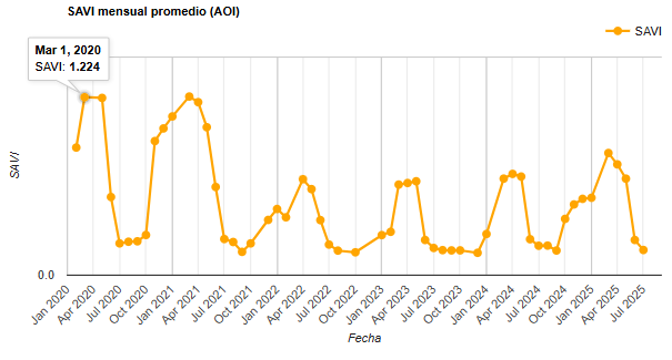
Pasamos ahora al SAVI, el Índice de Vegetación Ajustado al Suelo (SAVI) de Sentinel-2 es una transformación de imágenes que intenta reducir la influencia del brillo del suelo en la estimación de la vegetación, especialmente útil en áreas con vegetación escasa o etapas iniciales de crecimiento.
El SAVI es un índice de vegetación que se calcula a partir de las bandas del rojo y del infrarrojo cercano de las imágenes Sentinel-2, similar al NDVI (Índice de Vegetación de Diferencia Normalizada), pero con un factor de corrección adicional para el suelo.
El NDVI, aunque ampliamente utilizado, puede verse afectado por el brillo del suelo, especialmente en áreas con poca vegetación o donde el suelo es visible entre la vegetación. El SAVI intenta corregir este efecto utilizando un factor de ajuste del suelo, denominado L, que varía según la densidad de la vegetación.
SAVI= ((B8 – B4) / (B8 + B4 + L)) * (1 + L)
SAVI – Índice de Vegetación Ajustado al Suelo
Por último veremos el índice EVI, este índice de Sentinel-2 es un índice que se utiliza para monitorear la salud de la vegetación, especialmente en áreas con alta densidad de biomasa. Se calcula a partir de las bandas 8 (infrarrojo cercano), 4 (rojo) y 2 (azul) de las imágenes Sentinel-2, utilizando una fórmula que ayuda a reducir el impacto de la atmósfera y del suelo en la señal de la vegetación.
EVI = G * ((B8 – B4) / (B8 + C1 * B4 – C2 * B2 + L)) *G: Ganancia (2.5 en Sentinel-2)
EVI – Índice de Vegetación Mejorado
Qué es lo que conseguimos al combinar con estos 4 análisis??. Lo primero unos diagramas conjuntos que nos muestran cómo se correlacionan espacialmente. Esto nos permite visualizar con rapidez los valores y ver cómo esta interacción de los índices NDVI, NDWI, SAVI y EVI nos van a ayudar en la toma de decisiones:
Condiciones favorables para la siembra con humedad suficiente y mínima competencia de vegetación anterior: Si NDVI < 0.3, SAVI < 0.3 y NDWI entre 0.2 y 0.4 Baja cobertura vegetal y nivel de humedad superficial moderado.
Estrés hídrico potencial: Si NDVI > 0.6 y NDWI < 0.2 Vegetación densa pero suelo seco → riesgo de déficit hídrico.
Vegetación poco vigorosa: Si NDVI < 0.3 y SAVI < 0.3 Vegetación escasa o en mal estado, posible daño o áreas sin cultivo.
Presencia de suelo desnudo o raleado: Si SAVI < 0.25 y NDVI entre 0.3 y 0.5 Vegetación con alta exposición de suelo, posible erosión o áreas sin cobertura completa.
Momento óptimo para fumigación o aplicación foliar: Si EVI > 0.7 y NDVI > 0.6 Alta biomasa y cobertura foliar → momento ideal para tratamientos.
Inicio de estrés por inundación o exceso hídrico: Si NDWI > 0.5 y NDVI < 0.5 Suelo saturado o anegado, vegetación afectada.
Madurez o cosecha cercana: Si NDVI disminuye rápidamente en semanas consecutivas y EVI baja de 0.5 La vegetación está senescente → momento probable de cosecha.
Crecimiento activo de la planta: Si NDVI y EVI aumentan simultáneamente durante varios días/semanas Etapa de crecimiento y desarrollo activo.
Posible estrés por plagas o enfermedades: Si NDVI cae por debajo de 0.4 mientras SAVI se mantiene estable Vegetación dañada sin cambios en suelo → posible plaga o enfermedad.
Zona con alta humedad superficial: Si NDWI > 0.4 y SAVI > 0.5 Suelo húmedo con vegetación densa, buen estado hídrico.
Pérdida de vegetación significativa: Si NDVI y SAVI bajan simultáneamente a menos de 0.2 Daño severo, incendios, o remoción de cultivos.
Como veis, se pueden deducir muchas cosas de la interacción de estos índices. Ya no hablamos de uno solo que nos muestre cierto detalle, hablamos de varios que nos dicen varias cosas en lugar de una:-) Esto nos ayuda a una intervención justificada, cuantitativa, empírica y científica. Una intervención que poco tiene que ver con las témporas, las creencias populares o incluso la experiencia, tiene que ver con la diferencia entre hacer las cosas bien o no.
Para terminar, comentar que este método es interesante pues el único input que necesita es un área de interés (automatización), es escalable en el sentido que puede aumentar su alcance mediante la realización de otros análisis en paralelo de otras variables (como precipitaciones o temperatura) y ayuda definitivamente a tomar decisiones.
1 Automatización: mediante scripts en interfaces de Cloud Computation (Computación en la nube) como Google Earth Engine o Google Cloud o un simple script Python desde QGIS o ArcGIS Pro, se puede generar un sistema recurrente que actualice cada cierto tiempo estos análisis.
2 Valor añadido: se pueden incorporar datos climáticos históricos (precipitaciones, temperatura) y modelos de predicción de heladas o lluvias.
3 Beneficio práctico: el agricultor optimiza la fecha de siembra, fumigación o recolecta mientras reduce riesgos de pérdidas por malas condiciones de arranque y ajusta mejor el calendario de trabajos.
Este flujo de trabajo está diseñado para que cualquier propietario de un terreno, independientemente de su finalidad, pueda comprender mejor cómo las lluvias o las temperaturas afectan a la misma. Esto le permitirá tomar decisiones informadas que optimicen su producción. Por supuesto, para un análisis más detallado y específico, estoy preparado para desarrollarlo, adaptándolo al tipo de cultivo y actualizándolo según sea necesario.
Si lo encuentras interesante, comparte, si no, ni se te ocurra;-)
Alberto C. Geógrafo, GIS Analyst, curioso, inquieto pero esperanzado ante un mundo cambiante.