
Quieres conocer cuál es el momento óptimo para plantar? Para fumigar? Para recolectar?. Sabías que dos de cada tres agricultores no cosechan en la fase de madurez adecuada?. Aquí abajo te describo un método completamente automatizado mediante el uso combinado de varios índices de vegetación como NDVI, NDWI, SAVI y EVI que podemos extraer del Satétile SENTINEL-2 en la plataforma COPERNICUS de la UE para conocer exactamente y anticipar las mejores decisiones de intervención sobre tus tierras.
Category Archives: Flujos de trabajo /workflows
Sentinel-1 SAR: Un aliado indispensable para el análisis y seguimiento de inundaciones – Derna, Libia (2023)

La gestión y monitorización de fenómenos hidrológicos extremos, como inundaciones repentinas o fallos estructurales en presas, representan un desafío crítico para los especialistas en geomática, hidrología y planificación territorial. En este contexto, la tecnología radar de apertura sintética (SAR) a bordo del satélite Sentinel-1 de la Agencia Espacial Europea (ESA) ofrece una capacidad sin precedentes para capturar información precisa y fiable sobre la dinámica superficial, independientemente de las condiciones atmosféricas y lumínicas.
Urban delineation methods beyond administrative boundaries
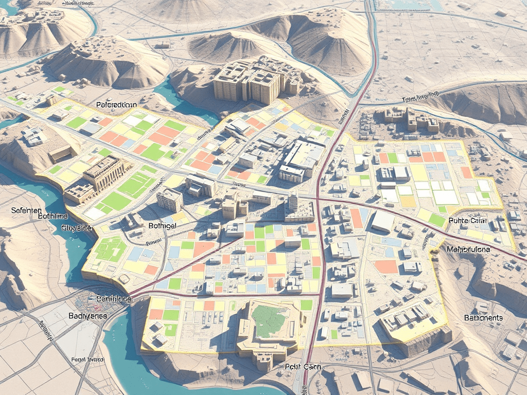
As a geographer working with Geographic Information Systems (GIS), I am particularly interested in exploring urban delineation methods that move beyond the constraints of administrative boundaries. Instead of relying on official municipal limits—which can often be outdated or misaligned with functional realities on the ground—I focus on delineating urban areas based on physical indicators such as built-up surface, population density, and spatial continuity. This approach allows for a more accurate and dynamic understanding of urban space.
Urban Heat Islands, Trees, and Climate Justice in the Anthropocene: A Remote Sensing-Based Reflection

In recent years, the need to understand the urban environment has grown more urgent than ever. Climate change is not an abstract future scenario; it is already here, reshaping our cities day by day. Among the many phenomena that demand our attention, the Urban Heat Island (UHI) effect stands out—not only for its environmental and public health impacts but also for its socio-political implications. Through satellite imagery and remote sensing, we can now visualize and quantify these dynamics with increasing precision. This post reflects on such an analysis I conducted using LANDSAT 8 imagery (Scene ID: LC08_L2SP_201032_20250328_20250401_02_T1, Date Acquired: 2025/03/28), and discusses the findings in the broader context of urban planning, climate justice, and the urgent need to protect urban vegetation.
Visualising Wind from a GRIB Mesh Layer in QGIS and Create an Animated GIF

For a brief introduction into this new GRIB Mesh format (new to me) I followed step by step this tutorial bellow I had found in Hans Van der Kwast YouTube channel, it happened to be very good source and I finally made it (see below). The idea was analysing the winds during a Storm in the Netherlands (this storm was actually the 14th of March 2022 but I analyzed the 15th, no impact on the tutorial whatsoever but please note this point).
Tracking COVID19 TIA 14d a 20220310
sa mejora drásticamente, una incidencia 10 veces menor (de media) que la de hace solo dos meses, que llegó a algunos máximos en determinadas ZBS a una incidencia de 4,500 casos por 100,000 habitantes… La presión en la calle baja levemente, ya se permite desde hace un par de semanas ir sin mascarilla por la calle y se comenta que la semana que viene probablemente se quitarán las mascarillas en interiores (qué ganas!).
¡Cartografía en estado puro! Análisis COVID19 (Tasa de Incidencia acumulada 14d) por Zonas Básicas de Salud en la Comunidad de Madrid, España

asa de Incidencia Acumulada para cada una de las 287 Zonas Básicas de Salud de Madrid, definiendo rangos y colores correctos de visualización y luego un poco de Photoshop aquí y allá y voilá!
Visualizing Tweets!
How about a quick visualization of tweets in CartoDB? Hey guys, the way we used to visualize is changing on a daily basis so it’s time to catch up!!!. Let’s add a timestamp and play!! We will take a look at this dataset in depth shortly so be aware of our schedule! Regards, Alberto C.MScContinue reading “Visualizing Tweets!”
Creating value through Open Data

The benefits of Open Data are diverse and range from improved efficiency of public administrations, economic growth in the private sector to wider social welfare (Source: http://www.europeandataportal.eu/) Performance can be enhanced by Open Data and contribute to improving the efficiency of public services. Greater efficiency in processes and delivery of public services can be achieved thanks toContinue reading “Creating value through Open Data”
Tipologías usuarios Madrid Río. Estadísticas y tendencias interesantes
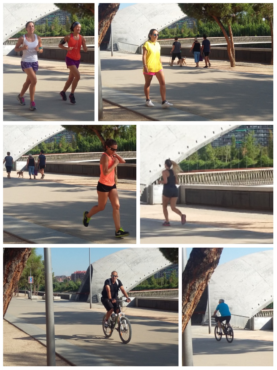
Para la multitud de personas a las que como a mí, les ha sorprendido esta infrastructura en frente de sus casas hay posibilidad de encontrarse en el mismo metro cuadrado a alguien corriendo, alguien andando, una pareja con un carrito de niños, unos amigos en patines, alguna persona en bici… unos más rápido y unos más lento, todos hemos de convivir en un trazado de unos 7,5km de largo y no más unos metros de ancho, con lo que unas mínimas normas de circulación se imponen.

