
For a brief introduction into this new GRIB Mesh format (new to me) I followed step by step this tutorial bellow I had found in Hans Van der Kwast YouTube channel, it happened to be very good source and I finally made it (see below). The idea was analysing the winds during a Storm in the Netherlands (this storm was actually the 14th of March 2022 but I analyzed the 15th, no impact on the tutorial whatsoever but please note this point).
Tag Archives: geovisualizacion
¡+7,000km corriendo!

Ayer llegué a los 7,000km corriendo desde que empecé allá por Agosto de 2014. Parece que no es nada pero es como si hubiera llegado desde Madrid a la ciudad de Karagandá en Kazajistan… Sí es mucho para mí, que empecé andando porque no podía correr. Hay muchas cosas que me ha dado correr, un espacio para mí y mis pensamientos, saber que soy capaz de hacer algo de forma consistente y lograr mis objetivos (razonables). No importa que llueva, nieve o granice, ahí sale Alberto con sus pantalones cortos a darlo todo.
Tracking COVID19 TIA 14d a 20220310
sa mejora drásticamente, una incidencia 10 veces menor (de media) que la de hace solo dos meses, que llegó a algunos máximos en determinadas ZBS a una incidencia de 4,500 casos por 100,000 habitantes… La presión en la calle baja levemente, ya se permite desde hace un par de semanas ir sin mascarilla por la calle y se comenta que la semana que viene probablemente se quitarán las mascarillas en interiores (qué ganas!).
Actualización de Tasa de Incidencia 14 d COVID en Madrid a 20210928

En resumen, ¡Todo va bien!. Dedos cruzados y toquemos madera (¡yo no soy supersticioso porque trae mala suerte!!!!!). Buen viernes. Alberto C.Geógrafo, analista GIS, curioso, preocupado por la situación actual, etc…
Relación entre Tasa de Incidencia y Dinero en Madrid a 20210720 (COVID19)
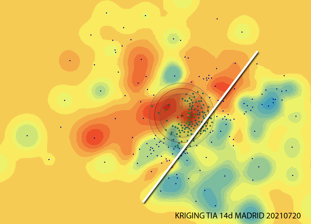
Analizando la incidencia en Madrid, a día de hoy (20210721) estas Zonas Básicas de Salud están entre las 20 más altas y preocupantes, por encima de los 780 casos por cada 100,000 en los últimos 14 días. Alguien intuye algún tipo de correlación?, Yo, sí.
Visualizar mapas animados en el tiempo: Seguimiento de aves en CARTO [ENG]
SuperinteresantE demo para ‘jugar’con datos reales georeferenciados desde la aplicación CARTO. Tres aves migrando desde El Norte de Europa hasta el África subsahariana. Source: https://carto.com/learn/guides/styling/animating-maps-with-point-data This guide describes how to visualize point data over time, by applying the ANIMATED aggregation style to animate your map. This feature requires a map layer containing point geometries withContinue reading “Visualizar mapas animados en el tiempo: Seguimiento de aves en CARTO [ENG]”
Jugando con CartoDB

Hace ya mucho tiempo que he oído hablar de CartoDB y que vengo practicando en su página web a visualizar bases de datos sencillas. Crea una cuenta Incorpora tus datos o tómalos de la galería Selecciona en modo datos la columna que quieres simbolizar/visualizar Conviértela en NUMBER si estuviera en STRING Selecciona en modo mapaContinue reading “Jugando con CartoDB”
Solar + Shadows analysis on Rue Massillon, Nantes (France)
This is the beautiful building in from of my house in Nantes… Let’s model it first using Sketchup. Also I have used a non standard style only for visualization purposes… If we have the North behind us this means we are going to have a lot of light… but so far we are just guessing… Now weContinue reading “Solar + Shadows analysis on Rue Massillon, Nantes (France)”
Architectural models and some fun
I started sketching this building across the street and decided to include some funny pseudo 3D pictures of my girlfriend and myself… Architectural modelling is easy using Sketch-up. This model took me about 5 hours work (during the weekend, shame!), using components, texturing, handling scenes and exporting/editing Video. Hope you guys like it.
Ever tried Google Earth 3D Building Maker?
I started modelling 3D buildings quite a few years ago, I used to use 3D StudioMAX… After almost forgetting everything i knew about modelling, 3D and so on Sketch up was released by Google. In a few days i was not just making demos but working and producing!!! Its extremly easy!!!!. Now They have justContinue reading “Ever tried Google Earth 3D Building Maker?”
