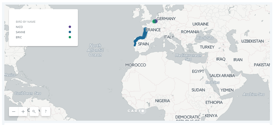
SuperinteresantE demo para ‘jugar’con datos reales georeferenciados desde la aplicación CARTO. Tres aves migrando desde El Norte de Europa hasta el África subsahariana.
Source: https://carto.com/learn/guides/styling/animating-maps-with-point-data
![]() This guide describes how to visualize point data over time, by applying the ANIMATED aggregation style to animate your map. This feature requires a map layer containing point geometries with a timestamp, or numeric field.
This guide describes how to visualize point data over time, by applying the ANIMATED aggregation style to animate your map. This feature requires a map layer containing point geometries with a timestamp, or numeric field.
- Select the
bird_trackinglayer - Click STYLE to apply styling options for the map layer
- Choose ANIMATED as the aggregation option
- Ensure the column
time_dateis selected
To gain better understanding from our bird tracking data, color the paths of each of the three birds separately, by using the bird_name column to style the points by value.
After animating your data, click the FILL color and select BY VALUE. Choose the column bird_name to style your markers by the birds’ names. Edit the stroke to 0, change the blending to source-over, and set the resolution to 1.
![]()
You can download the datasource here: bird_tracking
