Just come back from Chile, Peru and Colombia, where my employer held some conferences on Smart Cities. I had the chance to talk in both venues: GIS expertise, geoprocessing, spatial analysis, etc. This is all about GIS, as always lately 😉
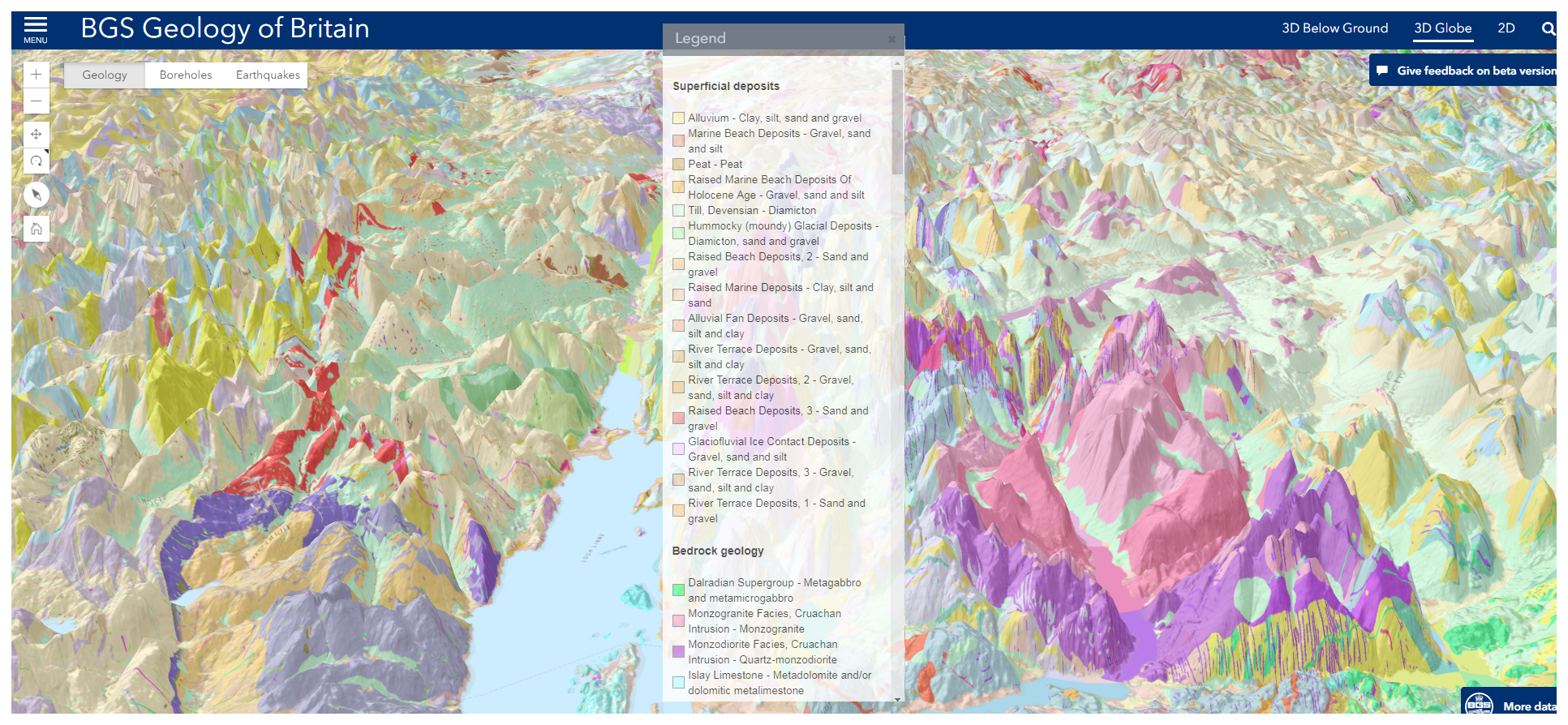
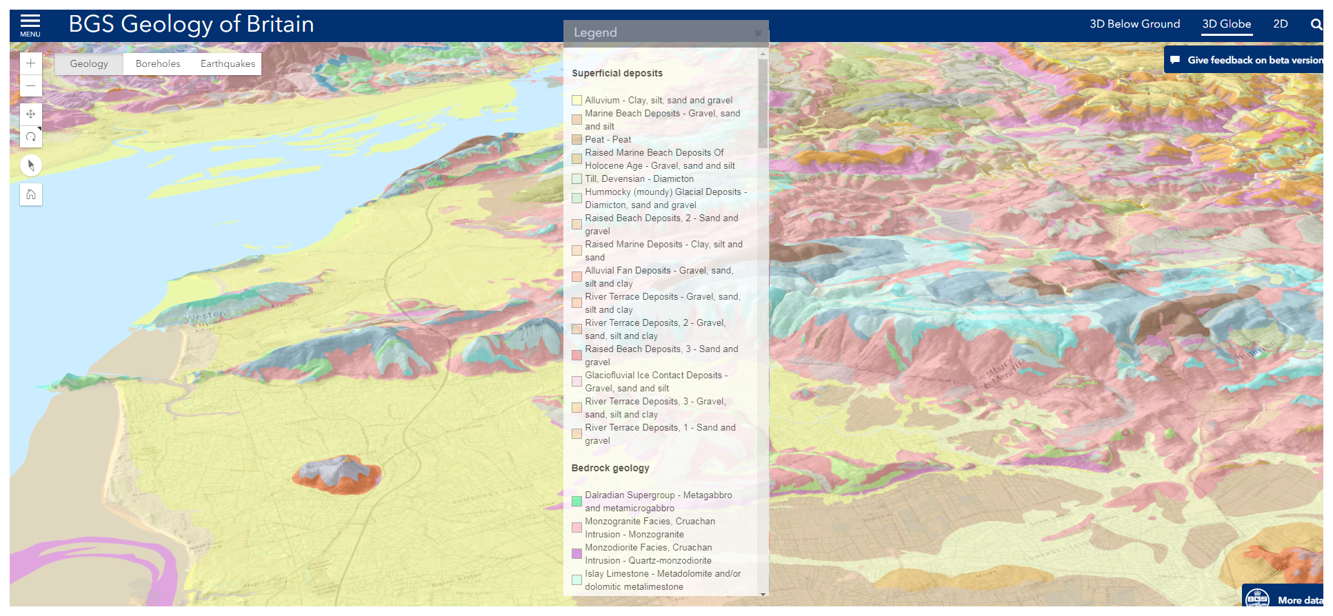
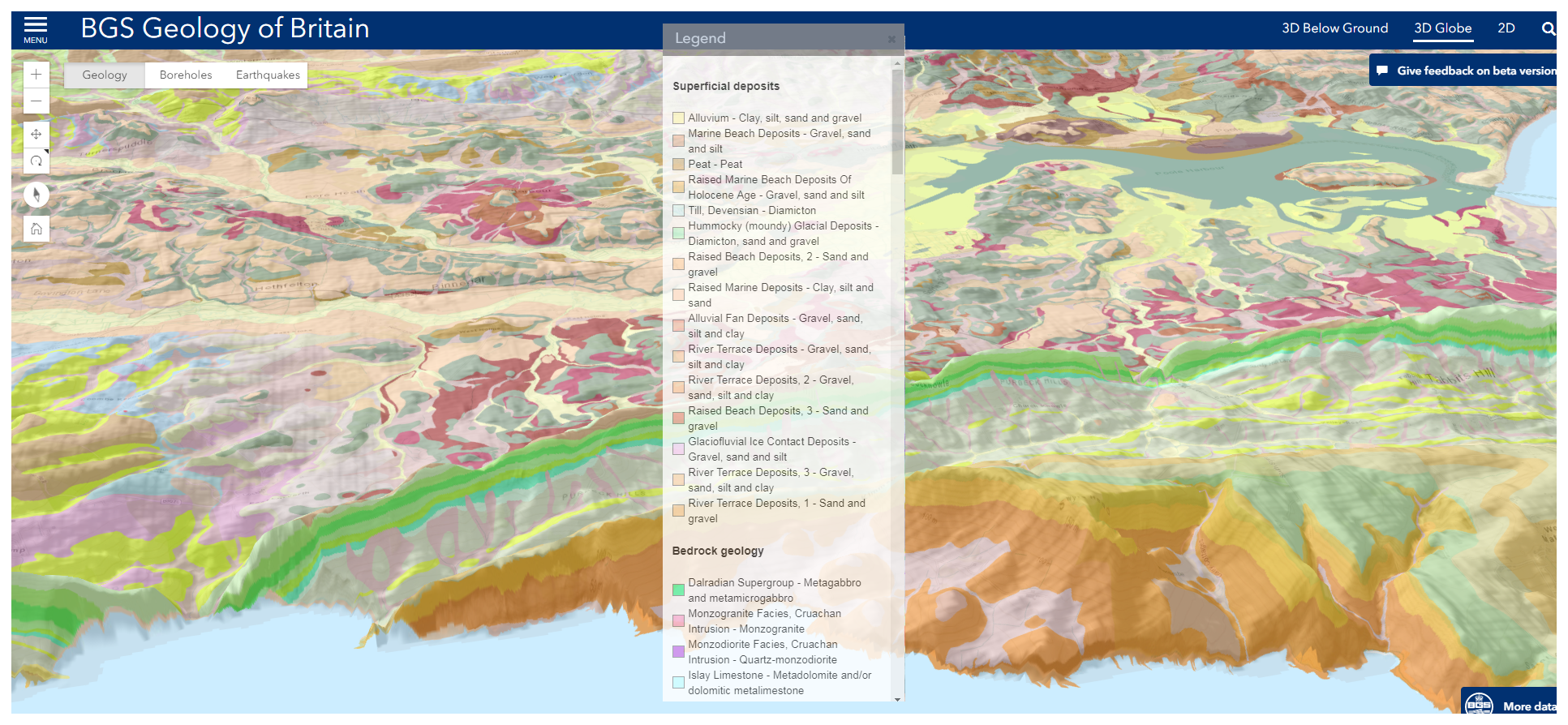
Oh! a must see: BGS Geology of Britain. Source from http://www.bgs.ac.uk/discoveringGeology/geologyOfBritain/home.html
Britain is fortunate in possessing a remarkably varied geology within a relatively small area.
The rocks that make up our islands represent a long and complicated history of events. They encompass most of the major periods of geological time and extremes of climate from desert to glacier.
Our rocky heritage was the source of many raw materials vital to the Industrial Revolution and therefore to the nation’s wealth and political power.
It is therefore not surprising, given this combination of natural treasures and the enquiring spirit of the times that, as modern sciences flourished, many important early pioneers were British Geoscientists.
It’s not the first time that i do one of these only courses but i can tell, i have learnt a lot with this one. I strongly recommend it for those wanting to learn a bit more than the basics about remote sensing or GIS analysis. A comprehensive combination of ArcGIS tools and standard GIS knowledge is in very clear English, perfectly subtitled if needed and very easy to follow.
Creo que será interesante para inmobiliarias que sean capaces de georeferenciar estimaciones de precio por zonas.
El procedimiento incluye como inputs tener estimaciones de precios por bloque y precios reales (o anunciados) con lo que podemos extraer un ratio que nos diga la relación entre el precio actual y el esperado.
Recodad por favor que estos datos son aleatorios, es decir que no son más que una teoría a la espera de tener datos reales. Este primer mapa nos dice de 1 a 7 el precio esperado por bloque.
Este segundo nos dice dónde están los pisos y su precio anunciado.
El tercero nos compara y simboliza un precio con el otro. Cuánto mayor es este ratio, mejor precio teórico tiene la casa. Por ejemplo si el precio esperado es 6 pero el precio anunciado es 1, el ratio será de 6. Cuánto mayor ratio, mejor y viceversa.
El resultado más concreto es el siguiente:
Cuanto más rojo mejor, cuanto mayor es el ratio, mejor.
Este análisis permite rápidamente encontrar inmuebles de buen precio o saber decir al cliente que el precio de venta es demasiado alto en comparación con la zona donde está ubicado.
SuperinteresantE demo para ‘jugar’con datos reales georeferenciados desde la aplicación CARTO. Tres aves migrando desde El Norte de Europa hasta el África subsahariana.
This guide describes how to visualize point data over time, by applying the ANIMATED aggregation style to animate your map. This feature requires a map layer containing point geometries with a timestamp, or numeric field.
Select the bird_trackinglayer
Click STYLE to apply styling options for the map layer
Choose ANIMATED as the aggregation option
Ensure the column time_date is selected
To gain better understanding from our bird tracking data, color the paths of each of the three birds separately, by using the bird_name column to style the points by value.
After animating your data, click the FILL color and select BY VALUE. Choose the column bird_name to style your markers by the birds’ names. Edit the stroke to 0, change the blending to source-over, and set the resolution to 1.
(Cartograma creado para contribuir a la vigilancia de los síndromes gripales aportando informaciones complementarias a las de la Red ‘Centinelas’ [FR])
L’objectif de l’Indicateur Avancé Sanitaire (IAS®) “Syndrome Grippal” est de contribuer à la surveillance des syndromes grippaux en France en apportant des informations complémentaires à celles du réseau Sentinelles. Cet indicateur a été validé par comparaison avec les données du réseau Sentinelles. Au niveau national, La corrélation croisée avec le réseau Sentinelle est forte (0,88). Cette corrélation valide la pertinence de l’IAS®. L’IAS® est calculé chaque jour en employant une méthode de lissage temporel : les informations des sept jours précédents et des 7 jours suivants sont prises en compte pour calculer la valeur d’un jour donné. Ceci fait que l’indice d’un jour J peut légèrement évoluer jusqu’à J+7.
Recibí este link por Facebook hace un rato (Gracias Paco!)… https://hoyodecrimen.com/mapa#/19.4052/-99.0987/12 y me dediqué unos minutos a analizar un hecho puntual, el homicidio doloso, en un periodo concreto de tiempo, de 2013 a 2015. Veamos la previsualización de todos los homicidios ocurridos en 2013 en CARTO.
El autor de la página llamada CRIMEN POR TU RUMBO donde están volcados estos datos es Diego Valle. Desde luego el planteamiento es interesante e inquietante. Quién quisiera saber los crímenes que se han cometido por la zona por donde me voy a mover. Yo?. Yo no, desde luego porque no saldría pero en términos de análisis es sin duda muy, muy interesante.
Mi aproximación era mostrar más que un mapa estático con datos puntuales, un mapa dinámico, que permitiera ver una evolución global de cada uno de los acontecimientos estudiados.Esto son todos los datos en bruto, todos los crímenes
Todos los crímenes desglosados. De todos ellos se podría intentar sacar un patrón espacial. Dónde se roba más a los negocios? a los transeúntes, a los taxis? dónde son más comúnes las violaciones? Cuál es la evolución en el tiempo? Tiende a ocurrir más al Norte o más al Oeste? Va la cosa a mejor o a peor?.
El resultado preliminar es el siguiente:
Claramente la tendencia es a aumentar y a descentralizarse, veamos a través del maravilloso Carto (ex CartoDB).
Software utilizado: ArcGIS 10.3 + Geostatistical analyst
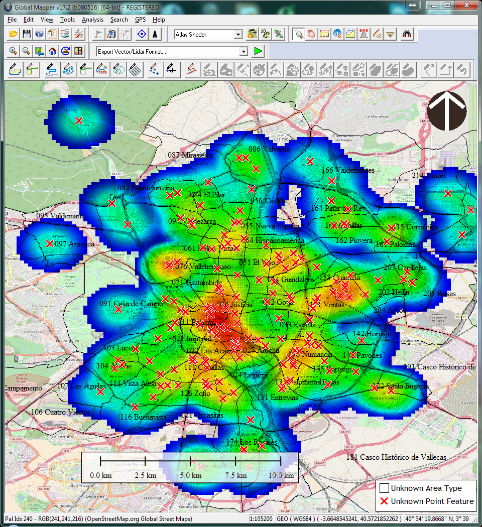
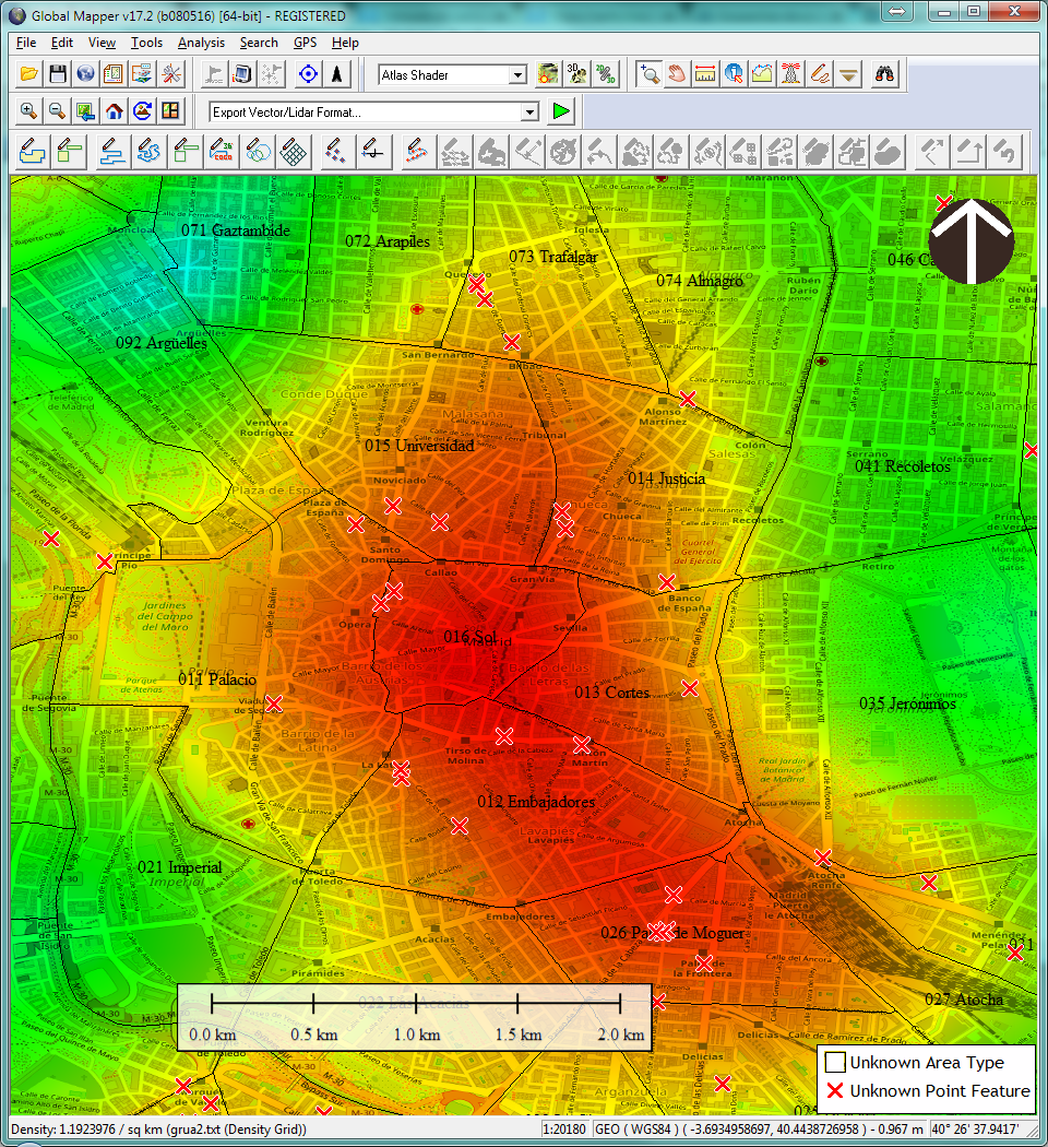
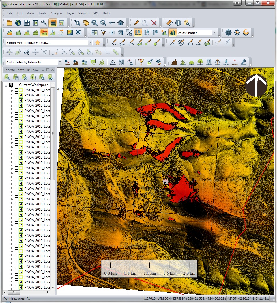
Global Mapper 17.2 +density maps
Free Video Capture 7.8.3
Algún otro enfoque que os resultaría interesante? No tenéis más que proponerlo.
Imagine you need to promote recycling. Imagine you have 1000 inhabitants from a small village and you need to provide proper colored plastic bags for each and every one of the categories you need to disaggregate: organic, plastic and paper.
You need to service them all properly but you can only choose 5 shops (out of the 10 available) where you will distribute the bags for free.
In green all 1000 inhabitants (houses) and in orange the placement of all ten shops.
In green the final result: the 5 shops chosen out of the 10 potential available due to having checked they are the most optimal (the shortest euclidean distance).
Allocates a set of demand points (Customers) to user specified number of supply points (Facilities) out of a Facilities point dataset based on the Euclidian distance between the Customers and Facilities.
100 customers anywhere in the World
In other words the function selects N Facilities out of K candidates to service a set of M Customer locations in such a way that each Customer is allocated to a single Facility (based on Euclidean distance) and the total distance between the Customers and selected Facilities is minimized.
Customers attached to 3 pre-defined facilities
In a more simple way: take a bunch of customers and assign them the closest facility (using euclidean distance, the “ordinary” (i.e. straight-line) distance between two points)). In this particular theoretical analysis I have also selected a maximum range of 5000 meters so anything beyond won’t be taken into consideration.
Questions: Am i giving a proper service with those facilities i have already deployed?. Is there any of them way too far away so we cannot service at all?. Is there any of them over populated and in the end we cannot provide a proper service?. If you happen to come across any other question, please add it to comments so i can modify the post.
Result table:
FID Shape Id FacilityID Facility Type Num_Alloc Max_Dist Total_Dist
0 Point 0 2 2 Selected 4 4852.68 15362.93
1 Point 0 1 1 Selected 11 4110.57 37839.93
2 Point 0 0 0 Selected 18 4991.27 73591.27
This ArcGIS video shows some light over these type of analysis: