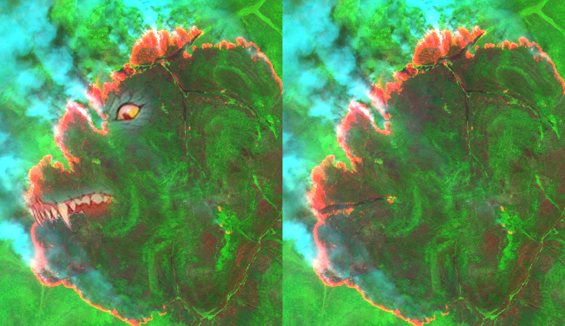
En Los Ángeles, la combinación de condiciones meteorológicas, como los vientos secos de Santa Ana y las altas temperaturas, crea un entorno propenso a incendios forestales. Estos fuegos, a menudo cercanos a áreas urbanas, representan un gran desafío para la gestión de emergencias. Aquí es donde Sentinel-2 se convierte en una herramienta crucial. Utilizando la combinación de bandas 12, 8, 4, Sentinel-2 permite detectar rápidamente focos de calor y evaluar la extensión de las áreas quemadas, lo que es vital para coordinar respuestas eficaces. Esta capacidad de monitoreo casi en tiempo real es fundamental para mitigar el impacto de los incendios y proteger tanto a las comunidades como a los ecosistemas.
Aquí abajo adjunto solo algunas de las posibles combinaciones de capas que nos puedes ayudar a identificar patrones y modelar nuestro análisis, el número de combinaciones es casi incontable:
Color natural (Bandas 4, 3, 2): La combinación True Color (4, 3, 2) en Sentinel-2 reproduce los colores naturales tal como los veríamos a simple vista. Es ideal para proporcionar una representación realista de los paisajes y es útil para identificar áreas quemadas en comparación con su entorno
Falso color (Bandas 8, 4, 3): La combinación Falso Color (8, 4, 3) resalta la vegetación en tonos rojos, facilitando la identificación de áreas quemadas y la detección de cambios en la cobertura vegetal. Es una herramienta valiosa para evaluar el impacto de los incendios y monitorear la regeneración del entorno.
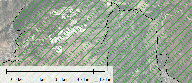
Burned Area Detection: La detección de áreas quemadas con Sentinel-2 permite identificar las zonas afectadas por incendios con alta precisión. Al utilizar combinaciones de bandas especializadas, es posible resaltar las áreas afectadas, facilitando el análisis de daños y la planificación de la recuperación. Esta técnica es esencial para evaluar el impacto y coordinar esfuerzos de restauración.
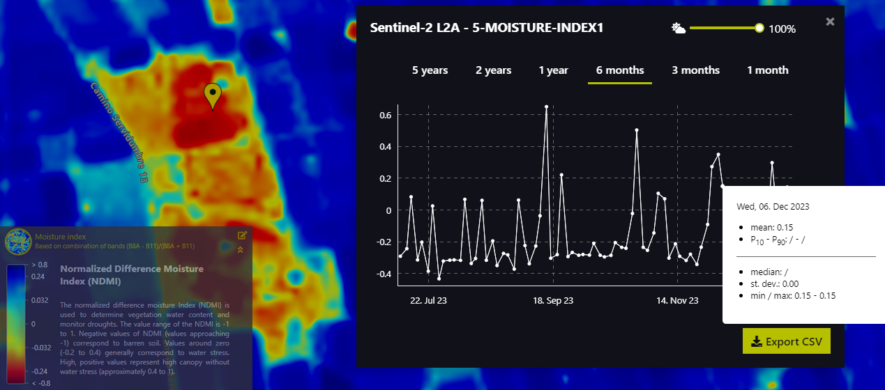
Bandas 12 (SWIR), 8 (NIR), 4 (Red): La combinación de bandas 12, 8, 4 en Sentinel-2 es clave para la detección de incendios, ya que utiliza el infrarrojo de onda corta (SWIR) junto con el infrarrojo cercano (NIR) y el rojo. Esta combinación permite identificar de manera precisa las áreas quemadas y los focos activos, gracias a su sensibilidad a la humedad y la vegetación residual. Es una herramienta esencial para la evaluación detallada de los daños y la gestión de emergencias.

Y estas otras combinaciones más genéricas o para otros propósitos pero siempre diseñadas para resaltar características específicas según las bandas espectrales:
4-3-2 (Color Verdadero) Propósito: Visualización realista del paisaje.
8-4-3 (Color Falso) Propósito: Detectar vegetación saludable (aparece en tonos rojos).
11-8-2 (Geología) Propósito: Identificación de suelos y rocas, discriminación de minerales.
12-11-8A (Detección de Humedad del Suelo) Propósito: Evaluación de contenido de agua en el suelo y áreas húmedas.
8A-11-2 (Detección de Vegetación Estresada) Propósito: Identificar vegetación afectada por sequía o enfermedades.
4-8A-11 (Detección de Áreas Quemadas) Propósito: Evaluar daños tras incendios forestales.
8A-4-2 (Infrarrojo de Cercano a Visible) Propósito: Monitoreo de vegetación y mapeo del agua.
3-2-1 (Color Real Modificado) Propósito: Imagen más contrastada para análisis visual general.
12-8A-4 (Detección de Fuegos Activos) Propósito: Identificación de incendios forestales y áreas afectadas.
8-3-1 (Detección de Áreas Urbanas) Propósito: Resaltar zonas urbanizadas en tonos brillantes.
11-8A-4 (Estudio de Suelos y Vegetación) Propósito: Distinguir áreas de vegetación y suelo desnudo.
2-3-4 (Agricultura Visible) Propósito: Monitoreo agrícola usando colores visibles.
5-4-3 (Infrarrojo Visible para Agricultura) Propósito: Resaltar diferencias en tipos de cultivo.
7-6-4 (Mapa de Índice de Vegetación) Propósito: Identificar áreas de crecimiento vegetal vigoroso.
12-8-2 (Monitoreo de Humedad y Suelos Secos) Propósito: Evaluación de áreas secas frente a áreas húmedas.
4-5-3 (Monitoreo Costero y Marino) Propósito: Estudio de aguas superficiales y costas.
8A-11-12 (Monitoreo de Áreas Áridas) Propósito: Evaluación de desertificación y erosión.
12-8-8A (Análisis de Aerosoles y Polución) Propósito: Identificar partículas suspendidas en el aire.
8-11-4 (Mapa de Biomasa y Plantaciones) Propósito: Determinar la biomasa en áreas forestales.
9-7-2 (Monitoreo Marino y Coralino) Propósito: Estudio de arrecifes y aguas costeras.

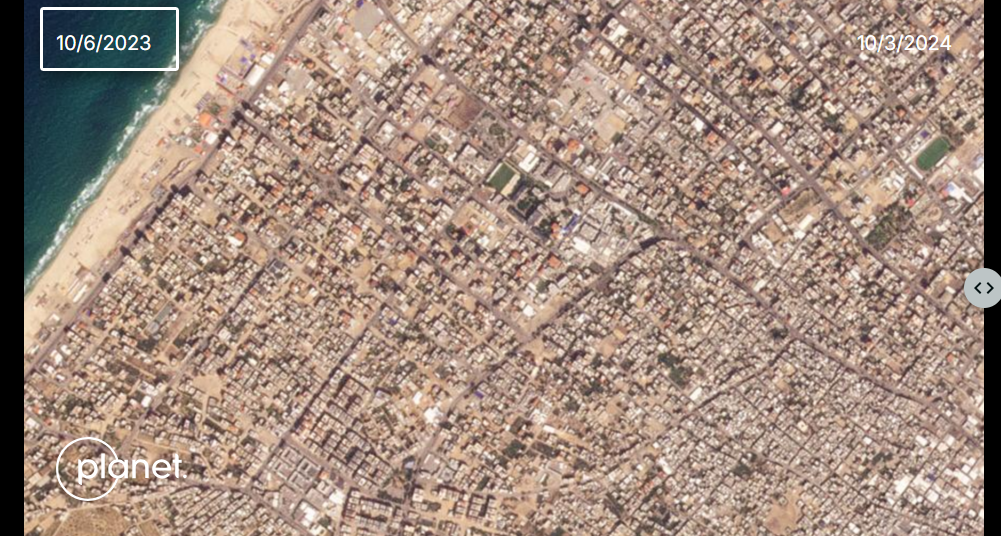
Combina el Burned Area Detection con una contabilización rápida pero precisa y efectiva de edificios en el área mediante Overpass Turbo dentro de OSM, pero qué es Overpass?. Una maravilla de herramienta para extrarer mediante secuencias de SQL cualquier dato almacenado en Open Street Maps. Lo primero, decide qué es lo que tienes que extraer aquí:
https://wiki.openstreetmap.org/wiki/Map_features
Y luego busca la manera de conseguir un código para extraer lo que necesitas, tienes varias maneras: haz el código tú mismo (1), pregunta a la AI de turno (2) (por ejemplo ChatGPT) que lo haga por tí y por último también puedes usar un lenguaje lógico mediante el wizard interno de Overpass (3), pero de nuevo qué es overpass?. Overpass Turbo es una herramienta interactiva para consultar y visualizar datos de OpenStreetMap (OSM) mediante el uso del lenguaje de consultas Overpass API. Esta herramienta permite a los usuarios extraer información específica del enorme conjunto de datos de OSM, como calles, edificios, parques, tiendas o cualquier otro elemento mapeado, de una forma sencilla y gráfica.
Por ejemplo yo he usado el segundo método (2), pregunta directa a la AI:
——————————————————————————–
[out:json][timeout:25];
// Get all buildings within the visible map area
(
way“building”;
relation“building”;
);
// Output full geometry
out body;
;
out skel qt;
——————————————————————————–

Las características principales de Overpass Turbo son:
Compatibilidad con estilos personalizados: Incluye opciones para personalizar la visualización mediante estilos de mapeo adaptados a los datos consultados.
Editor interactivo: Proporciona una interfaz gráfica donde los usuarios pueden escribir consultas utilizando el lenguaje Overpass QL o Wizard, lo que facilita su uso incluso para principiantes.
Visualización en mapas: Los resultados de las consultas se representan directamente sobre un mapa, lo que permite identificar de manera clara los elementos extraídos.
Filtros avanzados: Permite aplicar filtros detallados, como buscar nodos, vías o relaciones con etiquetas específicas (ej. amenity=school para escuelas o highway=primary para carreteras principales).
Exportación de datos: Los resultados de las consultas se pueden exportar en varios formatos, como GeoJSON, KML o datos crudos en formato XML de OSM.

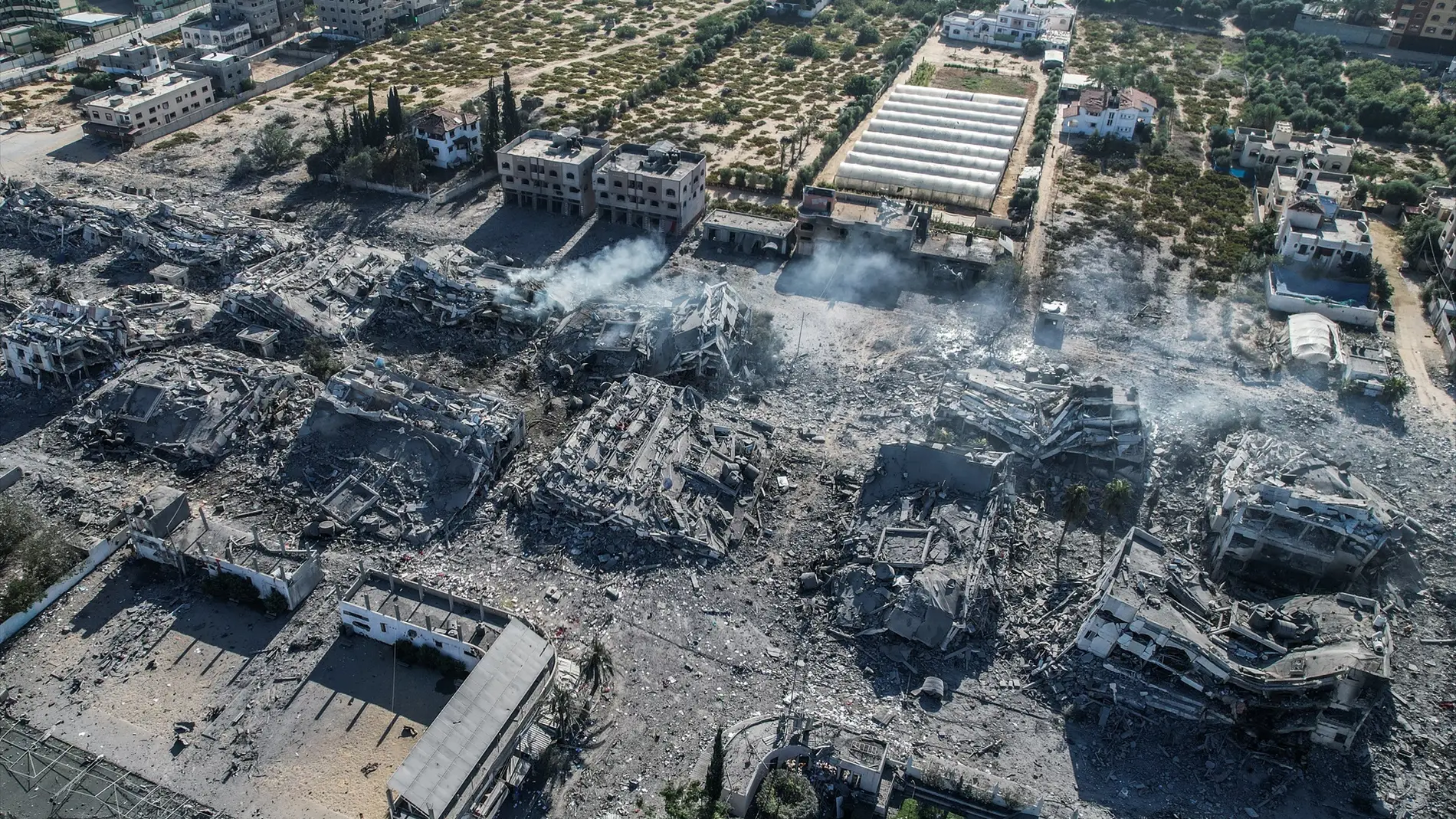
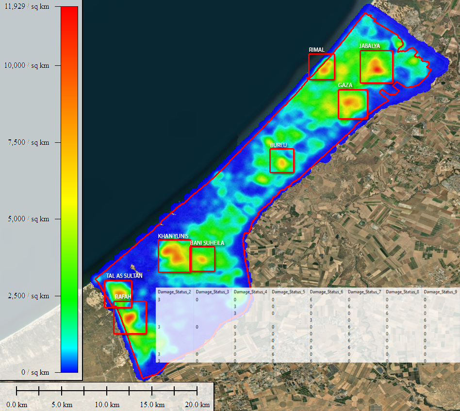
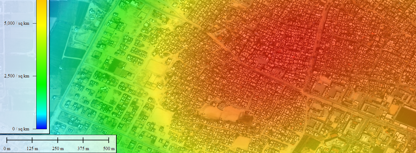
El análisis de incendios recientes en Los Ángeles utilizando datos de Sentinel-2 subraya el poder de la Teledetección para monitorear y evaluar desastres naturales en tiempo casi real. De esta manera, es posible identificar áreas afectadas y cuantificar los daños de forma eficiente, lo que permite a las autoridades implementar medidas de respuesta más rápidas y efectivas. Si además de la capacidad de encontrar y análizar el evento tenemos ocasión de cuantificar rápidamente los efectos mediante una base de datos abierta a la que tengamos acceso con licencia de uso comercial y sobre todo, de manera rápida, sin grandes requerimientos, entonces sí, en ese momento seremos útiles.
En un contexto donde el cambio climático incrementa la frecuencia e intensidad de fenómenos como los incendios forestales, el uso de tecnologías como Sentinel-2 no solo es crucial para la gestión de emergencias, sino también para la planificación a largo plazo y la protección del medio ambiente. Estos datos pueden ser utilizados para desarrollar modelos predictivos que ayuden a anticipar futuros incendios y a crear estrategias para mitigar su impacto. Además, el análisis de patrones de incendio a lo largo del tiempo puede ofrecer información valiosa sobre cómo los ecosistemas responden al fuego, facilitando así la restauración de áreas afectadas.
El Remote sensing y su uso combinado con otras herramientas de búsqueda y validación de datos geolocalizados abiertos se consolidan como parte de un procedimiento indispensable en la construcción de un futuro resiliente, permitiendo no solo una mejor comprensión de un fenómeno cada vez más cotidiano como los grandes incendios, sino también el desarrollo de políticas públicas y por qué no, privadas, más informadas y eficaces.
Alberto
GIS Analyst
Sources:
https://elpais.com/us/2025-01-15/incendios-en-california-en-vivo.html#?rel=lom
https://overpass-turbo.eu/index.html#
https://www.aa.com.tr/en/americas/tide-is-turning-on-los-angeles-fires-as-thousands-of-structures-burned-deaths-expected-to-rise/3446193
https://apps.sentinel-hub.com/eo-browser/?zoom=10&lat=41.9&lng=12.5&themeId=DEFAULT-THEME&toTime=2023-10-13T08%3A41%3A58.975Z