La gestión y monitorización de fenómenos hidrológicos extremos, como inundaciones repentinas o fallos estructurales en presas, representan un desafío crítico para los especialistas en geomática, hidrología y planificación territorial. En este contexto, la tecnología radar de apertura sintética (SAR) a bordo del satélite Sentinel-1 de la Agencia Espacial Europea (ESA) ofrece una capacidad sin precedentes para capturar información precisa y fiable sobre la dinámica superficial, independientemente de las condiciones atmosféricas y lumínicas.
Sentinel-1 opera enviando pulsos de microondas hacia la superficie terrestre y midiendo la señal reflejada, lo que permite superar las limitaciones típicas de los sensores ópticos que dependen de la luz visible y se ven afectados por nubosidad o ausencia de luz diurna. Esta independencia de las condiciones meteorológicas y de iluminación convierte a Sentinel-1 en una herramienta indispensable para la observación continua y en tiempo casi real de eventos catastróficos, especialmente en regiones donde las condiciones atmosféricas adversas son frecuentes.
El caso del colapso de presas en Derna, Libia, ocurrido en septiembre de 2023, es paradigmático para ilustrar las capacidades de Sentinel-1 en la detección y seguimiento de inundaciones masivas. Antes del evento, las imágenes radar adquiridas muestran una reflectividad característica del terreno seco y vegetado. Tras el colapso, la superficie inundada se manifiesta como áreas de baja reflectividad radar debido a la presencia de agua, que actúa como un reflector especular, causando un fuerte debilitamiento de la señal recibida. Este contraste en la intensidad radar permite una delineación precisa de las zonas afectadas.
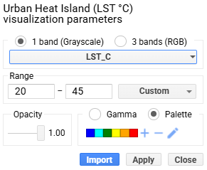
El análisis temporal de imágenes Sentinel-1, mediante técnicas que incluyen la generación de mapas de diferencia logarítmica de intensidad (en decibelios), posibilita la identificación de cambios significativos en la superficie, facilitando la distinción entre áreas inundadas y no inundadas. Estas técnicas son especialmente valiosas cuando se emplean imágenes adquiridas en modos coherentes y con polarizaciones adecuadas, siendo la polarización VV (vertical transmitido, vertical recibido) comúnmente utilizada para capturar la variabilidad de la rugosidad superficial y contenido dieléctrico.

Más allá de la detección inmediata, Sentinel-1 permite la monitorización de la evolución post-evento, lo que es fundamental para la gestión de emergencias y la planificación de la recuperación. Las series temporales de imágenes permiten evaluar la retirada progresiva del agua, la estabilización del terreno y la posible identificación de riesgos secundarios, como deslizamientos inducidos por saturación de suelos. La capacidad de generar mapas actualizados con alta frecuencia es una ventaja crítica que supera ampliamente a otras fuentes de datos.

Técnicamente, el procesamiento de datos Sentinel-1 para análisis de inundaciones incluye pasos como la calibración radiométrica, corrección geométrica, reducción del ruido speckle mediante técnicas de filtrado espacial o temporal, y la aplicación de umbrales o algoritmos de segmentación para generar máscaras binarias de agua/no agua. Estas máscaras pueden ser combinadas con modelos digitales del terreno (DEM) y datos de uso del suelo para mejorar la precisión y contextualizar la información. La integración con sistemas GIS permite generar productos cartográficos que apoyan la toma de decisiones en tiempo real.


Un poco de historia de las Inundaciones en Libia esos días
El desastre se desencadenó la noche del 10 al 11 de septiembre de 2023, bajo el impacto de la poderosa “Medicane” (ciclón mediterráneo) Storm Daniel, que descargó precipitaciones extraordinarias en la región. En 24 horas, Derna registró hasta cerca de 400 mm de lluvia, un volumen asombroso considerando que su precipitación media anual apenas ronda los 300 mm.

Estas lluvias torrenciales colapsaron dos presas clave en el cauce del Wadi Derna—la presa Derna (Belad) y la presa Abu Mansour—con una capacidad combinada cercana a los 30 millones de m³. La ruptura de ambas estructuras liberó una ola de agua de hasta 7 m de altura, que arrastró todo a su paso por casi 12 km desde las zonas montañosas hasta el mar Mediterráneo.
La magnitud del impacto fue devastadora. Se estima que causó entre 5.923 y 20.000 muertes, con al menos 8‑10 000 personas desaparecidas, y dejó más de 30 000 desplazados en.wikipedia.org+1en.wikipedia.org+1. Decenas de barrios completos desaparecieron, al igual que 4 puentes, y grandes secciones urbanas fueron barridas hacia el mar france24.com+2apnews.com+2es.wikipedia.org+2. La ciudad sufrió graves daños en su infraestructura crítica: hospitales inoperativos, morgues saturadas, destrucción masiva de edificios—más de 400 estructuras anegadas en lodo y escombros .
La escasez de mantenimiento en las presas—sin obras significativas desde 2002—y la falta de sistemas de alerta adecuados fueron factores determinantes. Aunque el servicio de meteorología libio emitió advertencias 72 horas antes, las instrucciones oficiales fueron confusas: se impuso toque de queda mientras se daban mensajes contradictorios sobre la evacuación. Esto atrapó a la población en zonas de riesgo justo cuando las presas fallaron hrw.org.
El colapso de las presas no solo generó muerte instantánea. En los días subsiguientes, se temió un brote de enfermedades renales y gastrointestinales debido a la contaminación del agua; más de 150 casos de diarrea infantil fueron reportados en Derna reuters.com+8apnews.com+8en.wikipedia.org+8. Pero debido al colapso de infraestructura sanitaria, el acceso al agua potable estaba interrumpido.
Esta tragedia fue catalogada como “el segundo fallido de presa más mortal de la historia”, solo detrás del caso de Banqiao en China (1975) en.wikipedia.org+1nrc.no+1. Además, han surgido procesos judiciales: en julio de 2024, el tribunal de Tobruk condenó a 12 responsables (hasta 27 años de prisión) por negligencia criminal reuters.com+1bbc.com+1.
El caso de Kirissah (a veces escrito Kirrissah), que se identifica con el Wadi Derna, sufrió un efecto similar: se formaron gigantescos depósitos de escombros, calles enteras quedaron enterradas y miles de personas fueron desplazadas o muertas arrastradas por el agua.
En resumen, el desastre de Derna supuso una conjunción letal de fuerte evento climático (Storm Daniel), infraestructura crítica en estado de abandono y falta de gestión de emergencia.
Sentinel‑1, mediante su capacidad para mostrar pérdidas intensas de energía radar (áreas oscuras = agua), permitió caracterizar espacialmente las zonas anegadas, lo que resulta clave para entender, mapear y gestionar tanto la emergencia inmediata como la reconstrucción posterior.

La bibliografía técnica destaca la importancia de Sentinel-1 como sensor radar para aplicaciones hidrológicas. Según el informe de la ESA sobre Sentinel-1 (ESA, 2023), la misión proporciona una cobertura global con revisit times de 6 a 12 días, resolución espacial de hasta 5×20 metros y disponibilidad gratuita de datos, lo que la convierte en una fuente accesible y fiable para la comunidad científica y agencias de gestión de riesgos. Investigaciones recientes han demostrado que la combinación de datos Sentinel-1 con algoritmos avanzados de detección y aprendizaje automático incrementa significativamente la capacidad para identificar y delimitar eventos de inundación con alta precisión (Smith et al., 2022; Zhang y Li, 2023).
En conclusión, Sentinel-1 representa un recurso estratégico para la observación y análisis de inundaciones y otros fenómenos naturales que alteran la superficie terrestre. El caso de Derna ejemplifica cómo esta tecnología puede proporcionar información esencial para responder ante desastres, evaluar daños y planificar acciones de mitigación y recuperación. La disponibilidad continua de datos y la evolución de técnicas de procesamiento posicionan a Sentinel-1 como una piedra angular en el arsenal de herramientas para la gestión de riesgos ambientales en el siglo XXI.
Quieres echar un vistazo en directo?. Ya sabes, haz clic aquí abajo:
https://code.earthengine.google.com/f1fc0a55f324e1a74822b78a042f4c52
Espero que el post te haya resultado interesante, recuerda que la metodología para analizar cuantitativamente un evento de estas características (lluvias con alta intensidad horaria y rotura de una presa de grandes dimensiones) usando métodos de cloud computation permite adaptabilidad, escalabilidad, coherencia, precisión. Este análisis que acabas de leer, no es único y puede ser combinable con otros análisis que tienen en cuenta otros factores como mencionados anteriormente (la duración de los eventos, su cobertura espacial, la forma del terreno local, las variaciones estacionales y anomalías climáticas. Todo ello con datos abiertos, consistentes y reproducibles.)
Alberto C.
Geographer, Senior GIS analyst, curious person and Open Data (not only) lover
Referencias:
- ESA. (2023). Sentinel-1 User Guide. Agencia Espacial Europea. https://sentinel.esa.int/documents/247904/685211/Sentinel-1_User_Guide
- Smith, J., et al. (2022). Advances in flood mapping using Sentinel-1 SAR data and machine learning. Remote Sensing of Environment, 280, 113156.
- Zhang, H., & Li, X. (2023). Integration of Sentinel-1 SAR and optical data for improved flood monitoring. International Journal of Applied Earth Observation and Geoinformation, 125, 103035.
- apnews.com+15britannica.com+15english.alarabiya.net+15bbc.com+4bbc.com+4global-flood.emergency.copernicus.eu+4
- english.alarabiya.net+5britannica.com+5en.wikipedia.org+5
- apnews.com+3en.wikipedia.org+3nrc.no+3