Urban Atlas: Precision Geoespacial en el Corredor de Copernicus. Usos del Suelo combinados con estimaciones de población sobre cada una de las clases, un paso más en combinación de fuentes de Datos Abiertos en la nube.
Este análisis representa un pequeño test rápido desarrollado por Alberto C (Geovisualization.net) para mostrar las potencialidades de uso de un asset externo en la plataforma Google Earth Engine (GEE) mediante JavaScript. Se trata de un mapa de usos del suelo (LULC / Clutter) de media-alta resolución que ofrece una precisión temática y espacial muy precisa (significativamente superior a la de Corine Land Cover) a lo que añadimos una estimación de población con una base de datos transnacional como WOLDPOP 100m y otra en paralelo GHSL 100m. Este flujo de trabajo, que integra capas externas con datasets globales de computación en la nube, se ha ejecutado íntegramente en unos pocos minutos, demostrando la agilidad operativa de las herramientas cloud actuales.
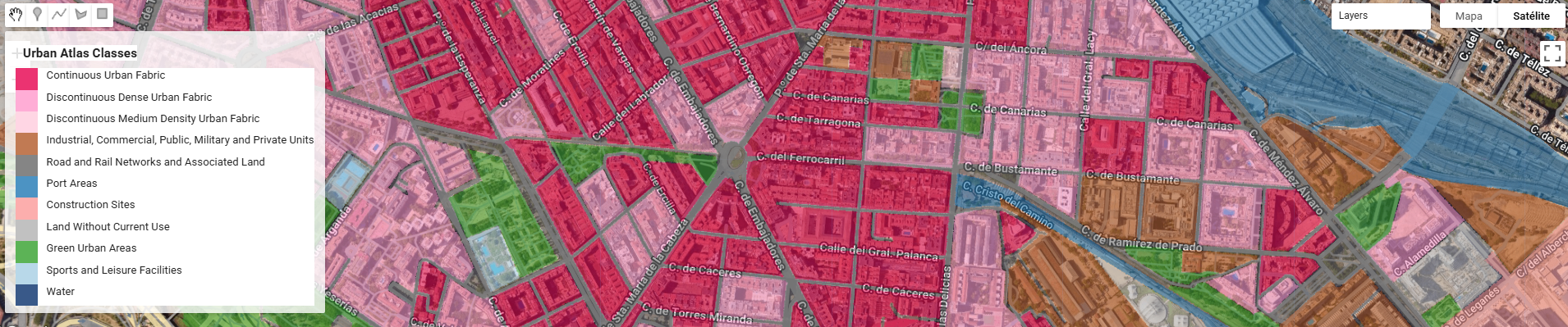
Urban Atlas (UA) representa el estándar de oro dentro del Copernicus Land Monitoring Service (CLMS) para el análisis de la morfología urbana en Europa. A diferencia de Corine Land Cover, UA ofrece una resolución temática y espacial drásticamente superior (Unidad Mínima de Mapeo de 0.25 ha para clases urbanas), permitiendo discriminar entre tejidos urbanos continuos y discontinuos con una precisión de densidad del 10% al 80%.
Casos de Uso de Vanguardia: Del Urbanismo a la Resiliencia
En la actualidad, el Urban Atlas se ha consolidado como la capa base para modelos críticos:
- Modelización de Islas de Calor Urbanas (UHI): Gracias a la diferenciación entre superficies selladas y áreas verdes, UA es el input fundamental para correlacionar la temperatura de superficie (LST) con la tipología edificatoria.
- Gestión de Escorrentía y Riesgo de Inundación: La clase High/Low Imperviousness permite calcular coeficientes de escorrentía precisos para el diseño de infraestructuras hidráulicas.
- Planificación de la “Ciudad de los 15 minutos”: Se utiliza para analizar la fragmentación del ecosistema urbano y la accesibilidad a servicios según el tejido residencial.
- Cuentas de Ecosistemas: Monitorización del “Urban Sprawl” (expansión urbana) y la pérdida de suelo agrícola o forestal colindante a las Funcional Urban Areas (FUA).
Integración en Google Earth Engine: Escalando el Análisis
La verdadera potencia del Urban Atlas se libera al integrarse en motores de Cloud Computing como GEE. Pasar de un análisis local por municipio a un análisis continental es ahora una cuestión de código, no de capacidad de hardware.
Ventajas de la automatización en GEE:
- Zonal Statistics a Gran Escala: Mediante el uso de
reduceRegions, se pueden extraer perfiles de uso de suelo para miles de ciudades en segundos, cruzándolos con datos de población. - Fusión Multi-Sensor: GEE permite intersectar el ráster categórico de Urban Atlas con series temporales de Sentinel-2 (NDVI) o Sentinel-1 (Backscatter) para validar la salud de la vegetación urbana o la altura de las estructuras.
- Remapping Dinámico: Como hemos visto en flujos de trabajo previos, la capacidad de aplicar un
.remap()instantáneo permite simplificar las 27 clases originales de UA en indicadores binarios (Gris vs. Verde) para generar histogramas de resiliencia en tiempo real.
Ejemplo de flujo lógico en GEE:
JavaScript
// Agregación de clases para análisis de infraestructura verde
var greenSpace = ua_image.remap([14100, 14200, 31000], [1, 1, 1], 0);
var stats = greenSpace.reduceRegion({
  reducer: ee.Reducer.mean(),
  geometry: region_interes,
  scale: 10
});
El Futuro: Automatización y Deep Learning
El siguiente paso que estamos viendo en la industria es el uso de Urban Atlas como Ground Truth (verdad terreno) para entrenar redes neuronales convolucionales (CNN) sobre imágenes de muy alta resolución (VHR), permitiendo actualizar los mapas de uso de suelo de forma continua sin esperar a los ciclos de actualización trienales de Copernicus.
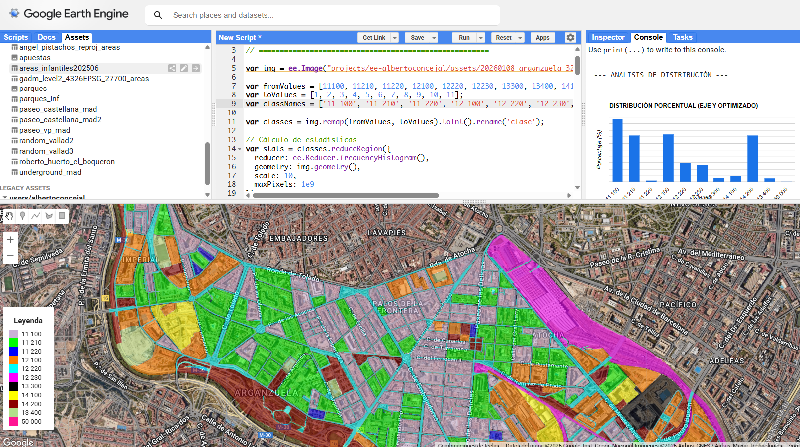
Las estimaciones de población se obtuvieron mediante la intersección espacial de los datos de población en cuadrículas de WorldPop 2020 con clases categóricas de uso del suelo y la agregación de los recuentos de población por clase.
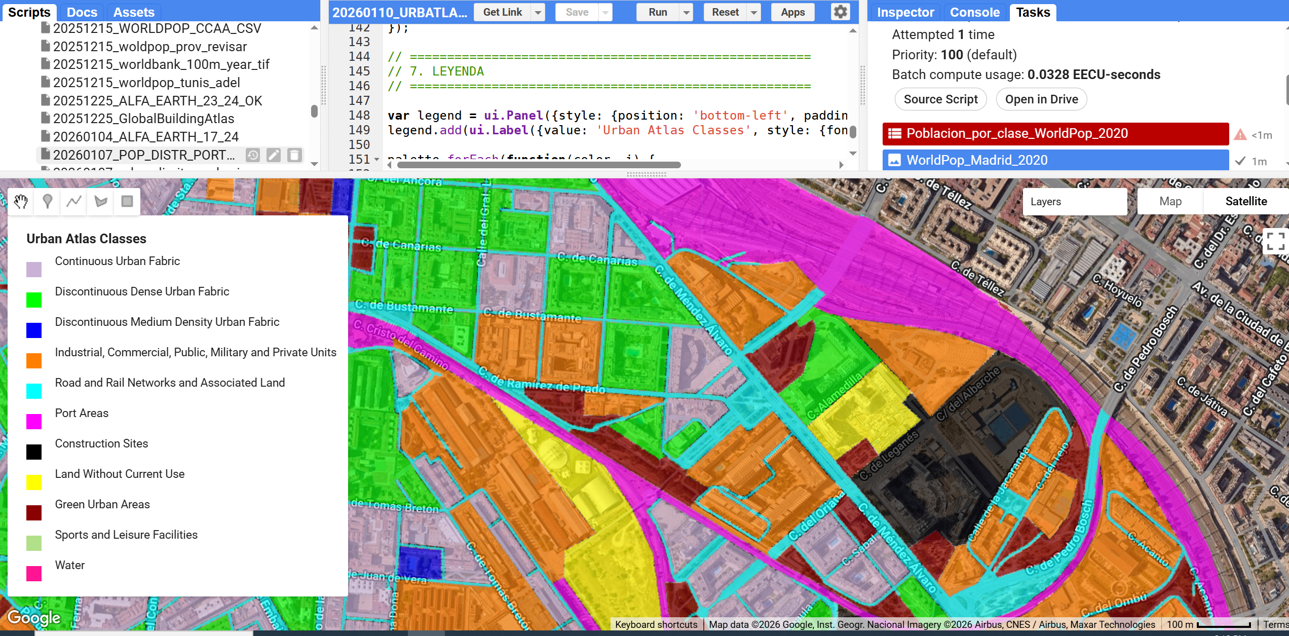
Cambiamos fácilmente la leyenda puesto que necesitamos unos colores más más adecuados
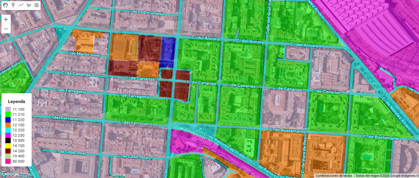
Las clases de uso del suelo se obtuvieron del Atlas Urbano Copernicus y se agruparon en categorías temáticas siguiendo la nomenclatura oficial del Atlas Urbano. El scrip de GEE saca directamente esta tabla en formato CSV.
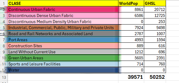
Si bien no hay correspondencia con la población real del distrito esto es porque por un lado tenemos una fuente vectorial de media-alta resolución (urban atlas) mientras que los datos de población vienen de una fuente continua de 100m (100 veces menor). Este análisis advierte de las limitaciones del estudio mientras que se enfoca en las potencialidades de uso de fuentes en la nube que con toda lógica, deben de hacerse coincidir en aras de una completa coherencia.
Si te interesa el tema, pídeme el ASSET de URBAN Atlas (lo puedes ver en las fuentes abajo del post) o el ASSET de población sobre el AOI para que puedas importarlo en tu workspace o si no quieres replicarlo simplemente dime qué te parece este enfoque!
Un saludo!
Alberto C.
Geodata Analyst
Sources:
https://code.earthengine.google.com/afe5dbf9b75c53dda2b82e4cad6d0b4e
https://land.copernicus.eu/en/products/urban-atlas/urban-atlas-2018#download
https://developers.google.com/earth-engine/datasets/catalog/WorldPop_GP_100m_pop?hl=es-419
https://human-settlement.emergency.copernicus.eu/
https://hub.worldpop.org/project/categories?id=3
https://developers.google.com/earth-engine/datasets/catalog/JRC_GHSL_P2023A_GHS_BUILT_V