Aquí la ‘convesación’ via twitter con el presentador de TVE Jacob Petrus. Me quejé de que se mencionara dentro de una frase, como tantas veces hemos oído, en radio y televisión, la expresión ‘La geografía española…’ refiriéndose a España en general. Lo que me indignó fue que Jacob Petrus es Geógrafo además de presentador generalista (y meteorólogo según pone en su CV) y como tal, según mi punto de vista, ha de ser precavido con la semántica y el significado de las cosas.
Allá por el año 1993, en la primera clase del primer día de carrera mis profesores Fernando Molinero y Maite Ortega (cada uno de ellos, en clases diferentes) mencionaron el hecho de que a menudo se usa la frase hecha ‘la geografía española…’ para hablar de La península o España, es decir, un lugar, sin embargo a ellos no les parecía correcto el uso dado que la Geografía (con mayúsculas) es una ciencia y como tal debe entenderse.
De acuerdo con sus palabras la RAE (Real Academia de la Lengua Española) dice:

(Territorio, paisaje. Usado también en sentido figurado). Pero si lo que se pretente es hacer una analogía, en este caso no sería a mi juicio correcto dado que la misma palabra tiene un significado quantitativa (ordinal) y qualitativamente (ciencia vs lugar) superior. En todo caso, queda a la interpretación particular.
Otros Geógrafos, también presentadores de televisión y meteorólogos como Florenci Rey jamás osaron utilizar tal expresión.
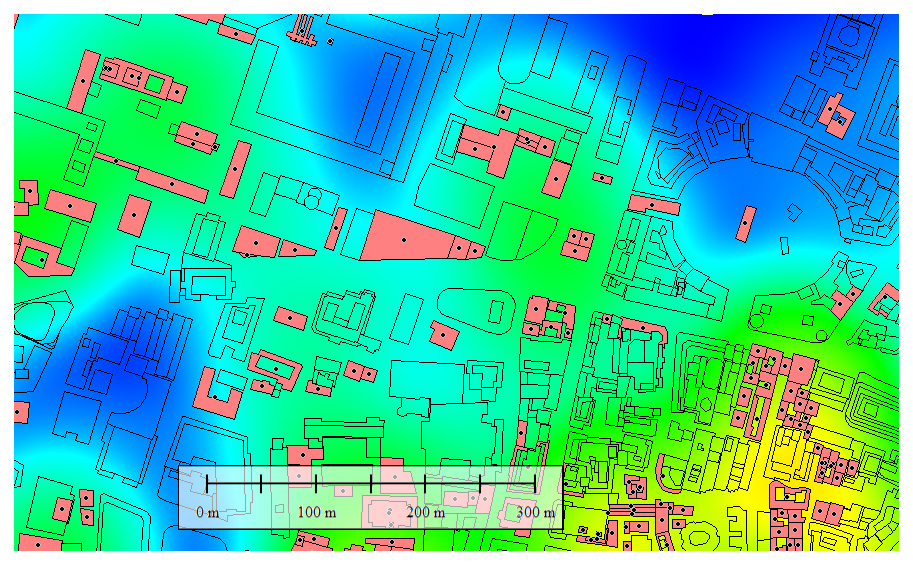
Claramente es una frase usada con ninguna maldad, con ganas de describir algo se dice ‘en toda la geografía española ocurre tal o tal fenómeno’ pero el efecto secundario de esas palabras es que se puede pensar que el todo LA GEOGRAFÍA es la parte EL LUGAR y de tal manera algo grande se convierte en algo pequeño.
La Geografía ya es de por sí una ciencia algo denostada por otras como la Arquitectura, la Biología, la meterología, la Topografía, el Urbanismo, la Física, y tantas otras. A lo largo de los años me he dado cuenta que no se comprendía claramente qué es ser un Geógrafo y qué es la Geografía, que éramos los que hacíamos de todo sin estar especializados en nada, de hecho cuando empecé a estudiar no había otro destino que la enseñanza o las oposiciones pero afortunadamente ahora, con la aparición del GIS y todo lo asciado a la geolocalización, eso ha cambiado notablemente.
La Geografía según yo la entendí era la ciencia de la interrelación de el hombre con el medio y hace falta la figura de un profesional que comprenda de manera global todas esas interacciones, es ahí donde llegamos los Geógrafos.
Más de 20 años han pasado desde ese día y he visto casi a diario cómo se ha usado la expresión por gente que no sabía y no tenía por qué saber la importancia de una simple frase, pero llegada la oportunidad de manifestarse usando Twitter y hablando directamente con la persona referida (Jacob Petrus) he creído conveniente hacerlo.
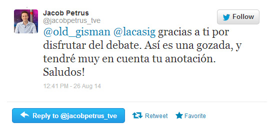
No obstante he de agradecer que al menos me haya contestado, cosa que habla bién de él.

Actualización: No sólo me ha contestado sino me ha asegurado que tendrá en cuenta mi anotación.
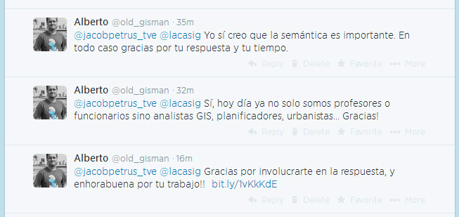
Me pone contento este grado de interactividad y rapidez de feedback. De nuevo Gracias Jacob!