I guess we all can make a DTM out of many sources but SRTM is one of the most common ones, right?. Then let’s learn from this very simple approach how close we are from the SRTM raw data.
- Selecting a not very big representative area to be able to handle it,
- exporting raster to polygon (from SRTM 3 arcsec/90m) dataset 1
- exporting raster to polygon 30m (our DTM dataset) dataset 2
- exporting to POIs 30m (our DTM dataset) dataset 2b
- Spatial join POIs dataset 2b vs dataset 1
- RMSE
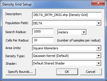
- visualizing delta using a density map/gaussian kernell +appropriate symbolization
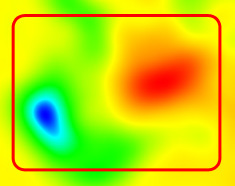
In yellow we see theres a full correspondence between SRTM and our DTM dataset and in blue there’s a ‘hole’ and in red there’s a ‘mountain’, this means it’s in here where the shift is more important.
This way we can highlight if sources are OK.
It’s simple but it works. How do you like it?. Please feel free to send some feedbak.
(Software used: ArcGIS 10.1, Global Mapper 13.2)
Cheers,
Alberto C.
MSc GIS, QC