After living in France for four years i have to tell i am always aware of Meteo information on TV (well, i live in Brittany, i guess this makes sense!). It was the same in Spain or anywhere else in the world where i had lived and the reason why is i have always loved Meteo and statistiques, mostly after working as an aerial surveying photographer in the late nineties… but that’s another history.
Weather forecast its quantitative data that distributes spatially, meaning every single spot will have a different figure, even if it’s separated no more than 1 mm, at least in theory. So the question is: as its impossible showing predictions for every single square mm of the area of interest, we need to estimate them using different models. Still if we point anywhere at the map we should know if the icon or figure applies or not to the spot i want to know about.
Let’s make it easier to understand, lets use images!!!
First of all, i know its difficult but it’s important, please don’t have into account Meteo news are presented (in this particular case) by Anaïs BAYDEMIR, which is a beautiful TV journalist at France 2… Let’s not focus on this (but if you happen to want to know more about her i hereby copy a couple of links to both wikipedia and youtube:
http://fr.wikipedia.org/wiki/Ana%C3%AFs_Baydemir
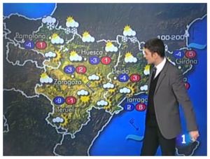
Having said that, le’s take a look the way this is shown in Spain (TVE 2014). Well, again let’s not focus on the guy’s grey suit but…
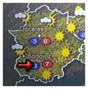
Information it’s kind of OK but what happens if we want to know about a spot in the middle of two icons?. Is the partly cloud icon which applies to my place or it’s the ‘sun and flies’ one?. How can i be sure of the forecast if i live in this this big region in the SW of Spain?…
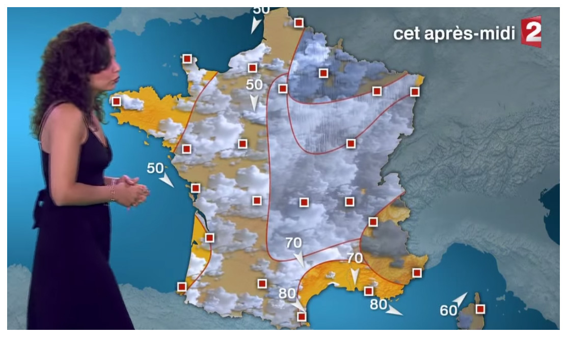
On the other hand let’s focus on Anaïs_Baydemir, ops, meaning let’s focus on the way France 2 shows this information:

Every single square mm is perfectly defined, if we want to know the forecast in a particular place we know the icon that corresponds to the spot and we don’t have to guess…
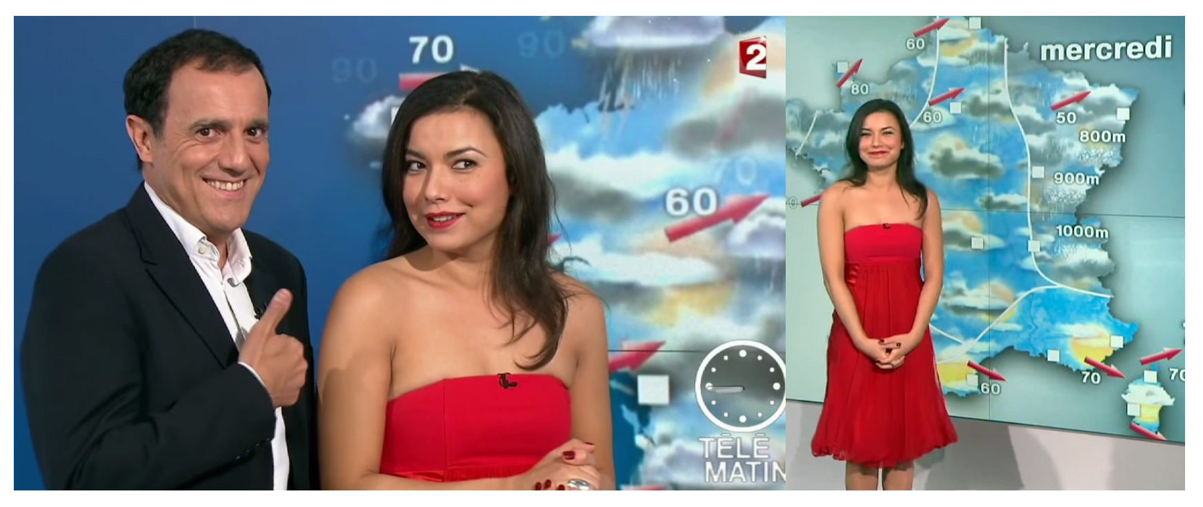
I know it’s kind of nothing too important, mostly if introduced this saucy way but think about it, wouldn’t you prefer to read Meteo this way? (again i’m not asking if you prefer the way the french “beauté” is showing the info compared to the way the spanish guy does, that’s completely irrelevant… right?)
Regards,
Alberto C.
MSc GIS and Meteo fan
