Now that we have completed a first example, let’s continue with a real-world one. Its important working on a Data Model to define what we understand as a Risk and how important this is. Meaning. High voltage power lines are an actual risk but the closer we are, i guess the bigger the risk is, meaning i.e 3 if we are within 50m and 1 if we are 150m away… It’s only a guess.

Same thing related to antennas, Petrol stations, etc.
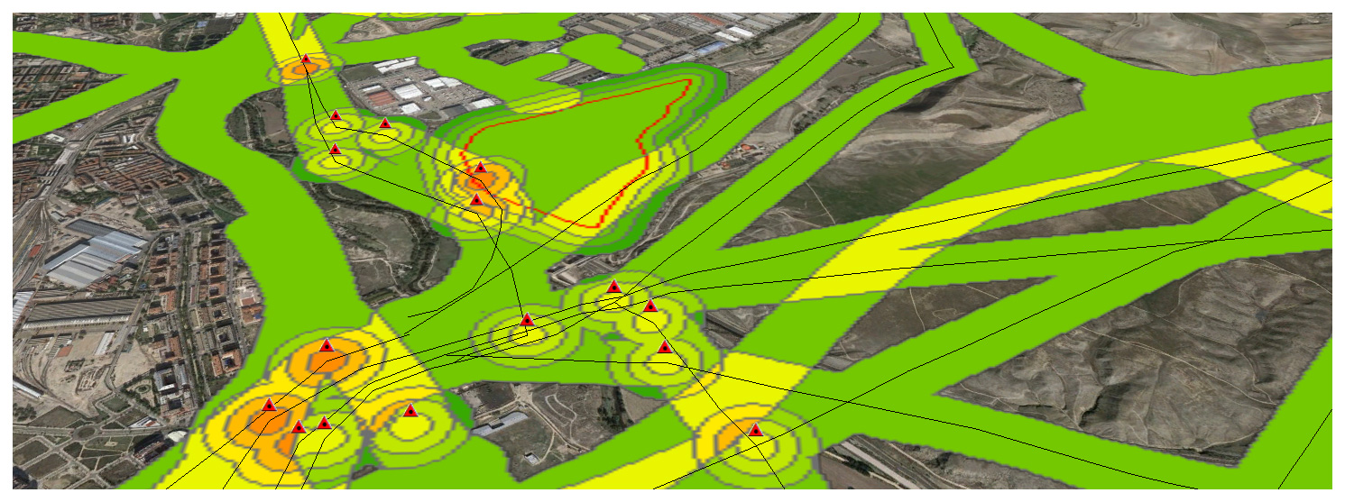
This is my Data Model defined over the city of Madrid, Spain.
1 LINES- Roads speed >50 km/h within 100m risk=3
2 LINES- Power lines within 100m risk=3
3 POINTS-
Antenna,
High voltage towers,
Petrol stations:
risk if within 50m=3; risk if within 100m=2; risk if within 150m=1;
4 AREAS-
Cement factories,
Electric Sub-stations,
Waste storage facilities:
risk if within 50m=3; risk if within 100m=2; risk if within 150m=1;
(NOTE: You can choose your own risk thresholds and importance. Also note these information downloaded from Open Source data (Cartociudad, CNIG) has not been double checked and it has been used as is).


How is this risk, or these combination of risks impacting in the population of Madrid?

Can we extrapolate these patterns to other cities in the world?
We will definitely continue this analysis shortly.
You can also visuallize this analysis using CartoDB, the field regarding “risk exposure level” is called ALL2, and ranges from 2 to 12:
Software: ArcGIS 10.3, Global Mapper 17, CartoDB
Please share if you enjoyed it… or just to say hello!
Alberto C
MSc GIS and remote sensing UAH
