
In recent years, the need to understand the urban environment has grown more urgent than ever. Climate change is not an abstract future scenario; it is already here, reshaping our cities day by day. Among the many phenomena that demand our attention, the Urban Heat Island (UHI) effect stands out—not only for its environmental and public health impacts but also for its socio-political implications. Through satellite imagery and remote sensing, we can now visualize and quantify these dynamics with increasing precision. This post reflects on such an analysis I conducted using LANDSAT 8 imagery (Scene ID: LC08_L2SP_201032_20250328_20250401_02_T1, Date Acquired: 2025/03/28), and discusses the findings in the broader context of urban planning, climate justice, and the urgent need to protect urban vegetation.

The cost of development: asphalt over trees
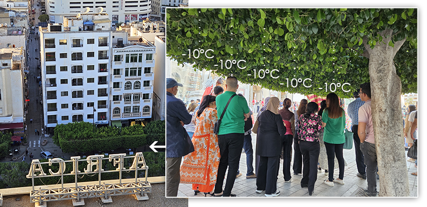
Too often, urban development favors concrete and asphalt over natural surfaces. In many cities, especially in rapidly gentrifying neighborhoods, entire rows of mature trees are being cut down—not because they are sick or pose a danger, but simply to make room for more parking spaces, wider roads, or new apartment blocks. Trees, which take decades to grow and seconds to cut, are treated as obstacles to progress. Yet their value, both ecological and social, is immense.

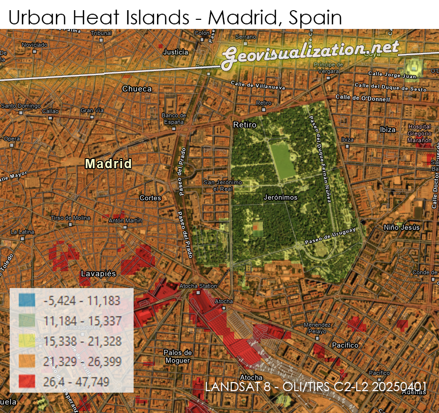
Satellite-based land surface temperature analysis reveals a clear, consistent pattern: densely vegetated areas within cities are significantly cooler than adjacent treeless zones, sometimes by 15 to 20 degrees Celsius. In my analysis of LANDSAT 8 thermal infrared bands over a metropolitan area in late March 2025, I identified strong correlations between canopy coverage and lower surface temperatures. Tree-lined streets, small urban parks, and green roofs stood out as cool “islands” amid seas of radiant heat.
Heat inequality: who pays the price?
Urban heat is not evenly distributed, and neither are its consequences. Vulnerable populations—often those with the least political power—live in the hottest neighborhoods. These same areas are usually where green infrastructure is most lacking. As climate change increases the frequency and intensity of heatwaves, this inequality translates into direct threats to human health, particularly for the elderly, children, and those with pre-existing medical conditions.
At the same time, the race for gentrification leaves little room for ecological nuance. “Development” is still measured in square meters built, not in degrees Celsius reduced. Urban trees are not just amenities; they are critical infrastructure that provide shade, store carbon, reduce air pollution, mitigate flood risk, and promote mental well-being. Yet, they are among the first victims of neoliberal urban planning.
Vegetation as climate adaptation infrastructure
The evidence is overwhelming. Urban forests and tree cover reduce surface and air temperatures through shading and evapotranspiration. In many of the urban cores I analyzed, areas with 40% canopy coverage had average temperatures 7°C lower than nearby impervious surfaces exposed to full sunlight. This isn’t just about comfort—it’s about survival in a warming world.
But it’s not enough to plant saplings and walk away. Urban vegetation needs to be protected, maintained, and expanded strategically. We must prioritize native species, ensure access to water, and embed green corridors into urban design from the beginning—not as an afterthought.
The other side of the coin: artificial coolness
Interestingly, my LANDSAT 8 analysis also highlighted the inverse phenomenon—areas that appear cooler than expected due to artificial temperature manipulation, such as zones with massive HVAC systems. A striking example was the terminal of a major airport: its large roof surface, usually expected to be a heat emitter, registered abnormally low temperatures. Further inspection suggests this is due to industrial-scale air conditioning systems that exhaust cold air onto the surrounding rooftops.


These artificially cooled zones can distort temperature maps and create a false sense of environmental performance. While they offer localized relief, they do so at a high energy cost and often transfer heat elsewhere, contributing to overall warming. It’s a reminder that true climate resilience cannot be bought with electricity alone—it must be grown.

Decoding Land Surface Temperature with Landsat 8: The Role of MTL Metadata Parameters
To carry out this analysis, as I said, I used LANDSAT 8 Level 2 Surface Reflectance data, specifically the scene LC08_L2SP_201032_20250328_20250401_02_T1, acquired on March 28, 2025. This product includes surface reflectance, thermal bands, and preprocessed atmospheric corrections, making it well-suited for urban temperature analysis.

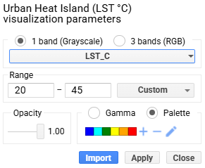
Of particular importance for this study is the thermal band 10 (ST_B10), which is used to estimate Land Surface Temperature (LST). However, the values provided in the ST_B10.TIF file are not in degrees Celsius or Kelvin by default, but in scaled digital numbers (DNs). To convert these DNs to actual surface temperature values in Kelvin, two critical scaling parameters must be extracted from the accompanying metadata file (LC08_L2SP_201032_20250328_20250401_02_T1_MTL.txt).
In that file under the LEVEL2_SURFACE_TEMPERATURE_PARAMETERS group, we find the following:
TEMPERATURE_MULT_BAND_ST_B10 = 0.00341802
TEMPERATURE_ADD_BAND_ST_B10 = 149.0
These constants are unique to each scene and ensure physical consistency in temperature retrieval. They are derived by USGS based on instrument calibration and radiometric normalization processes specific to the acquisition date and sensor conditions.
Including this calculation step in the code is not optional—it is essential. Without applying temp_mult and temp_add, the raw digital numbers would be meaningless from a physical or environmental interpretation standpoint. They would not correspond to any known temperature scale and would render the thermal analysis scientifically invalid.
The procedure
(1) Single (one day) approach. This is the code for R Studio I extracted from TAMYGEO’s video and adapted to my needs over Madrid, first thing using ChatGPT for extracting text from a video capture, second thing, once I had verified proper installation of R Studio, installing terra package (one of the Spatial Data Analysis in R):
install.packages("terra")
library(terra)

input_folder <- "C:/GEO/EJEMPLO_CALOR" //custom
output_folder <- "C:/GEO/EJEMPLO_CALOR" //custom

temp_mult <- 0.00341802 //custom, the multiplicative rescaling factor
temp_add <- 149.0 //custom //custom, the additive offset

b_st <- rast(file.path(input_folder, "LC08_L2SP_201032_20250328_20250401_02_T1_ST_B10.TIF")) //custom, actual B10 from Landsat 8

lst_kelvin <- (b_st * temp_mult) + temp_add
lst_celsius <- lst_kelvin - 273.15 //returns px value in celsius degrees

lst_utm <- project(lst_celsius, "EPSG:25830")

writeRaster(lst_utm, file.path(output_folder, "CALOR_MADRID_utm.tif"), overwrite = TRUE)
(2) Once I had my output TIFF, I used ARGIS pro for correct symbolization and classification.
(3) Also used ChatGPT for final retouching of the post.

(4) Monthly approach. Finally, I updated the same map but instead of one image, the average measurement of a month (July 2024). For this purpose I used GOOGLE EARTH ENGINE. I herewith add the link to recreate the analysis right away: https://code.earthengine.google.com/8f016b3d63dff47dfe0adc2bf4eba1ee
https://www.dropbox.com/scl/fi/1ctoer6tf3dybi2meo97f/UHI_L8_July2024.tif?rlkey=yq45vcupv6dbr0gbl4zaxqpx8&dl=0 (you can download the raw output TIFF here)


Why is better a monthly approach?
Reduced Impact of Temporal Fluctuations: Daily temperature data can be highly variable due to short-term weather conditions (e.g., clouds, wind, humidity). A monthly composite provides a more stable and representative view of the underlying thermal patterns.
More Consistent Data: Daily data can be sparse or inconsistent, especially in the presence of cloud cover or atmospheric conditions that may affect the satellite imagery. A monthly average reduces this inconsistency by using multiple images.
Smoothing of Extremes: Monthly averages smooth out extreme temperature events that might be caused by outliers such as unusual heatwaves or cold fronts. This gives a clearer picture of the typical urban heat island effect.
Longer-Term Trends: A monthly composite provides a better sense of long-term patterns, helping to understand the overall trends of Urban Heat Island (UHI) effects, which can be missed in a daily analysis.
Better Spatial Representation: Monthly composites are less affected by cloud cover or atmospheric interference, ensuring that areas which might be missed in individual daily images are considered in the final analysis.
More Effective for Urban Planning: For urban heat analysis, a monthly approach gives urban planners and decision-makers a clearer, more stable understanding of areas impacted by heat over time, helping to design better mitigation strategies.
In areas like Retiro Park, Madrid Rio or Campo del Moro, we can clearly see how the presence of lush vegetation provides a natural buffer against high temperatures. These zones maintain cooler surface temperatures compared to adjacent urban areas. The tree canopy in these parks absorbs heat, reducing the heat island effect and providing relief to both wildlife and human populations.

On the other hand, industrial areas and neighborhoods with little or no tree coverage, such as certain industrial estates or densely built-up residential areas, show significantly higher surface temperatures. These areas, with fewer green spaces, are more vulnerable to heat accumulation, leading to more intense UHI effects.
By incorporating a monthly (or quarterly) perspective, you can better capture these long-term thermal patterns and the benefits of vegetation in reducing urban heat, providing more actionable insights for urban planning and environmental protection (i.e urban trees’ growth throughout time).

Acknowledgment and final thoughts
This work would not have been possible without the generous and practical knowledge shared by the Tamara Sepúlveda (TAMYGEO) YouTube channel, whose video (link) not only inspired me but also provided the R Studio code that formed the backbone of my analysis. A heartfelt thank you for making high-quality geospatial science accessible and replicable.
As geographers, ambientalists, urban dwellers, urban planners, scientists and why not, society, we have a responsibility to push back against policies that trade long-term livability for short-term profitability. Heat is not just a symptom—it is a signal. And it is screaming that we must radically rethink how we design and govern our cities. Let trees grow. Let green guide us.
I hope you find the approach interesting. Would you like me to try it in another location anywhere in the world? Just let me know!
Alberto C
Geographer, GIS Analyst, and deeply concerned about human behavior
Sources:
https://posit.co/download/rstudio-desktop/
https://earthexplorer.usgs.gov/
https://en.wikipedia.org/wiki/Urban_heat_island
https://www.urbanheatislands.com/
https://www.youtube.com/watch?v=n8_Nx0z8iCs&list=LL&index=2&ab_channel=TAMYGEO
https://joint-research-centre.ec.europa.eu/jrc-news-and-updates/urban-heat-islands-managing-extreme-heat-keep-cities-cool-2024-07-22_en
https://dialnet.unirioja.es/servlet/articulo?codigo=10036795
https://www.sciencedirect.com/science/article/pii/S2212095522001250
https://geoai.au/urban-heat-island-uhi-understanding-and-technology-for-measurement/
https://www.voanews.com/a/study-heat-waves-cost-poor-countries-the-most-exacerbating-inequality/6810648.html
https://www.bbc.com/future/article/20211025-climate-how-to-make-the-rich-pay-for-their-carbon-emissions
https://code.earthengine.google.com/
https://elpais.com/espana/madrid/2025-06-10/que-calor-hace-en-cada-parque-infantil-de-madrid-los-satelites-de-la-nasa-dicen-que-el-64-se-disparan-hasta-los-41-grados-o-mas.html
