I am a geographer by training, and my professional career has always had a predominantly geospatial focus. Having recently completed a forty-hour course in R, using RStudio and GitHub, I feel that a whole new world of analysis has opened up before me. This work represents the meeting point between my basic geographical instinct and the technical capabilities of statistical programming. It is important to emphasise that I have invented this data and model entirely, so the results have no real meaning and contain inevitable biases. Their sole purpose is to learn and demonstrate the capabilities of this language. I believe that geographical knowledge and code are interdependent, as one without the other would not function successfully. It is precisely this symbiosis that I hope will make a difference in my current job search.
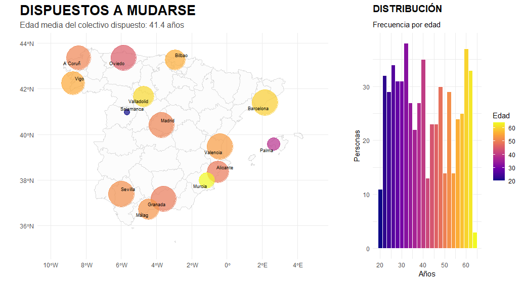
In terms of visual results, the analysis integrates layers of complexity that facilitate understanding of the territory. Using logarithmic scaling, we have managed to bring cities with very different data volumes together on the map, allowing us to identify small talent hubs that would normally be hidden by large capital cities. Furthermore, we do not simply place points on the map, but use colour gradients to link average age with location, making it easier to detect groups of young talent as opposed to more senior profiles. The inclusion of a histogram allows us to validate the general distribution of the data in relation to its geographical dispersion. This exercise demonstrates that the combination of territorial analysis and programming can transform data into a clear and strategic visual narrative.
Let us imagine an HR company that seeks to understand when its clients, with certain educational backgrounds and occupations, are most likely to decide to move to another city. In other words, is the profile of those willing to move mostly young or older? Urban or rural? With low or high levels of education? Where are they concentrated?
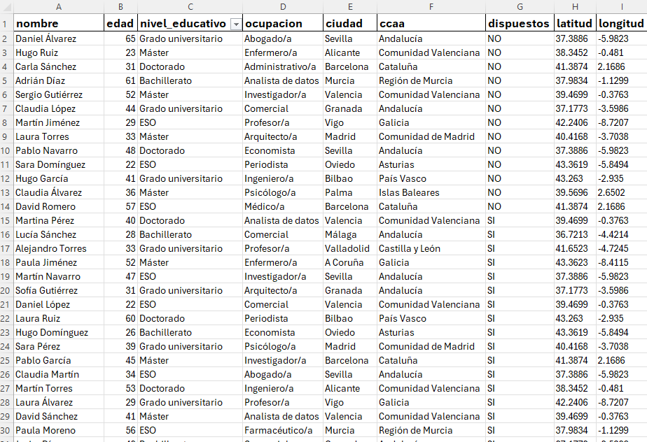
The database is a CSV file with only nine fields, thoroughly cleaned up so we can start playing around with the tidyverse library.
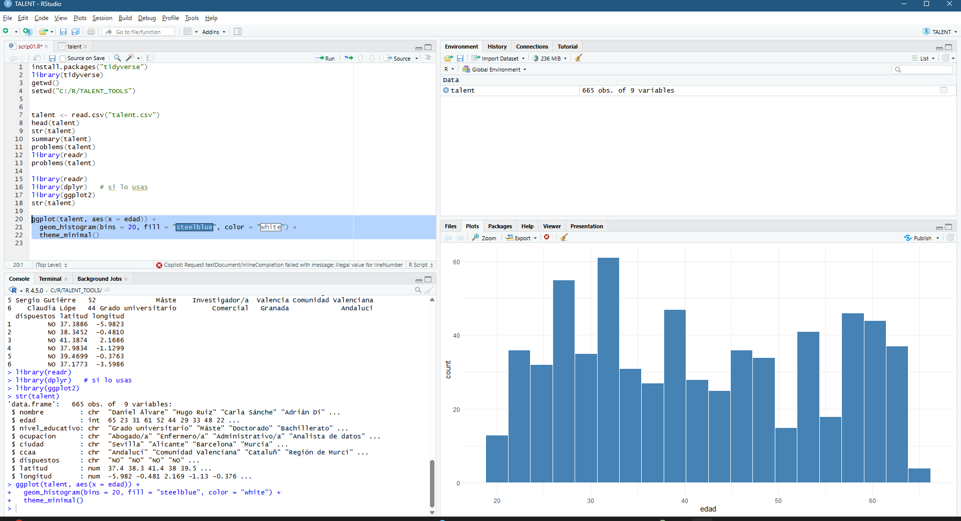
Once the project has been set up, which can actually be one of the most complex parts (directories, files with appropriate separators, overall consistency of information, etc.), we start to get our hands on the code (please don’t look too closely, I’m just a humble geographer… and blond!). Below, I begin to understand the basics and create a histogram of the number of people broken down by age.
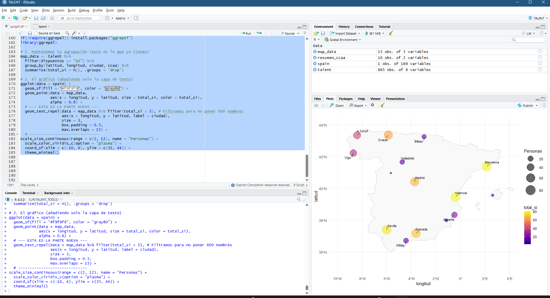
But, what is an analysis without a map to overlay it?? 🙂
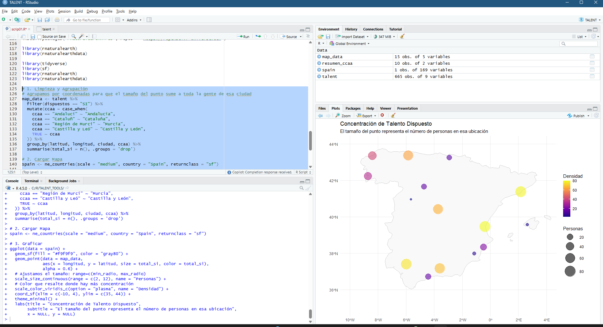
Inserting a map, adding labels, playing with sizes, colors, alphas, shapes… I have a lot to thank to my “geography visualization” teachers at the UVA in Valladolid!
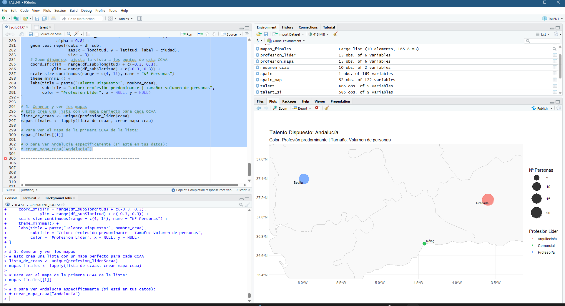
A little detour, let’s focus on Andalucía…
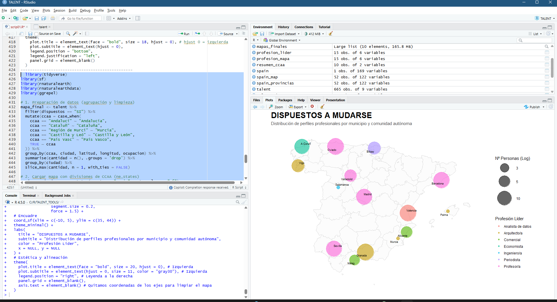
Here comes the fun. Adding colors to disaggreagate profiles and size to rapidly get to understand where is the bigger amount of people willing to move…
¿Do I need to disaggregate by bigger regions (CCAA in Spain)?
Please don’t blame me for the incoherence… this is FULLY RANDOM!!!! 🙂 Do we understand if we use a color fade for average age?
Should we try a violin-like diagram showing that I don’t just make pretty maps or graphs, but that you establish aKPI? Any HR recruiter can see which groups are ‘aged’ or which are the ‘youngest’ in relation to the total workforce. A Senior Geodata Analyst should know how to interpret the social reality behind the data 🙂

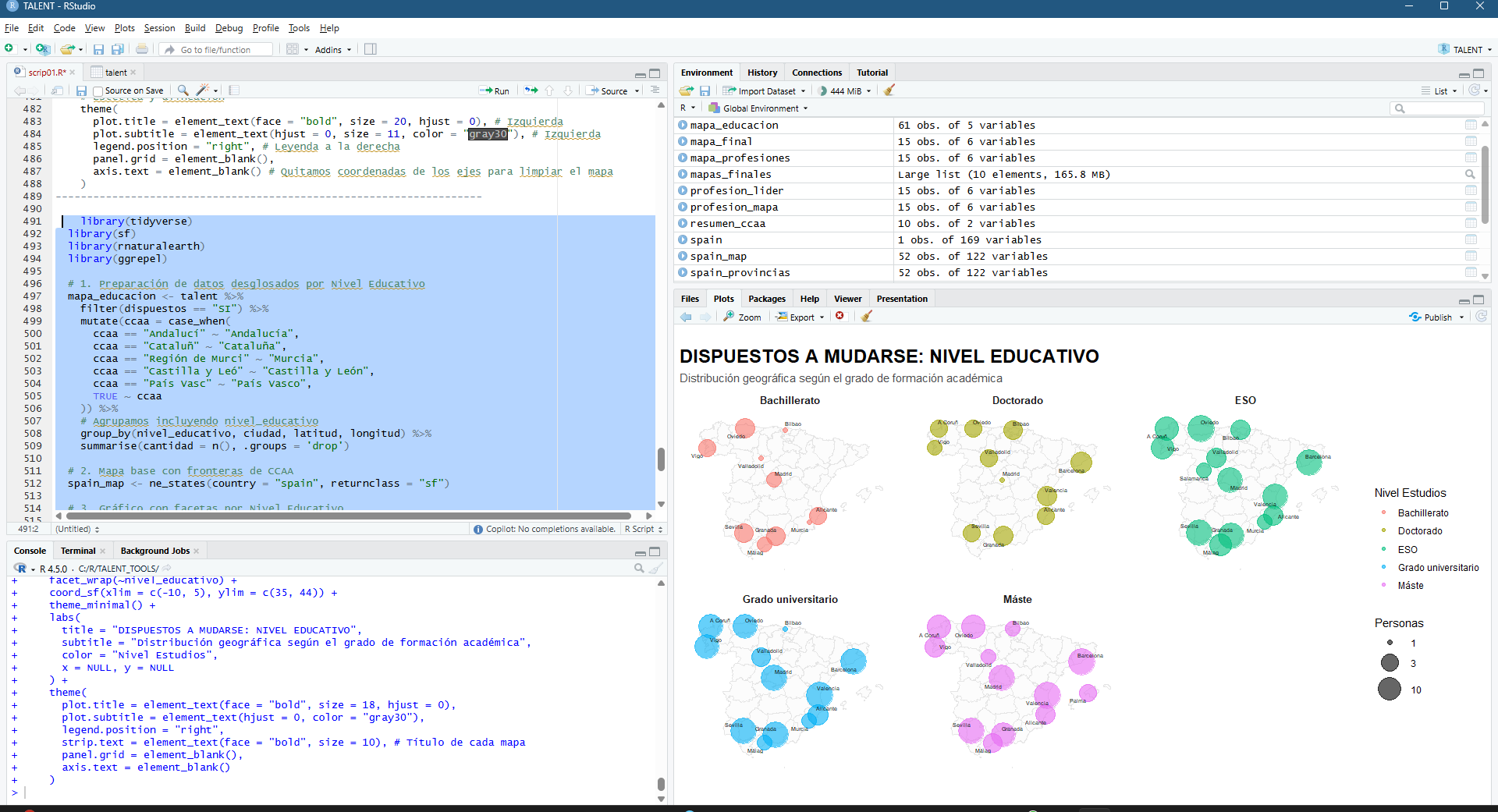
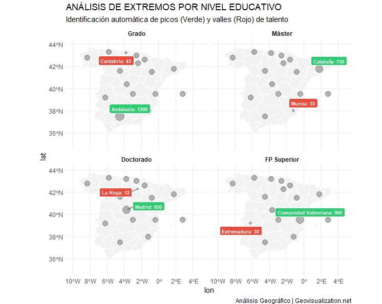
Or even better, a disaggregation and highlight of MAX-MIN cases per level of education.
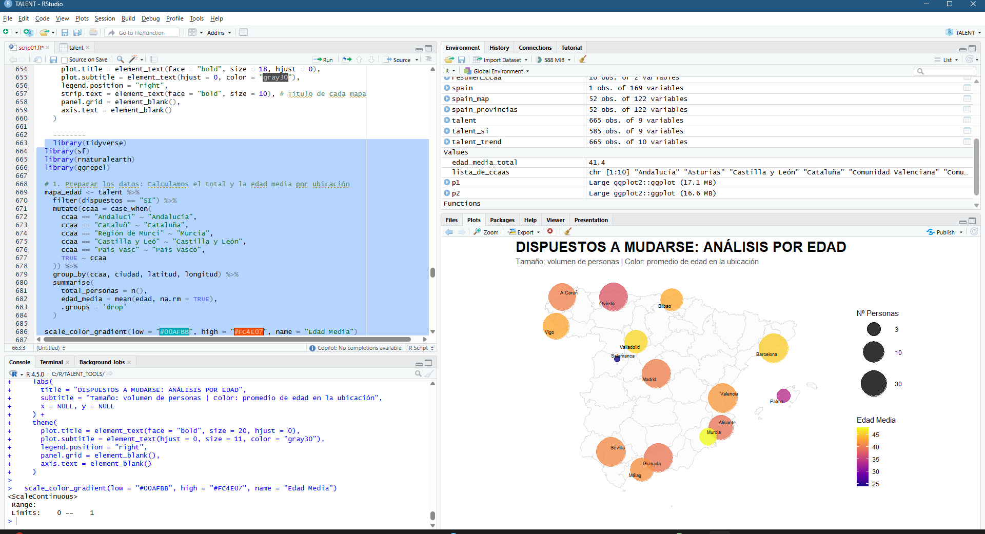
And the final result today (so far): the main cities, the age factor, the average candidate profile. Everything has an explanation:-)

Urban Concentration: The map shows that willingness to relocate is not uniform; it is concentrated heavily in Madrid, Barcelona, Seville, and Valencia. The larger circles in these areas confirm that they are the main ‘talent engines’.
The Age Factor: The trend line and histogram reveal a clear negative correlation: the younger the age, the greater the willingness. Younger talent (light/yellow colours) is the most flexible, while from the age of 45-50 (dark colours), the intention to move falls dramatically.
Geographical Balance: Thanks to logarithmic scaling, we see that although capital cities dominate, there is a constant flow of profiles in medium-sized cities, suggesting that talent is distributed but needs incentives depending on the stage of life.
Candidate Profile: The histogram confirms that the bulk of those interested are between 25 and 38 years old. Outside this range, mobility becomes exceptional.
Borders: The visualisation by autonomous community allows us to identify that regions such as Andalusia and Catalonia have a network of secondary cities with high mobility, unlike other regions where everything is concentrated in a single point.
In conclusion: the profile of those willing to relocate is mostly young, urban and highly educated, concentrated in the country’s major economic hubs.
I hope you enjoyed it. If you can think of any other scenarios where we don’t have to make up the data, I’ll give it some thought and write another post!
Alberto C.
Geospatial analyst and someone who is looking for a job. ¿Do you have one?
